[Accessibility] A tooltip when I hover over the color picker control / Named colors


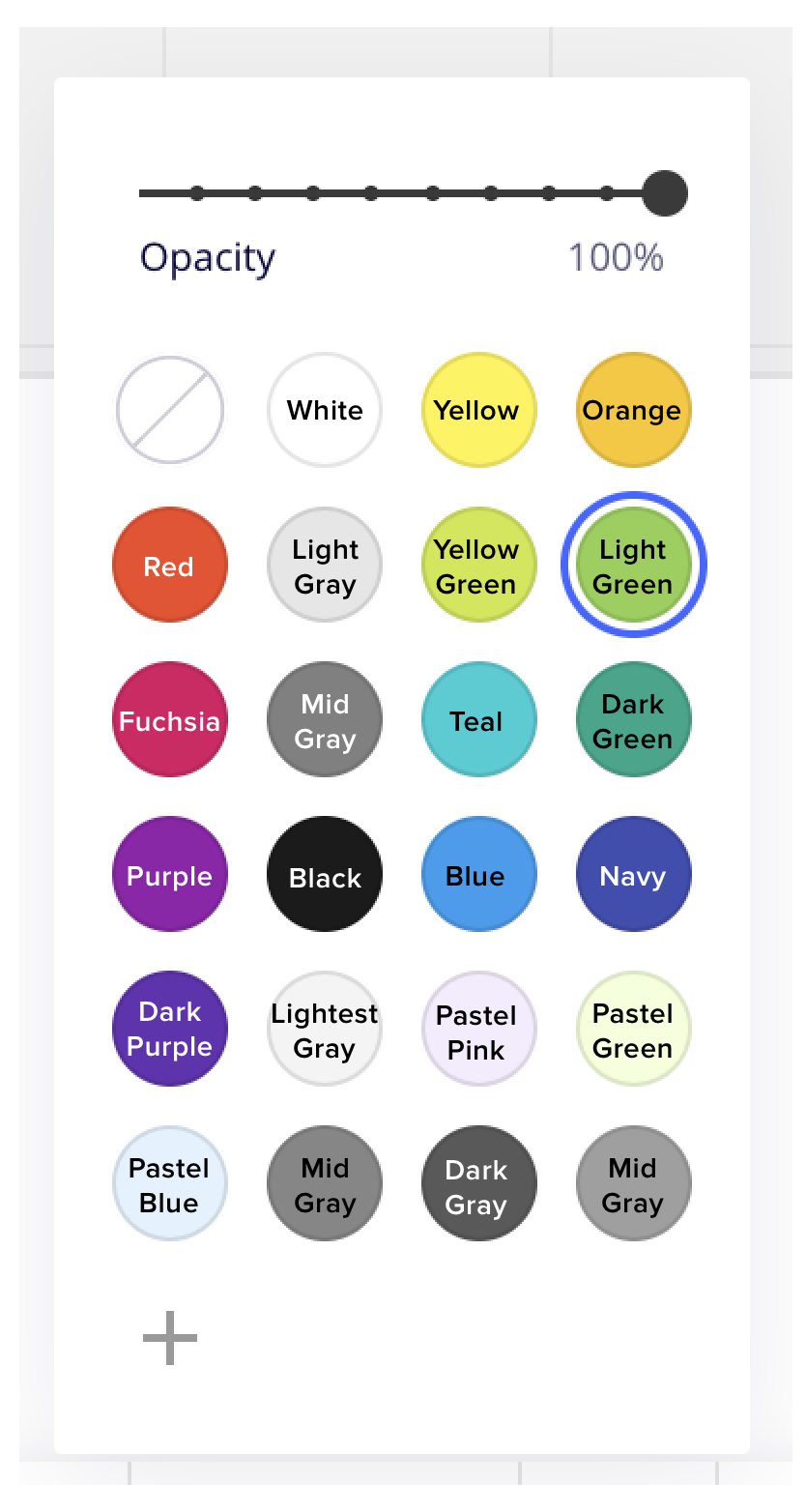
Being colorblind it is hard sometimes to choose the right color. Distinguishing between them isn’t the problem. Just seeing which one of them is the orange one can be difficult.


When picking a color, I would like to see the name of the color, when I’m hovering over one.


Of course this applies to the color picker on every object. From sticky notes to the background of whole frames. 

the whole ‘ability-centric’ consideration needs to be on the development agenda - @Eduardo Gomez Ruiz  - something to note :)


It is definitely something that should be included in Miro :disappointed_relieved: . It is a thing that helped A LOT when using other softwares to be sure I was selecting the colour I wanted to select. 


There should be a way to hover over each color and see the name. It is nearly impossible for color blind folks to identify and distinguish between colors. I created this guide for one of my coworkers, but I know this is not the only place colors are used in Miro.


As a user with color vision impairment, when I am selecting the color of a  shape/line/text I would like a tooltip when I hover over the color picker control so that I can select the correct color.


Given that I am selecting a well known colour like Orange, Brown etc, I would like the tooltip to read with the common name of that colour.
Given that I am selecting a custom colour without a name I would like to see the RGB value for the color.


This is a common accessibility which works the same way in Google G-Suite, MS Office, Adobe Tools etc. It is a small thing that is invaluable to approximately 1:12 of the population.


This is definitely a simple function that is blocking progress for those with color blindness. As an animator of many workshops in my company I struggle create schemes based on the most basic colors. It’s a bit distracting when you have to ask for assistance in finding a specific color in the middle of a workshop.


For the sticky notes, perhaps add different types of dashed borders.  The dashed border, code almost be like a morse code for the color name.  That way, in group meetings, color blind people will be able to match which sticky notes belong to the same group without asking the facilitator asking to hover over a sticky notes.

I imagine the border dashes could be a dark tone or light hint.  It will be subtle enough but still effective.


How come isn’t this a reality yet? Please be more inclusive with colorblind community, it’s very hard for us to choose the right color in sticky notes and shapes. :weary:


Hey Miro team, any chance this will happen soon? 😀