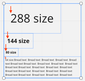
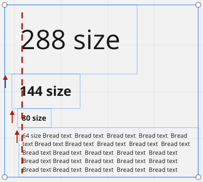
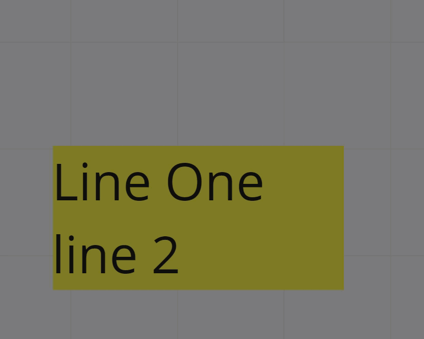
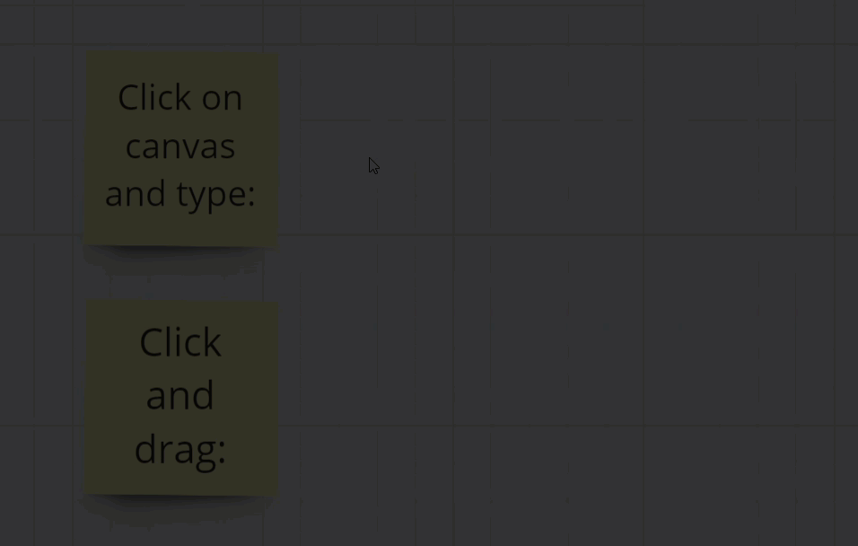
One of the things that frustrate me the most with Miro, is the left and right padding around texts that’s always relative to the text size. It basically makes it really difficult to align text blocks. Under no circumstance is the first picture below intended by a user. In stead we seem to be forced to eyeball it like in the second picture below.
Why not just do us a favour and make the left/right padding be the same no matter the size of the text. Maybe even leave it up to us to set it? :)
I generally really like Miro! Good job overall! This just feels like a mistake