Dear Miro community,
as we have seen in the past few months, Miro is not only the perfect tool for collaboration and ideation, but also a platform for delivering educational events, like training and workshops.
Today we'd like to open the topic of visual structure of your Miro boards. Since the space to use in Miro is unlimited, it may not come as a surprise that many of us feel unsure of how to organize our own boards to keep the structure clear and have a natural flow.
There are many things to consider:
- the amount of the content
- the structure of the delivery
- the public
- the intuitiveness of the layout
There are also many components in Miro that allow us to design a board:
- templates
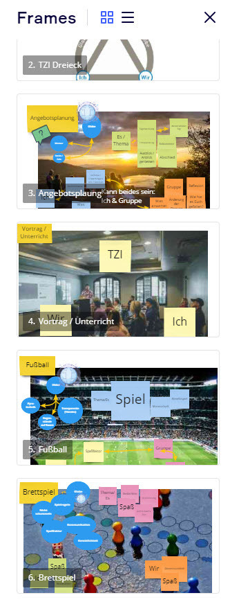
- frames
- shapes
- drag-and-drops
Combining it all into an intuitive board with a good flow is no easy task, that's why now is the time to learn from each other!
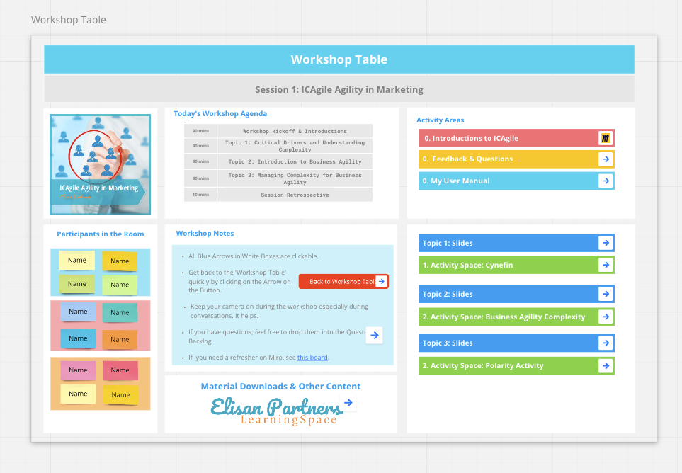
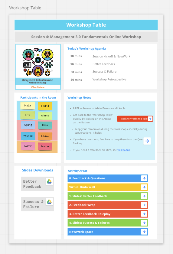
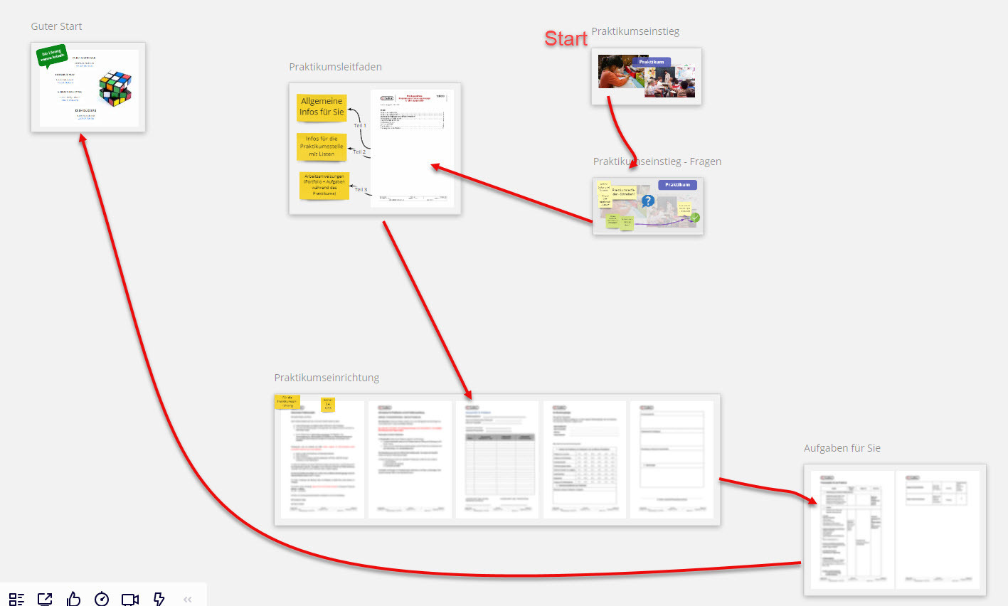
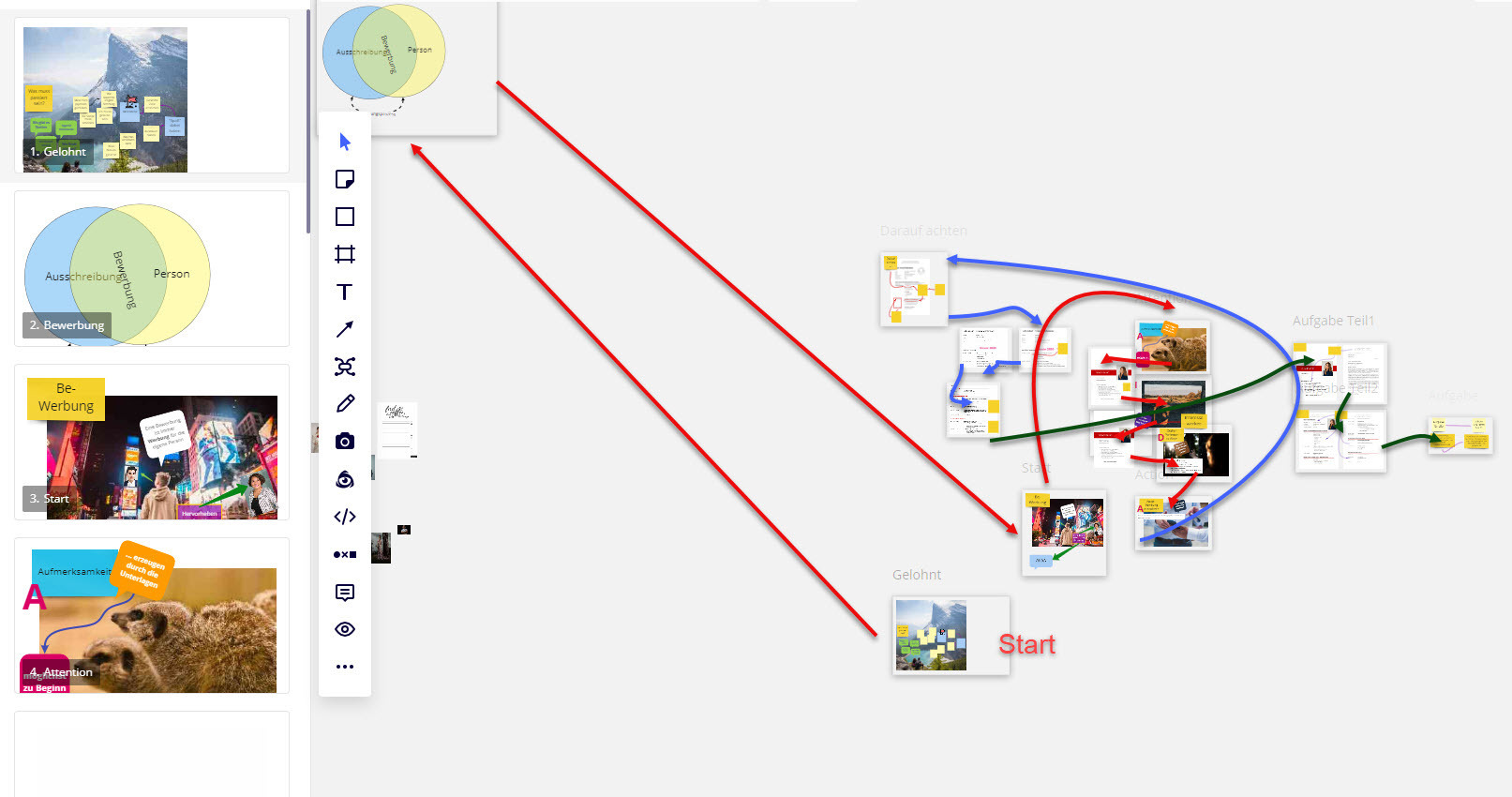
We've prepared some examples that may come in handy when considering the layout of your next training or workshop:
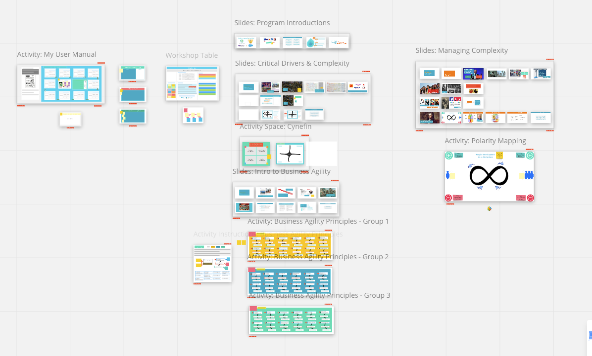
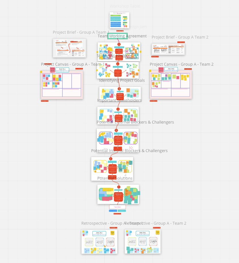
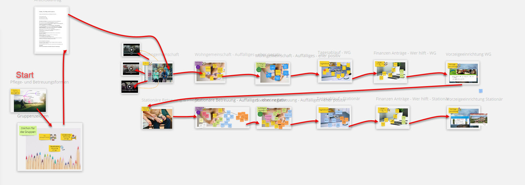
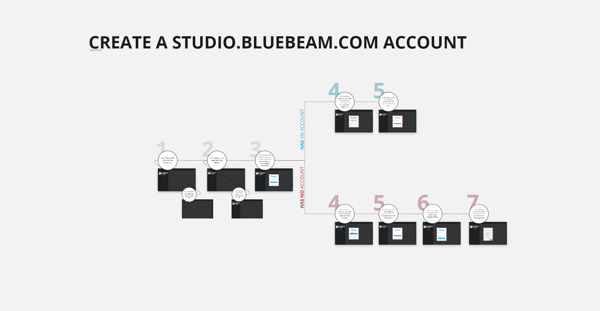
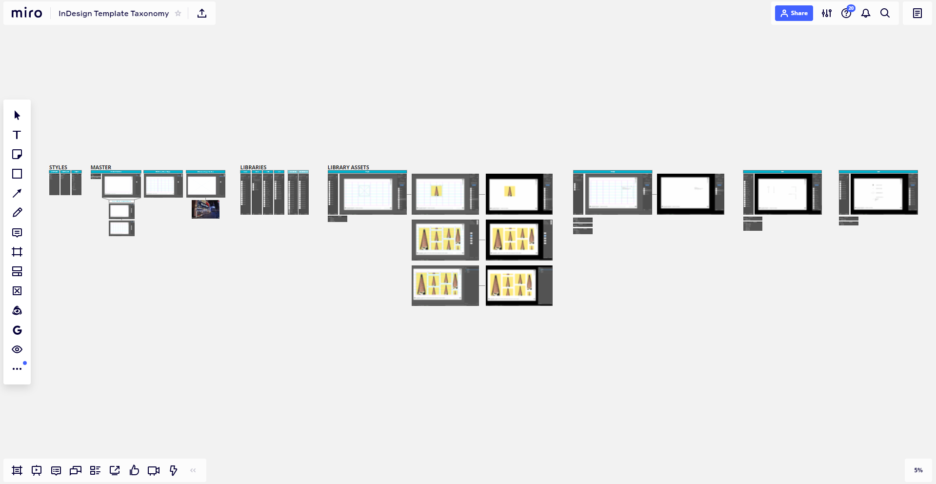
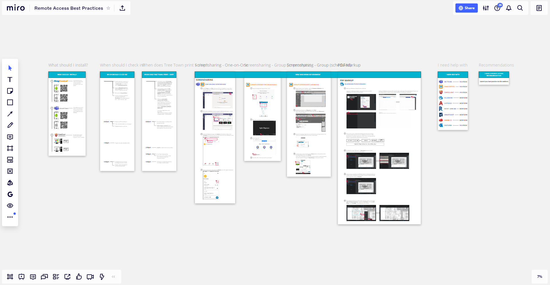
The linear layout comes as a natural selection, since we read and write that way. The idea is to organize your content into a left-right or top-bottom order and, if needed, spread it both horizontally and vertically. This offers you a great categorization structure.
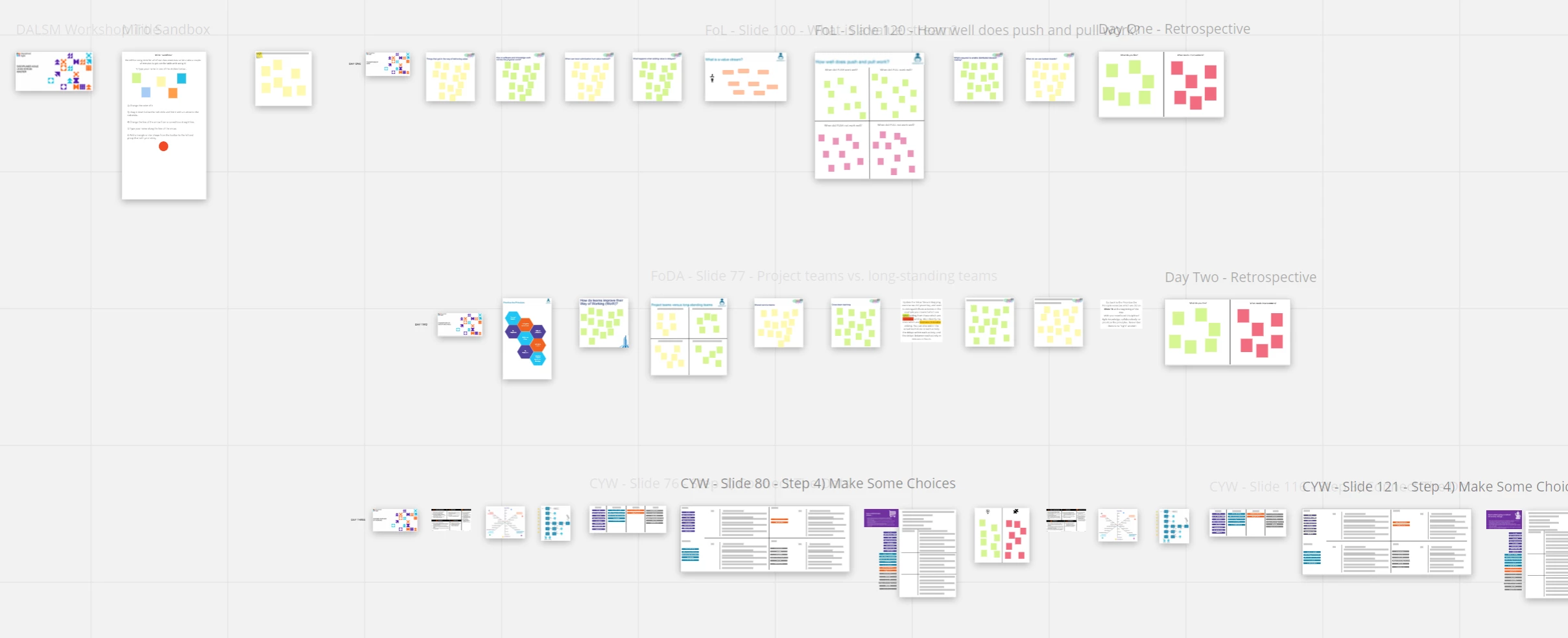

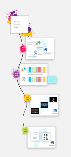
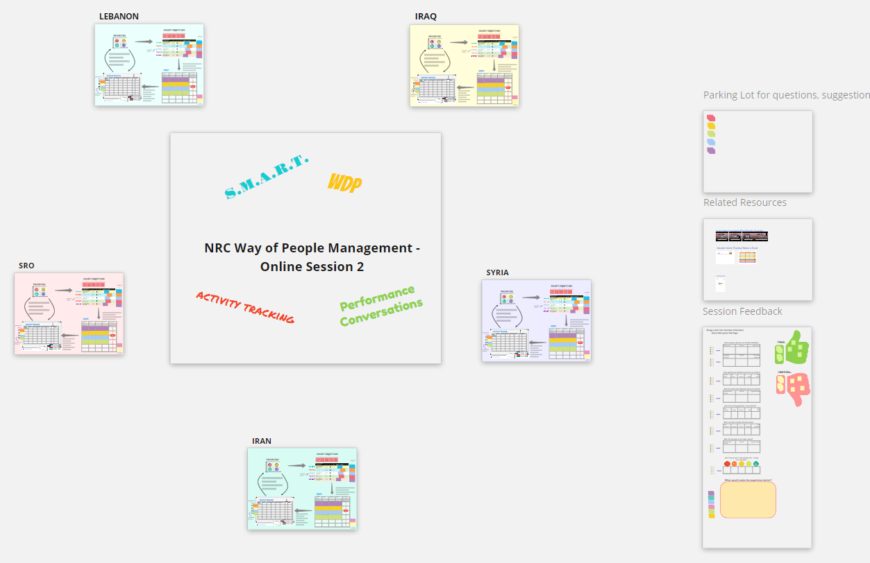
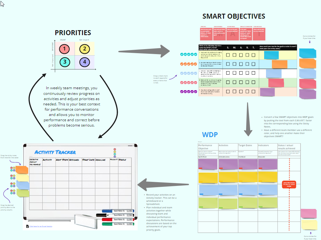
Other that may come to mind are the circular layout and squared layout, which both offer a "full circle" experience by returning to the point where you first started your journey.

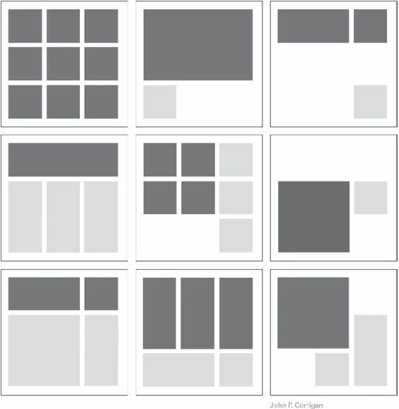
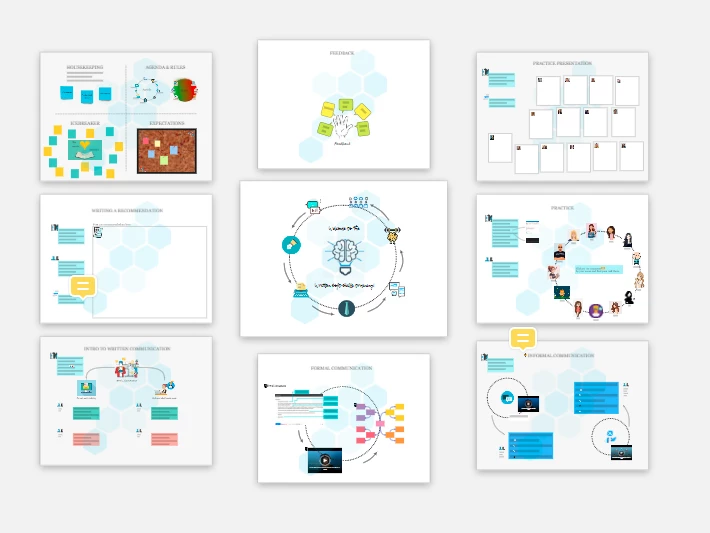
But, there are many others to consider: spiral layout, diamond layout, triangle layout, cascading layout etc., each with its own advantages.
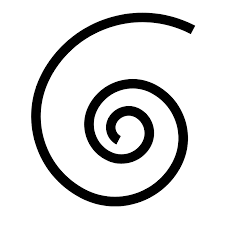
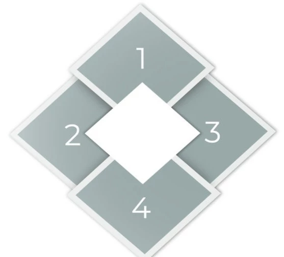

We are all different, so each of us finds his/her own style and a comfortable way of working, and this is an opportunity for us to grow from each other's experience.
We shared some of our favourites and most-used cases with you in the post, and now it's your turn to shine: tell us about your layout journey - from the ideation, following with the selection of the structure, all the way to the examples - screenshots welcomed :)


