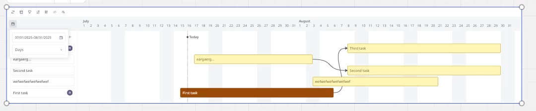
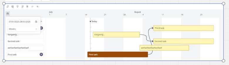
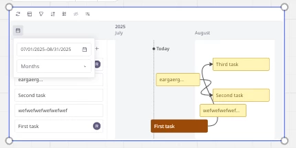
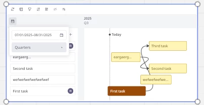
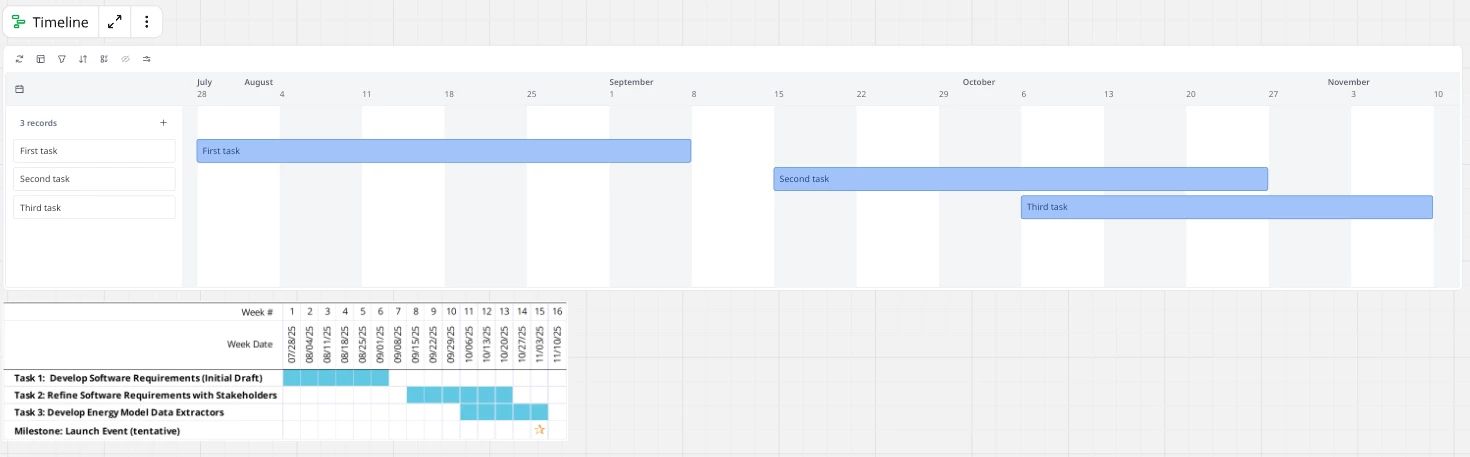
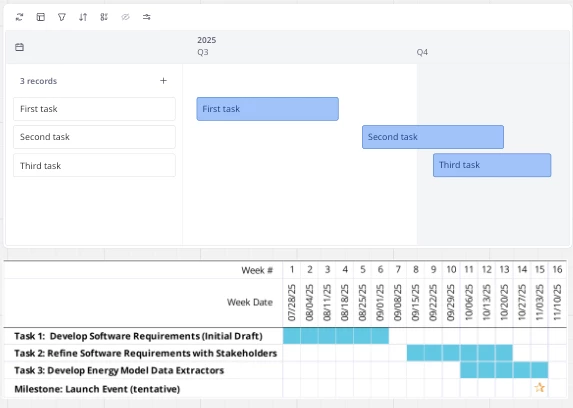
I was excited to use the Timeline feature for a project I’m working on. However, I need the width to fit on a normal page (8.5 x 11) for a proposal (although I plan to use the Miro board directly to help manage my project). I can increase the default width, but can’t reduce it, and I can drag a corner to resize up or down but that resizes text as well. There is plenty of space to show what I need with less width, but it seems the limitation is that the widget can’t shrink time periods to be less than X pixels and that “X” is just unnecessarily large.
Am I missing something here, or is the width actually limited like I’m describing?
If this is correct, what’s the best way to share this feedback directly to Miro? (I’m a longtime Miro free user, and just recently purchased a Business plan).
Page 1 / 1
Hi @Greg Collins
Good question - I too am interested in an answer. I encourage my bachelor students to use Miro - and having a Gantt chart is essential for them. But . . . they need to put a copy into their theses and I could never figure out a good way to do this for the reasons you mention. So sadly I encourage them to use 3rd party tools or Excel.
Even an export-to-CSV option would be wonderful. I have a feeling Miro will be under pressure to implement this, given the huge number of people using this feature.
Let’s see if anyone else has a suggestion!
@Greg Collins - I’m curious about this, as I currently can’t imagine wanting to compress it further than I can at this stage.
The minimum width is also dependent on what time period & granularity I choose - 4 example below
1/7/ - 31/8 using Days1/7 - 31/8 using weeks1/7 -31/8 using months1/7 -31/8 using Quarters
So it can be quite compressed by changing the “unit” - that might help to get it to the width that you were looking for?
@Kenneth Ritley - I was just about to raise a new feature request regarding the Timeline feature: “the ability to export the Table data from Miro as a csv or so” - Overall the timeline feature works quite well, it even allows for custom fields etc. but the limited ability to export it makes it quite tricky to hook it into reporting flows etc.
@Robin Head I ended up creating what I needed in Excel. See below for a screenshot showing the Miro version I couldn’t use and the Excel version that went in the proposal. I scaled them so that the text appears to be the same size. As you can see, the Miro version at its minimum width is over 2.5x wider for the same time period.
Sure, switching to quarters allows me to compress it further, but the time labels become pretty useless, and I wanted to be able to show weeks:
I actually didn’t realize earlier that changing the interval (e.g. weeks to months), allows me to shrink the width of the timeline. Using months could have gotten me pretty close. The text is noticeably smaller than paragraph text when pasting into my document, but I probably could have gotten over that for this specific example.
The ability to reduce the width further is valuable and doesn’t seem like it would be that difficult - especially since it’s only a matter of adjusting the min limit which already exists.
And thanks @Kenneth Ritley for the support!
Reply
🚨 Last chance for early-bird tickets to Canvas 25! 🚨