Trying to decide which board style to use?


Board 1) Design a Tick Tock Clone App

Features, Current Designs, references to relate to


Board 2) Clean my home

Clean my house, select who will do chores


Board 3)Pay Taxes

Gather paperwork from different areas of my life, health, income, home expenses


Hi @jayjay! Here are some suggestions:

  1. For the app, you could use wireframes from the Wireframe Library.
  2. To select who will do chores, you could either use a Kanban Template with cards, or a Todo list in Visual Notes. A third option would be to write the chores in sticky notes, then add a comment to a particular note and ping the “assigned person.” When the task is done, you could then mark the comment resolved.
  3. How about creating frames for different types of files, then simply upload them and place them in those frames?

Hope that helps. 😊


Board 1) Design a Tick Tock Clone App

Features, Current Designs, references to relate to


As @Henrik Ståhl mentions, there is the Wireframe Library app in Miro. A quick search of the Miroverse returned this UX Design Analysis template, but there may be others.

I would suggest just taking your current design process and moving it into Miro.

For the next two questions, while you can do these things in Miro, I will share one of my favourtie lines after 15+ years experience in providing IT solutions: Just because you can, doesn’t mean you should.


Board 2) Clean my home

Clean my house, select who will do chores

Try using Trello instead. Why:

  • The cards are more robust. Just look at the number of Wish List posts asking for more features in Cards → https://community.miro.com/search?q=cards&content_type%5B0%5D=ideation
  • In Trello cards, you can add checklists, assign multiple users, attach files (just to name a few features).
  • The mobile lists/cards experience on Trello is far superior - Miro is mentions that cards have limited functionality in their mobile app in their Cards Help Center article. This is all okay, thought, as Miro isn’t trying to replace Trello.
  • You can create a Trello card by emailing to a @boards.trello.com email address that you generate from your Trello board’s Email-to-cards settings.
  • I have even created an If This Than That/IFTTT action/recipe that will create a cards in my main Trello board via my Google Assistant, so I can say, ‘Hey, Google. Add CARD TITLE HERE] to my Trello board.’. I did this by following these instructions.
  • You can customize the board background colour or by using an image - not important in most workflows, but you can still do it :)
  • If you wanted to work on the Miro board for this because you wanted to work with others in real-time to create the list, you can still do this using cards or sticky notes. From there, you would select all of these objects, export to CSV, open that file, select the items, and paste them into the card title box in Trello (when you click “Add a card” and when you press enter, Trello will ask you if you want to create a new card for each line you just pasted. I just learned this was possible as I was replying to this post. This works from Excel, Google Sheets, any document (e.g., a text file). More on this here.
  • I will also note that in the past Miro Cards in a Kanban or User Story Mapping framework have been quite buddy for me - they sometimes get stuck in one location and cannot be moved, or cannot be deleted. I need to close down my browser, or the Miro desktop app, and sometimes clear caches. It is really annoying and embarrassing.


Board 3)Pay Taxes

Gather paperwork from different areas of my life, health, income, home expenses

 

Miro is not document-management friendly. You cannot work on the documents in Miro or search them, etc. You are better off to use something like Google Drive. Again, you can use Miro if you really want to, but I there is very little value in doing so.


@Robert Johnson Hehe, I see you're as passionate about management tools as Star Trek, Robert. 😉

I don't dislike Trello – quite the opposite, it served me well many years ago – but I wouldn't recommend it anymore (except for transitioning from Jira; I'd basically recommend almost anything in order to get rid of Jira).

If I would recommend a single tool for all of those things, I'd say Notion. It's far superior in all aspects, it's even great for documents (which Trello is not).

And the runner-up would be ClickUp. Trello just might make it into the top 5 but I doubt it.


Hey guys, I appreciate your feedback; I did a rough sketch; but mine looks terrible.. is there any button to press to get everything aligned (imagine how when a computer desktop has a ton of icons and then you click sort and it all comes together neatly. The stickey notes are place holders for additional data, i just didn’t change the context outside of the “eat right” category.


@jayjay There are a couple of ways:

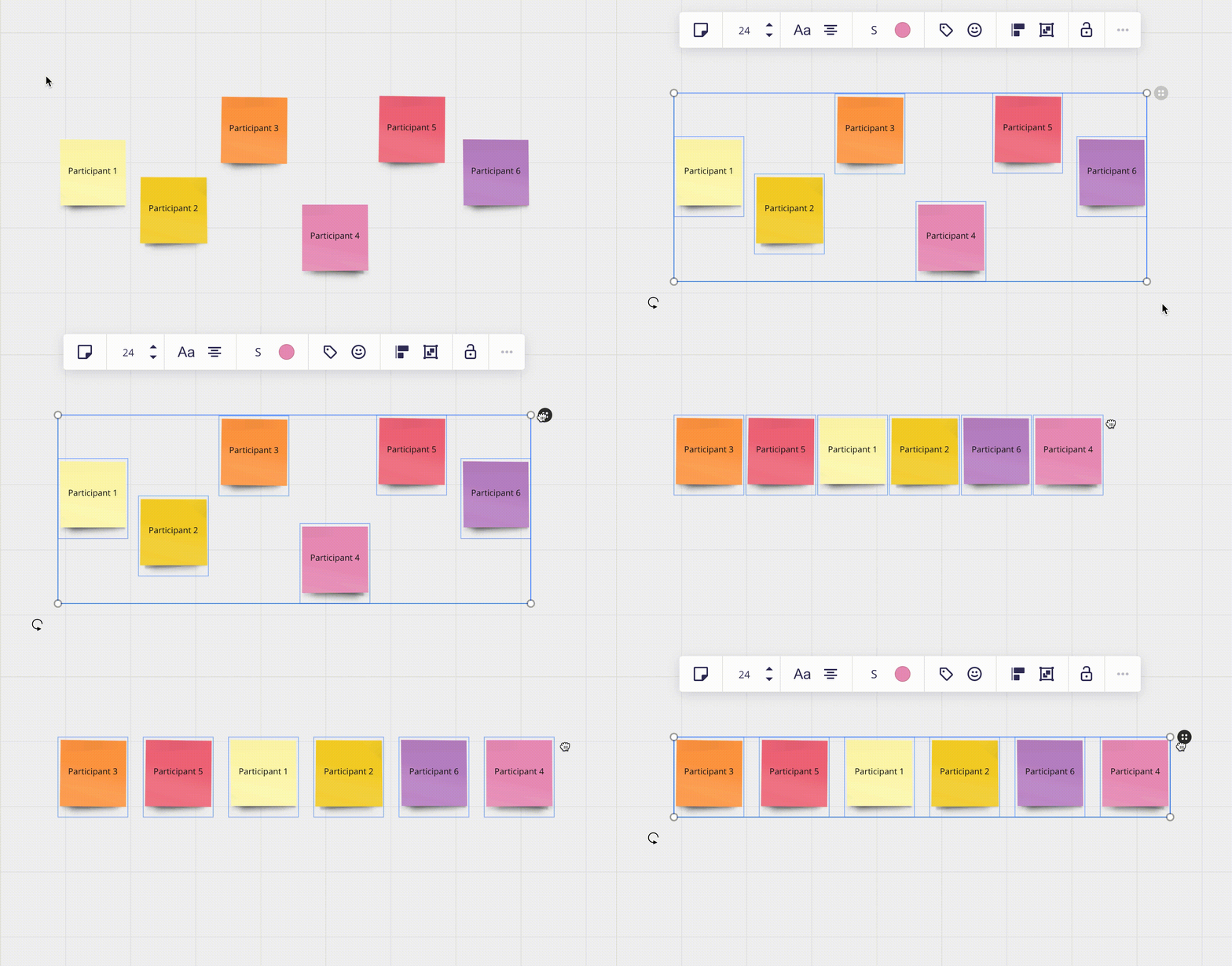
Auto layout

  1. Select the widgets you need to align.
  2. Click on the grey icon in the upper right corner and drag it horizontally.

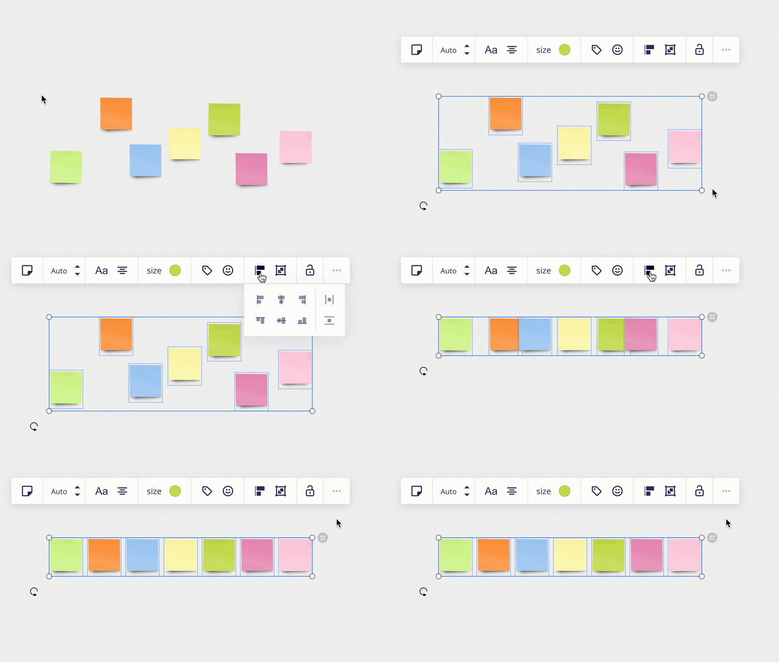
Aligning

Selected objects can be aligned horizontally, vertically, and on left/right sides in relation to each other.

I requested editor rights for your board, if you accept I could copy what you done and give some examples of how it can be structured. 🙂


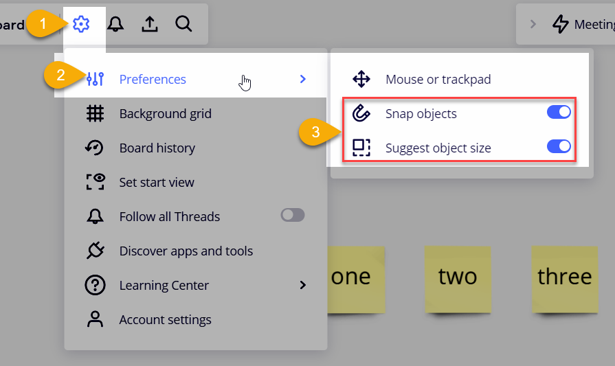
@jayjay - In addition to Henrik’s suggestions, you may also want to ensure that the following board settings are enabled:

  1. Smart guides - This will help you align objects better.
  2. Also check out the Suggest object size setting:


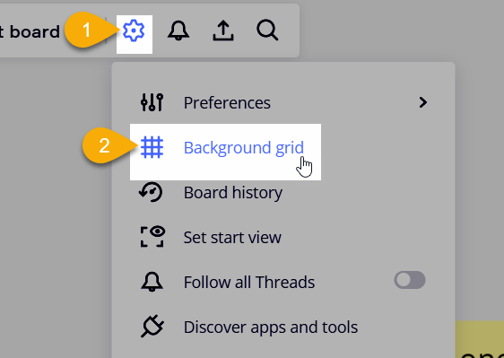
Snap to grid

This can also help to align objects:

https://help.miro.com/hc/en-us/articles/4403634496402-Miro-for-mapping-diagramming#h_01FGKK3PJSN5ZAX7N2FJ094XDG


@Henrik Ståhl just granted you access as requested. By the way, I was recently in Gothenburg, Sweden, not sure if you ever make it there; beautiful part of the country.


@jayjay Perfect, thanks! 👍 Gothenburg is nice, but I prefer Stockholm. You should come here during summer, it's very beautiful that time of year! 😀


@jayjay I’ve updated the board, copied the content and restructured it a bit. It’s right next to the original content. Didn’t do any fancy design updates, only simple alignments. 🙂


Reply