When adding a text box, with the text box selected, I have the option to set background colour and opacity, however the option to set border colour is not present as I have seen in tutorials explaining this function.
Could you provide a link where you have seen this function supported as I don’t believe a normal text box provides border shading options unlike a rectangle in which you have typed in text?
Kiron
Hi Kiron, thanks for the prompt response.
Following this link: https://help.miro.com/hc/en-us/articles/360017572094-Text
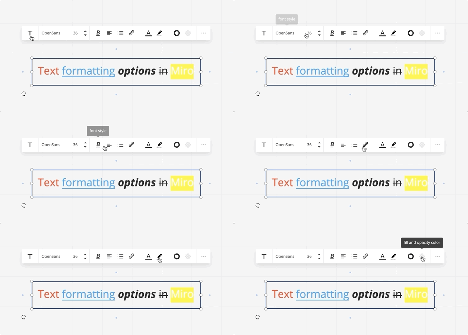
I can see that there is an option for border and background (the two options immediately to the left of the ellipses).
In my desktop app, I only see the option for the background (the checkered circle) and do not see the black outline button.
Should I just be using the box shape in this instance?
The border functionality appears to have disappeared - whether it was intentional or a bug is anyone’s guess. Either way, the documentation does not match the behaviour.
Tagging
It looks like there is no longer an option to modify the border of a text object:
Text Help Center article:
https://help.miro.com/hc/en-us/articles/360017572094-Text
Formatting options are available while you are typing, and whenever the text box is selected. You can choose the text font, text box and border color and opacity, change font size, highlight etc.
Text boxes have a limit of 6,000 symbols. The limit includes spaces and all style changes in code, so text formatting may decrease the number of symbols you can input.
Should I just be using the box shape in this instance?
I don’t get it, can MIRO just bring back control over the outline/border when using text boxes please?
Hey All!
Thanks for the nudge :)
Indeed, we’ve recently improved the UX for text boxes to make them more distinguished from the rectangular shapes. The update included:
- Removing the outlines for text boxes (you still can have them using the Shape widgets)
- Removing the padding (to make the text boxes more consistent and visually appealing)
- Adding the functionality of right & left text alignment.
You may also learn more about the improvements on our Changelog for Apr 12, 2021 (Bug fixes & Other improvements section): https://miro.com/changelog/.
We’ll make sure to update the Help Center article correspondingly ASAP to avoid any further confusion.
Thank you for the heads up! Let me know if any further questions pop up :)
Hi
The option to change the text border is not available now I’m afraid, as we slightly changed the text widget. Text now is more visually distinct from shapes, it can be aligned left or right and doesn’t have paddings.
Sorry about the confusion caused by the article and thank you for flagging! The documentation has been updated accordingly.
I get it… and yet it creates an extra step for me, rather than having the flexibility of choosing a border on the text or adding a shape. I think having this choice is helpful for me.
THANKS for updating us so swiftly!
Thanks all
I’m not sure I understand the goal of removing the simple to use functionality and replacing it with a less desirable user experience.
Shouldn’t it be up to the user of the product to determine if they want text boxes to be more distinguished from shapes? It is obviously subjective that the ‘new’ settings of text boxes are more visually appealing.
The functionality that shapes provide does not currently appear to match the functionality that text with border options provided. Shapes have different limitations, they don’t contain easy to use settings for bulleted lists etc.
I am now resorting to finding older boards I had with text that contains an outline. It is very perturbing as an end user.
Please bring back this once glorious option to text boxes.
This is terrible!!! I need a bulleted list of text within a border. Now the text box doesn’t have a border option and the shape doesn't have a bullet option. Please revert this ASAP!
I mean, who doesn't like bullets?
- I do.
- Me too!
Hi I noticed this change this morning and created an account here to inquire about it, thinking it was a bug of sorts, because it was important enough for me
Reading the replies in this thread I feel that I’m definitely not alone in in missing the old textbox format
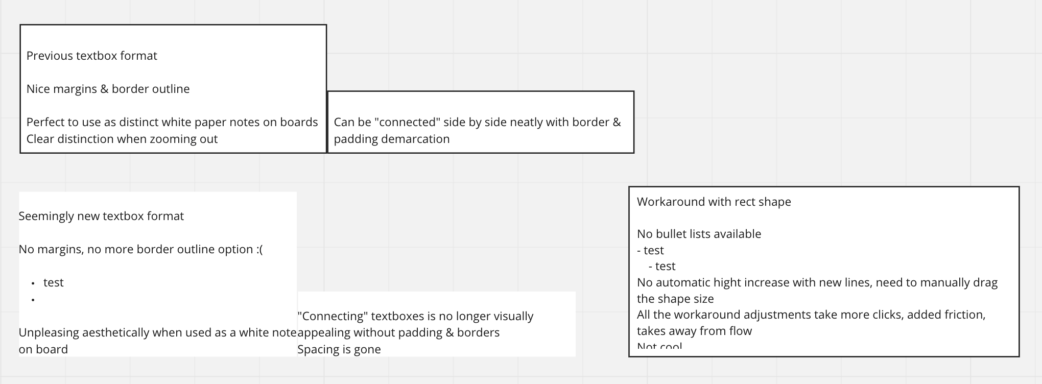
There are many reasons, but in great part because I use textboxes primarily as white papernote equivalent I spread everywhere in my boards. The contrast & aesthetics provided by padding & borders were an essential part of this amazing experience
The new textbox format, while maybe intended to work better without color background with no margins to be better added on top of shapes, completely abandons the openness to the workflow & visual appeal described above
Here’s a visual demonstration for more clarity on the issue
While it is true that old textboxes can be duplicated from previous boards, there’s no more border size editing, and the process in itself adds friction, which is the last thing you want when trying to be in FLOW when working (which Miro has being amazing at for me)
I don’t believe that the old textbox format was problematic to users, but even then, updates that take away previous features instead of adding more options on top (that could even be made default for the UX goal of clarity) is more perturbing than welcome for those of us who love the previous style
I sincerely hope you can forward this feedback to the design team and allow us to have the choice of textbox format instead of it being imposed out of the blue
Yes please, take this feature back!
Moreover, text boxes that already have borders still has the border – but there is no way to change the appearance of it.
PLEASE; return to the ability to have borders on text boxes!
Argh, please bring this back. Feels irritated not being able to edit text box border colour
Bump!
Trying to create a box with text, border, and bullet points. It seems ridiculous that you can only have two of these three in the same object, especially since it seems that this used to be possible. Why remove functionality?
My options appear to be:
- “Text box” with text and bullets, but no border
- “Shape” with text and border, but no bullets
- “Text box” with text and bullets then surrounded by a shape with a border - which is unnecessarily complicated. If I have to do this, then Miro is no longer an agile outlining tool.
:(
I don’t know who thought that removing borders from text boxes was a good idea, but I deeply disagree with that person. The border on textboxes was a very simple feature that allowed us to highlight items on screen. Now we have to draw rectangles and put boxes inside, which in turn causes problems moving around things. The new way is an objectively worse user experience.
EDIT: I want to take back most of my criticism. I didn’t realize you could just write on rectangles as it was a text box, which produces exactly what I want. Sorry for being rude. The only thing I could say is that it was less intuitive to find out that, since there is a “text box” tool thing.
Totally agree with TimBur: I want to have my borders around text boxes back! Or, a bullet / numbered list option in rectangles.
In many workshops that I facilitate, users want to structure their workshop conclusions at the end in text boxes to have a written form. They like to color their text boxes, and then… add a border to give the text some room to breathe.
Just came across this and I'm surprised this has been running for so long without change.
Eithers shapes with bullet list or text with option of a border
Or both
Why not? Surely it cannot be that difficult to bring this functionality back???
I also would like to have more similarity between text boxes and shapes.
At the moment I have a template using this feature which now cannot be changed.
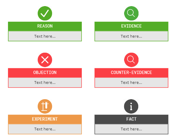
When someone copies a box shape they cannot have it auto-expand as they enter text - this used to be something text boxes could do. So I had used this to allow a box with outline colour and text to mean something interesting (parts of an argument map):
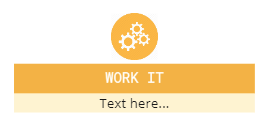
Now I need to update this to something less appealing (to me) and without the padding I used to have:
So I either need a box shape that can auto-expand with text, or a text box that can have a coloured border (or I need to change my template and hundreds of argument maps.
Just to add to the fray, this is an infuriating removal of something that makes my work with the app so much easier… it’s fine with me if you want to differentiate text and shapes but it makes no sense to call borders of text boxes shapes rather than borders.
I mean, who doesn't like bullets?
- I do.
- Me too!
Who doesn’t like borders?
Reply
Enter your E-mail address. We'll send you an e-mail with instructions to reset your password.