Hi, 


I have an issue with the connection lines and arrows. When scaling higher than a certain percentage, the lines grow and arrowheads grow thinner and thinner in width proportionally. And when Ii scale it smaller, the line grows wide proportionally.


A wish would be: when I scale my connection line (with arrowhead) it stays the same width in proportion to it’s length. 

Here I go from 80 % zoomed in to 11 % zoomed out and back again: 


@Sara de Hond - I agree, this disproportionate scaling of various objects (connection lines, shape borders, etc.) all seem to be unexpected.

I would suggest combining the following posts in one Wish List Idea post to request that all aspects of these objects scape proportionately.


Having the same issue. 

There should be a way to have the object scale to the relative same proportion. 

Similar to outlining a shape with a stroke in illustrator, once the shape is outlined it can scale up and down and keep the same proportions.


I agree. Especially the small arrowheads when you have a zoomed out flow is a nuisance, you barely see them while you do see the line.


My Miro board is so full of things, and the connecting lines are not within boxes to scale - but between boxes, I need a different method to scale my lines because when I zoom out to see the bigger picture, the connecting lines between boxes are almost unseeable...Plus, I am using a tablet, not a computer with a mouse, so scaling in and out the way shown in the Youtube video is not easy at all…


I would really love it if it could be fixed, often times miro drops me in at 2% zoom and I start building a page only to find out later when I want to use a line that I am unable to make a nice proportionally thick line, the highest I can get with line thickness is capped and unable to go higher than `strokeWidth: 20` which feels like a superficial limitation that could be fixed by letting me go beyond the limits the UI set for me.


Same here. It actually worked. Buy stopped around 1-2 weeks ago, arrow lines are extremely thin and almost invisible. Need this fixed soon. 


My company is thinking on moving to LucidChart because of this issue


Am suffering the same pain.  Building a large tree diagram and the sizing of the arrowheads is way out of whack - they’re almost half the size of the post-its that make up the nodes of the tree and it throws out the visual hierarchy I’m aiming for.


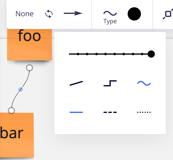
What about this one, community? I’m trying to use orthogonal connectors (it’s selected), but Miro is placing curved connectors between the objects instead. Your thoughts?


Connection Line width are a big issue on our boards.  Zooms gets down to 2-5% and the line is not visible.  It has been an issue for several years. 


Same here . Found out the hard way this also applies to (of course) line jumps which become invisible as you select a thicker line width 


Reply