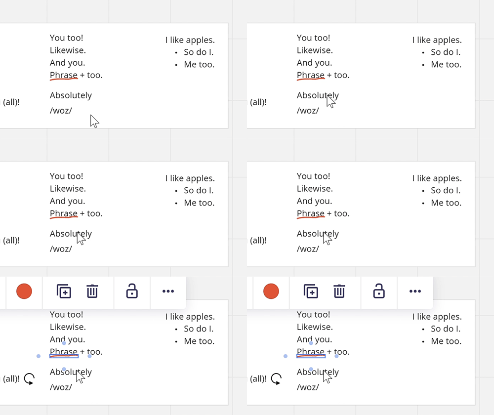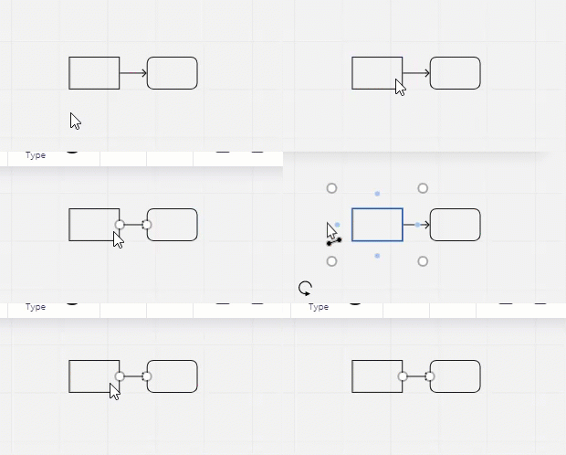
I seem to be the only one struggling with a total loss of precision when it comes to selecting a shape with an arrow nearby. If I am not zoomed in enough, the arrow will systematically be selected rather than the shape, even if the mouse is multiple pixels away from the arrow’s start point. I also had the issue with shapes close to one another where I just couldn’t select the shape in the middle… 

@Marc-Andre L -

I’m not sure what Miro’s approach is for deciding which object to pick when you don’t click exactly on one object’s pixels, but I have experienced this behavior myself when zoomed out too much. Because it is relatively easy to zoom in and out with my trackwheel, it hasn’t been a big deal. It might be interesting to know if the algorithm prioritizes objects based on which is in front or was created more recently.

Kiron


Yeah, that’s what I thought too, but still wrong in the end if you click something and it selects something else. From a user experience perspective, I personally believe a constant irritant, even if there is a simple and fast workaround, is something you want to avoid. Moreover, I think it’s directly linked to the automatic shape connection feature which I also find extremely irritating for all the accidental clicks that result in unwanted connections created. And frankly, I rarely work in diagrams where this is truly useful; it only really works in the early stages of a diagram, but once it gets crowdy, there’s no way an algorithm can figure out what’s going on in my process as I am defining it haha.


Yes! Very frustrating. @Marc-Andre L , I have this problem too.

As @Kiron Bondale says, I can solve the problem with zoom - but that adds two extra steps to my workflow.

Preferred UI process:

  1. Click to select

Current UI process:

  1. Zoom in
  2. Click to select
  3. Zoom out

With complex diagrams, this is a significant frustration. It takes me out of my design flow. Rather than a seamless and fluid UI, one that allows me to focus on my work, I have to consider Miro’s opinions. Is this thing too small for a regular click select? If so, do the extra steps. If not, do the regular steps.

Could this be fixed?


Update: I’ve shifted to Lucidchart. Miro is good for some things, but apparently not for complex/detailed diagrams (flowcharts, state machines, etc.). Lucidchart is currently working well, with none of the UI awkwardness that was frustrating me in Miro.

(Using Miro/Lucidchart via Firefox on Windows 10)


Hey everyone,

Our team has just released some improvements dedicated to increasing the precision of widget selection. I would be grateful if you could try navigating your boards with the diagrams again and let me know if you notice any changes. If you decide to give it a go, please make sure to log out of Miro and sign back in to ensure you're on the latest version of the application.


@Alyona I confirm this was improved !! Not perfect, but I just realized I haven’t been complaining about it for a while 🙂 Since I cannot access my previous account I won’t be able to mark this post as “Answered”, but I consider the new behavior is good enough for me.


@Alyona 

I’ve been using Miro on my old computer for a long time, but less than a month ago I changed to a new one and had to log in to a new device, and this non-precise selection is driving me crazy. I really need a piece of advice and help.

You can see how far my cursor from the line is. And I initially needed to choose the text, not the line.


Reply