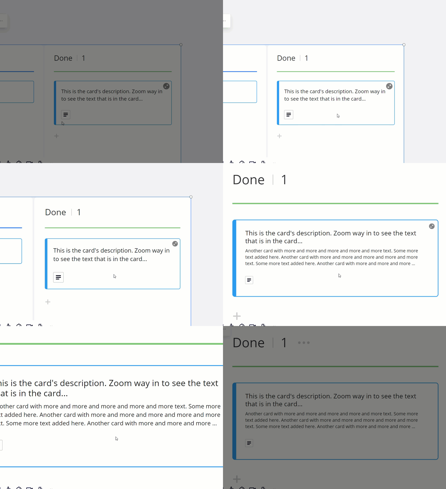
Few days ago I’ve noticed changes in design of Kanban block: frames on the cards become thinner and text font smaller.

In Firefox design isn’t changed.
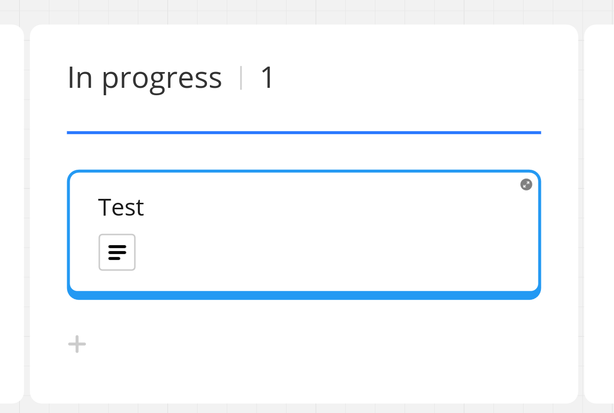
But in Chrome same board with same card and same zoom looks completely different.
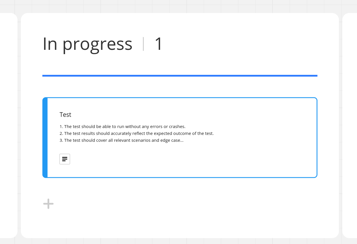
I’ve already tried to clear cache and application data in Chrome but it didn’t help.

What should I do to make design of board in the Chrome browser look as in the Firefox?

@Stepan Kokhanovskiy - This was actually a feature where, when you zoom into the card, some of the cards description text/content would be displayed. The feature disappeared a while ago, but appears to be back. I tested in Chrome, Edge, and Firefox on Windows 11 and the behaviour is consistent for me:


@Robert Johnson I was thinking that’s a problem with my browser and CSS styles because all my colleges have the “oldish” style of the board.

Now on your screen cast I see that you have same style as me.

May be we was chosen to be a testers for the new feature)


Perhaps Miro is bringing this feature back after removing it a few months ago:

https://community.miro.com/ask-the-community-45/resolved-jira-and-regular-cards-don-t-show-description-field-when-i-zoom-14944?postid=56689#post56689


Reply