Hello!
I searched and did not see this question asked before… So here it goes.
Context:
This whole post is regarding ‘User Story Framework Mapping’ Board Template.
Question:
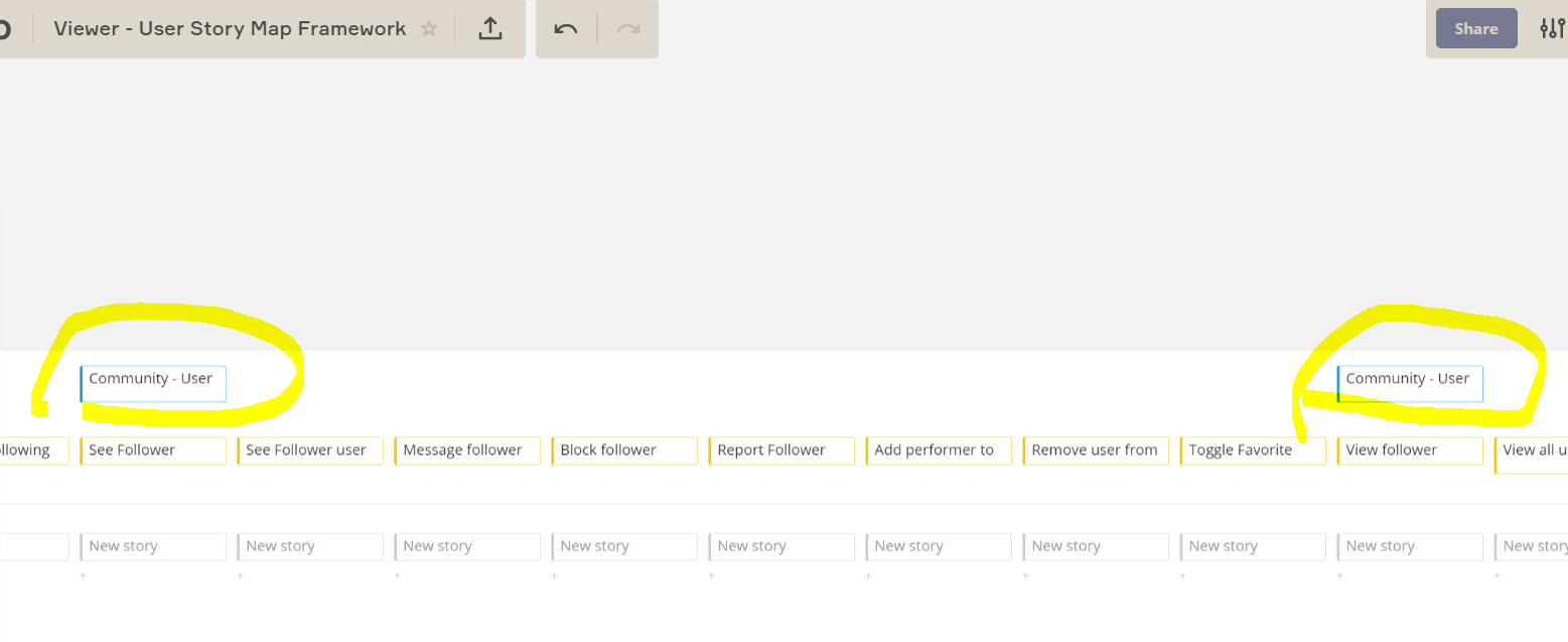
Is there a way to shrink the text size on the ‘Cards’ of the ‘User Story Framework Mapping Template? It is difficult to read when the text expands.
Example:
See Image Attached.
Basically I have many ‘activities’ which are like:
- User Module 1 - Sub Module (A) - Type (A)
- User Module 1 - Sub Module (A) - Type (B)
- User Module 1 - Sub Module (B) - Type (A)
- User Module 1 - Sub Module (B) - Type (B)
For example:
- Community Area - Friendships - View All
- Community Area - Friendships - View single relationship - Detail
- Community Area - Following- View All
- Community Area - Following- View single relationship - Detail
- Community Area - Followers - View All
- Community Area - Followers - View single relationship - Detail
As you can see on the screenshot, the only thing that I can see is ‘Community Area...’ and none of the text. It makes navigating large user Story Framework maps very difficult as I need to ‘zoom in’ and ‘click’ on reach activity to see the full-text-title of the Activity. Currently it is impossible to identify the activity when the text is large.
Link to image: https://ibb.co/d0FzJT9


