I’m actually creating user flows in Miro and import/sync mobile screen designs from Sketch App to the Miro board. Then I link from each of these synced screen designs to Zeplin (for the developers / measurements etc.) – Experienced this as a quite nice workflow!
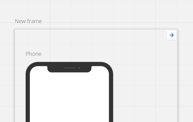
Only annoying point: Depending on the view zoom, the link buttons in the upper right corner are quite large and so cover content. Is there any trick/function to hide the link buttons (like “hide comments”) to have a cleaner and undisturbed view?
Thanks in advance!
Best, Christop
Page 1 / 1
@Christoph Klein -
I’ve played around a bit with this and there doesn't appear to be a way to get the link button to scale based on zoom level or to be hidden. As such, I’d suggest adding it as a wish list post following the guidelines here: Wish List: Everything You Need to Know | Miro
Kiron
Hi @Kiron Bondale thanks a lot for the quick response! Ok, I’ll add it to the wish list as suggested.
I’m actually creating user flows in Miro and import/sync mobile screen designs from Sketch App to the Miro board. Then I link from each of these synced screen designs to Zeplin (for the developers / measurements etc.) – Experienced this as a quite nice workflow!
Only annoying point: Depending on the view zoom, the link buttons in the upper right corner are quite large and so cover content. Is there any trick/function to hide the link buttons (like “hide comments”) to have a cleaner and undisturbed view?
Thanks in advance!
Best, Christop
Hi - Maybe I’m missing something obvious - BUT - why not add the link to an accompanying shape or a containing frame so the link icon is off your item off interest to start with?
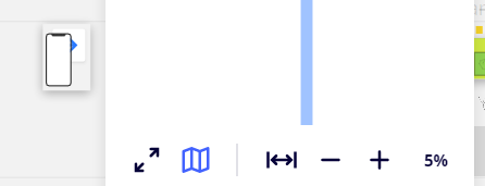
on my screen at 5% the link button is behind the item on the frame
Also - maybe there is a dynamic I don’t see but the link button is never (on my screen) bigger than the boarder width of the wire-frame for a ‘fone - I appreciate your importing from another tool - couldn’t you just ‘un-crop’ to have a white boarder of the size of th elink button?