Any way to continue using the old link/embed design?
Old link style on the left, new link style on the right
Dear Miro-Team and Miro-Community,
since about a week ago, links pasted into Miro create a card with a different style than before. My question is: Is there any way (official or unofficial trick) to keep using the old style of cards for new links? I would not mind creating them manually or copying the existing ones and changing the URL, but so far I have not found any such trick. I have even created a Miro-addon using the Web SDK, to recreate the old style using individual elements in a frame, but faced many problems such as getting the embed data without using cross site requests or tools like embedly.
So my question to the Miro-Team is: Is there any way to revert back to the old design? Are there plans to further improve the new design to make it more usable? Is there any way to create the old style of link/embed using the REST API or Web SDK?
And my question the the Miro-Community is: Does this bother anyone else? Has anyone found workarounds for this problem?
Why I care about the link design so much:
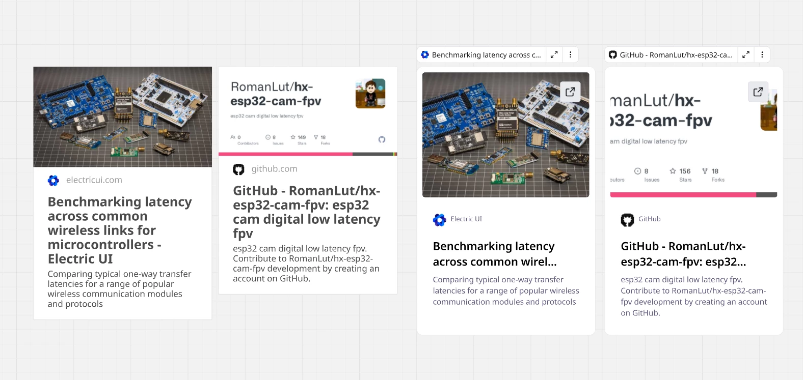
When I started using Miro a few weeks ago, one of the things that I really enjoyed was how you can add links to your board to act like a visual overview of all resources related to a project. A big part of what made that possible were the pretty, but information dense link/embed cards with a nice large image preview and enough space to fit the full title. Since a week, these cards seem to have been replaced with cards of a different style, that makes it nearly impossible to use Miro in this practical way.
My opinions on the new card design, compared to the old one.
Pros of the new cards:
Button for opening links directly
Cons of the new cards:
Title truncated much earlier. Even very short titles get truncated.
Less information even while using a smaller font due to vary large whitespace.
Floating bar above, that interferes with other items and unexpectedly appears only at certain zoom levels.
Very different design from old cards, requiring recreation of all cards if aiming for a consistent board design.
The proportions are odd and the design looks unfinished. (example: why is the favicon almost 2x larger than the domain name text?)
Best regards,
Felix
Page 1 / 1
Hey Felix, thank you for bringing this up, and writing the post about this issue. I was about to write it myself, this is an important topic. I’m fully agree with with you!
Additionally to what you’ve said, there is another (critical for me) function missing in the new design - the connection handles. Now, I can’t connect the embedded link to any other objects on canvas. That’s quite upsetting the new design misses this!
So, the question is if the team can bring at least the connection handles back. Ideally, I’d prefer to have the old design as an option to pick from along with Live Embed View and (new) Bookmark View.
Thank you!
Howdy @Felix24680 I’ve tried a few things but I could not get that old look-and-feel back. Sadly this happens from time to time with Miro - but THANKFULLY (and this is very important) Miro very seldom changes things that have already been in place. In my own case it would have been more horrible if my existing links all changed to the new shape.
Howdy @viz
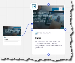
It is true the connection dots don’t appear anymore when you select the link shape first - at least not for me - but if you drag an arrow to it, then they will appear as shown here:
Cheers, Ken
Thank you for chiming in, I am glad I am not the only one bothered by this change. It is good to hear that they did not completely remove the connection functionality, but it is disappointing, that they chose to break their usual user experience by removing the connection dots that appear upon selection of any other element. I am sure this will confuse many other users too, many of which may think the ability to connect links has been completely removed in the new version.
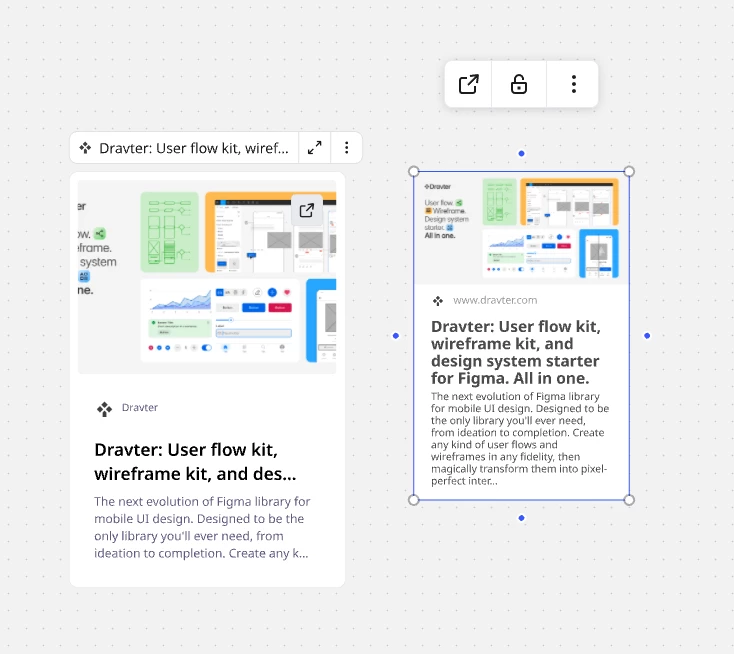
Part of what personally bothers me so much about this change, is that I cannot really see any advantage of the new design. My only theory is that it was chosen to make the interface look more “fun” and “friendly” rather than “efficient” and “information-dense”, which may be an attempt at approximating the style of what I assume is their main competitor. Ironically for me this change was the reason to try out and for now move over to this other platform. While I prefer the more business-like and professional look of Miro, this other platform is at least consistent with their “fun” look. And they even manage this style while being more information dense than Miro’s new design. Below is an example, showing how much less space is wasted on the embed cards on the other platform.
Other platform on the left, Miro on the right
If the new links have exactly the same outer size, that will be a plus for me - because I think today it depends a bit.
But . . . the secret to happiness with Miro is never really to pin yourself too tightly to its exact functionality. From the beginning (many years now) each time I use a hyperlink, I ALSO embed the hyperlink as a text underneath the graphic.
What I do appreciate - VERY MUCH - is that they go a long long way to ensure things are backwards compatible, so what I’ve built up in the past does not break.
At the risk of rambling, many users don’t type as fast as I do - but if you do things repeatedly, you can usually automate them. If I needed harmonized links, what I’d probably do is this: (1) navigate to https://www.opengraph.xyz/. (2) enter the URL; (3) take a quick screenshot of the thumbnail; (4) paste the screenshot into Miro; (5) add the URL below the screenshot as text.
I just tried it and I could do it in just less than 20 seconds. Plus the website gives me a selecting of different options. I think I could shave the time down to around 12 seconds.
Same thing for images: I use 1000’s of images. So I have PPT set up as an image pre-processor. I paste an image into PPT. Carry out predefined processing using buttons I customized, then CTRL-X and into Miro. In this way importing an image with e.g. a transparent background takes <10 seconds.
HAVE FUN!
@viz / @Felix24680 / @Kenneth Ritley
I have asked if this is expected, a bug, on a backlog to include on the new Format object.
Some background
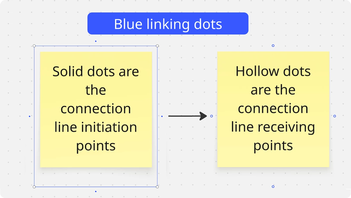
The Structuring board content help center article refers to these dots as the "blue linking dots". And, there are two styles/purposes:
Solid blue with white border indicates a new connection can be initiated.
The inverse (white with blue border) indicates a connection can be received.
For the purpose of this reply, I will try to use the term connection vs. linking as to not confuse the feature with hyperlinking.
As this post highlights, the experience we are used to in Miro is that a selected Format-style object is not displaying the solid- blue connection dots, but does show the white-connection receiving dots. This, of course, is unexpected and and inconsistent experience.
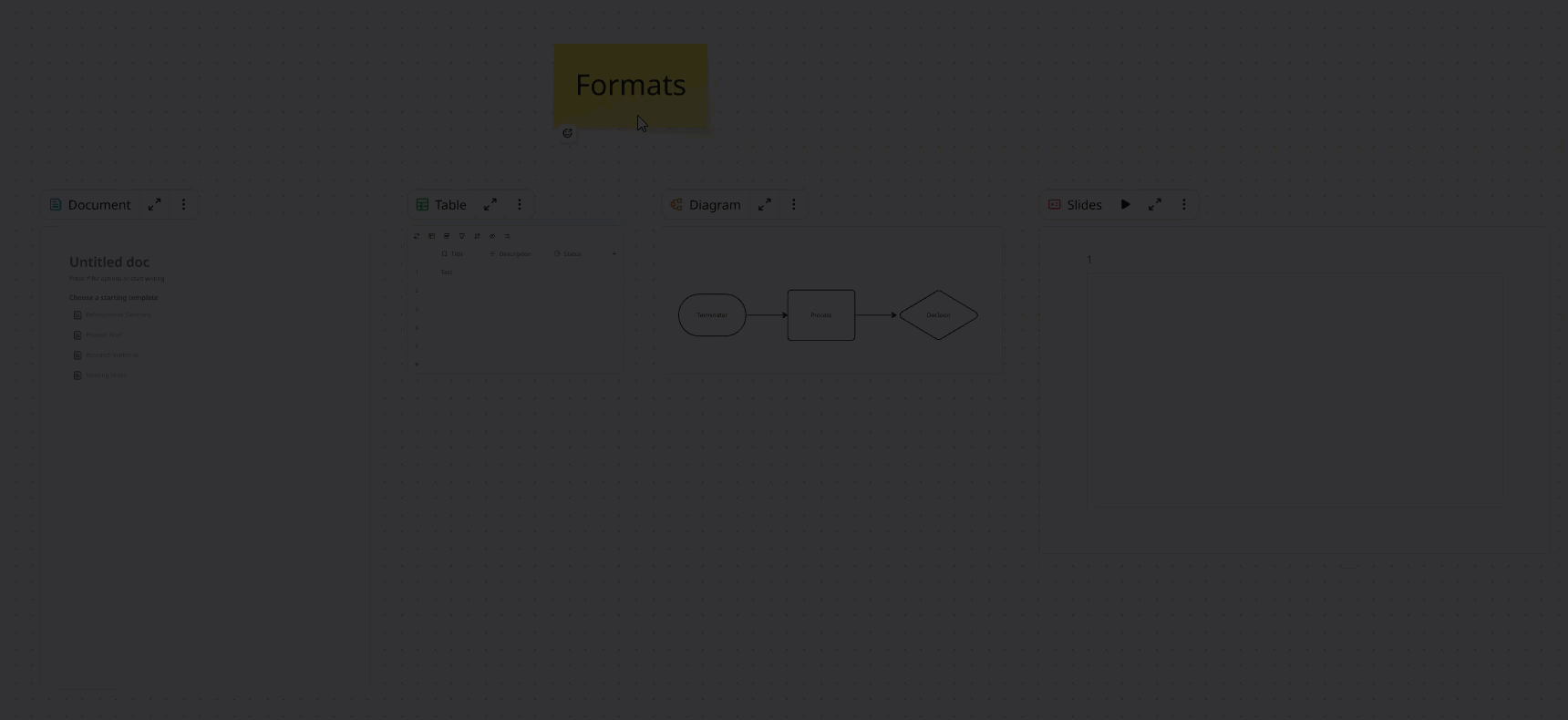
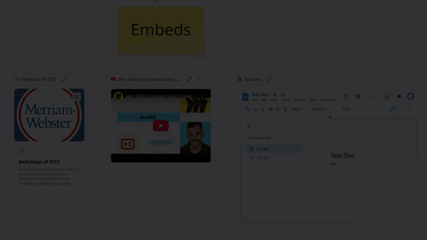
What are Formats?
The Format is a new type of object on the Miro board that can live directly on the canvas or expand into Focus Mode — a full-screen workspace with its own clean UI.
Formats come in several types, like Document, Table, Diagram, Slides, Kanban, Timeline, and even embedded external content (e.g., Google Docs, Sheets, or websites).
In short: Formats are structured spaces within your board, letting you work more deeply without leaving Miro.
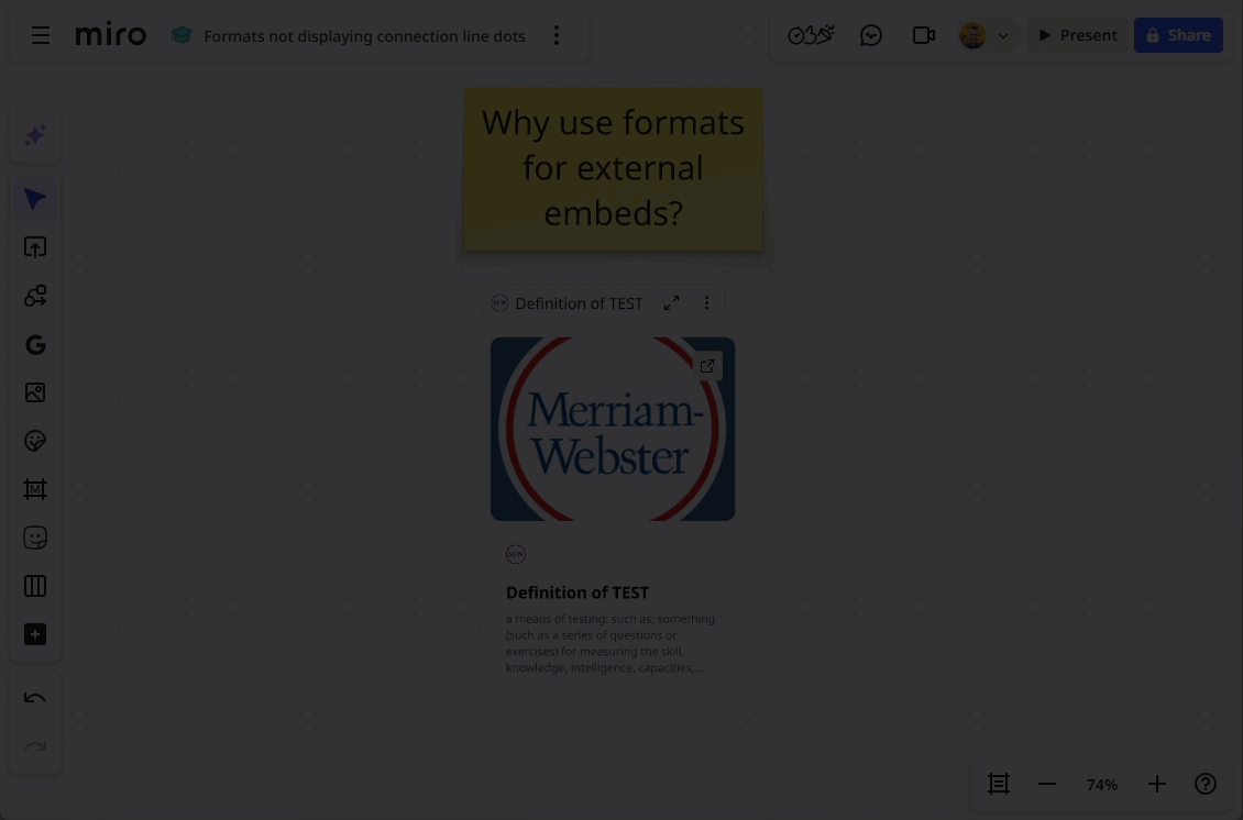
Why use Formats for Embeds?
Probably the biggest reason would be the ability to Focus Mode to view an external site within Miro:
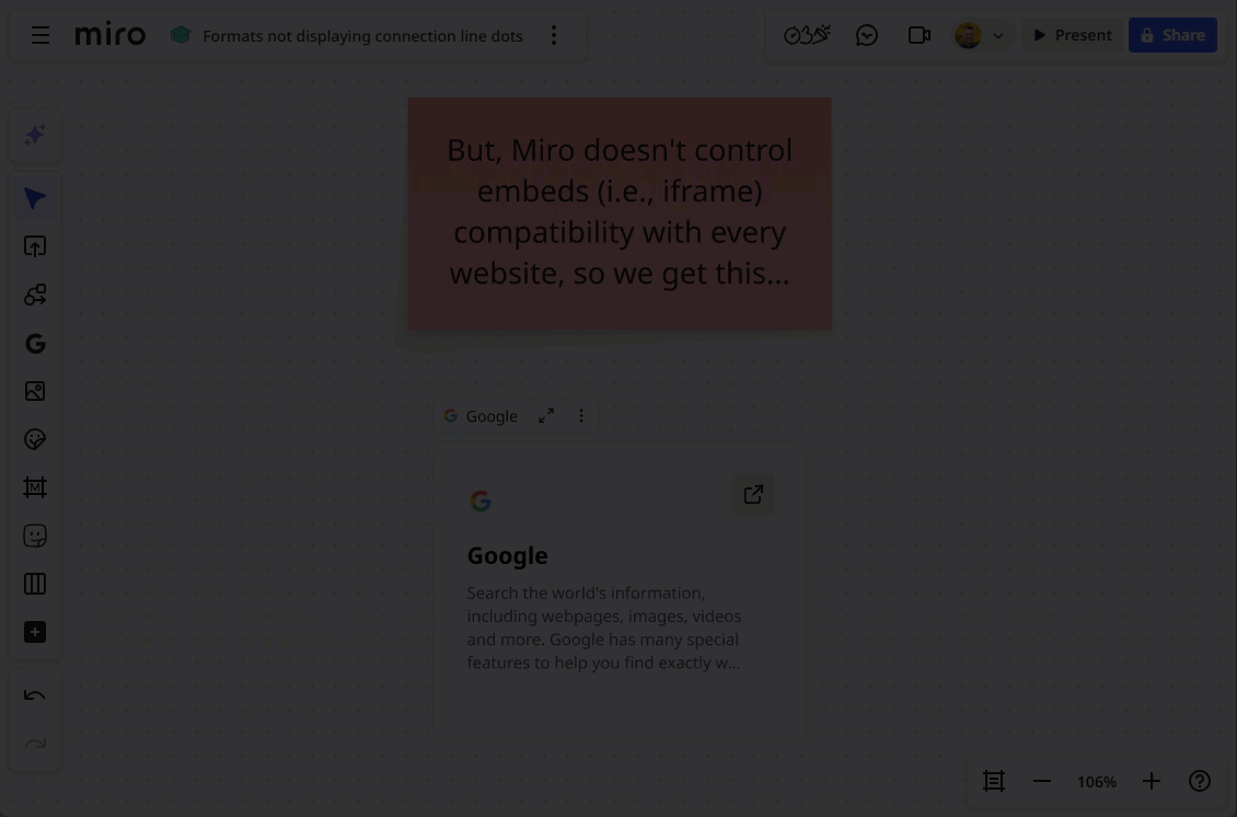
However, unlike 3rd-party embeds, where Miro likely has a business relationship to ensure an expected behaviour, e.g., Google Dos, Miro cannot control the fact that the external resource may not allow embeds via iframes, in which case something like this will happen:
As you can see, this is a poor experience and will surely lead to many support tickets, even though it is the expected behavior by design — from both Miro's and the external resource owners' perspectives.
Back to the dots…
Blue-Connection Receiving Dot Behaviour
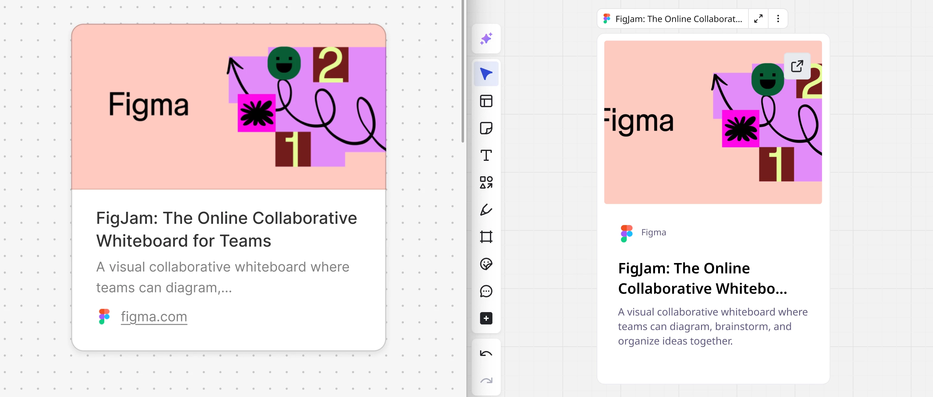
First, a look at the expected behaviour:
Let's recap the current experience on Formats:
Note: Inconsistent behaviour for the Slides format.
And, specifically, the embed Format:
This is unexpected and seems like a feature gap / UX inconsistency compared to other object types. It would be great if the Format supported the same blue-dot linking affordance so users could start connections directly from it, just like they do with other objects.