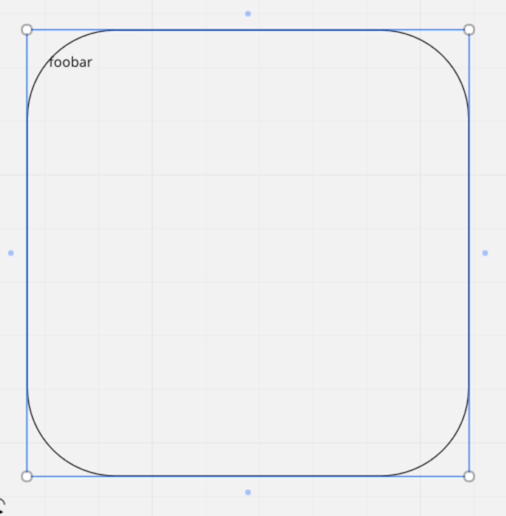
since the radius is fixed, at larger sizes it becomes too pronounced for my taste.
in other tools the radius can be modified (e.g. lucid),
i haven’t been able to spot a way to modify in Miro, am i missing it, or it doesn’t exist?
since the radius is fixed, at larger sizes it becomes too pronounced for my taste.
in other tools the radius can be modified (e.g. lucid),
i haven’t been able to spot a way to modify in Miro, am i missing it, or it doesn’t exist?
Hi
till now there is no option to change the radius size of the shapes.
Post this as a wish into the wishlist-secition here:
https://community.miro.com/ideas/modify-border-radius-on-rounded-corner-rectangle-shape-9513
Michael
Hi
Would changing the thickness of the border do the trick? You can change the opacity of the border as well.
I made a short clip on changing the border thickness, where you will see the option to change the opacity right below.
I see you posted this to the Wishlist, so if changing the thickness/opacity isn’t quite what you’re looking for, hopefully the Miro team will add the desired function soon.
I hope that helps!
Michael Sohn
border thickness/opacity wouldn’t address my thing in this case.
one detail that i should have added is that this manifests for me when i enlarge the round-corner shape to use as outer framing for a larger diagram.
at default size the round-corner shape looks fine, but when enlarged, the corner scales proportionately and it ends up being too pronounced at larger sizes. one side effect of this is that text aligned to a corner (e.g. top/left) actually touches the border.

Check it out HERE.
Jon
Hi
Ah, I see. Check out
Michael Sohn
Some genius stuff from
I gotta keep that in my toolbox.
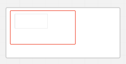
You can use the Wireframes components in the Apps area. Take a Text area and delete the text and the corners are consistent no matter how big you make the field
Limitations:

this works for bigger boxes and at least you can get the outline - hope this helps
Please fix this. Corner radius should not change based on width, user should be able to match radius of larger and smaller boxes, and stroke width should not change based on size of box.
since the radius is fixed, at larger sizes it becomes too pronounced for my taste.
in other tools the radius can be modified (e.g. lucid),
i haven’t been able to spot a way to modify in miro, am i missing it, or it doesn’t exist?
This is a great idea but you can cheat similarly to create the border - I used a solid block in the background that is the color I want the border to be, duplicated with a slightly smaller block in front that is white and adjusted to make the border thicker/thineer. It might not work for all colors/situations but it was a great cheat for what I needed. Thank you!
+1
This is a fantastic workaround, but why should we have to resort to workarounds? Please fix this!
Please fix this. Corner radius should not change based on width, user should be able to match radius of larger and smaller boxes, and stroke width should not change based on size of box.
This has frustrated me too again and again.
I’d recommend allowing, per rectangle, control via a toggle to either behave as is (size affects radius) or keep radius on resize. Control over the radius would indeed be nice (designers will be designers and will forever appreciate) but either a decent default or a choice from 3 (few) presets - like small/medium/big radius…
Actually this would be super sweet (though just allowing users to control the radius might be simpler : )

PS. This topic does not seem answered as it seems to be labeled.
Please can we add this feature? It’s one of the main reasons I use google slides to make mind maps/code diagrams. The ability to change border radius can change meaning of shapes and to my eyes improve aesthetics.
… Post this as a wish into the wishlist-secition here:
/OLD LINK REMOVED]
That link no longer works. It was maybe too embarrassing to have all those votes and no news in years.
Here is the correct link → https://community.miro.com/ideas/modify-border-radius-on-rounded-corner-rectangle-shape-9513
Just use a process shape from a flowchart. It’s still a fixed radius but much much smaller and aesthetically pleasing
Proposed 3 years ago and still not fixed? I’m really starting to lose faith in Miro. I really want to love it, but the things they’re choosing to focus on, like an AI assistant just so their marketing team can say they’re part of the AI wave, instead of things that are actually usable, is increasing in frustration. I guess it’s time to start exploring alternatives.
Here’s a post where I highlight some of the other shapes that have corners that scale better:
3 years later and rounded rectangles still have absurdly large corner radius. I work on product teams so I understand this feature is probably not a priority on their roadmap.
However, I also know there’s a ton of white boarding apps out there and you’re not going to find me saying I love Miro or promote it when basic things like these are not fixed or considered :(
You can use the fluxograma shapes.
Enter your E-mail address. We'll send you an e-mail with instructions to reset your password.