Hello community 👋
We’re always looking for ways to improve Miro so it’s as intuitive and user-friendly as possible. From improving search within Miro to offering a personalized creation toolbar, we aim to empower you to work efficiently from the moment you open your board. So here’s a few updates on how we’re doing just that.
Command palette improvements ⚡️
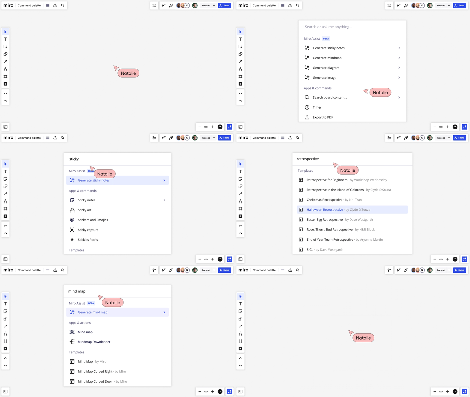
Now you can quickly find tools, apps, templates, settings, and other features and functionality from your Miro board — just click Ctrl + K or Cmd + K. This includes search results for recently viewed content, templates, and third-party apps like Notion, Youtube, and Amplitude.

Personalized shortcuts in the creation toolbar 📌
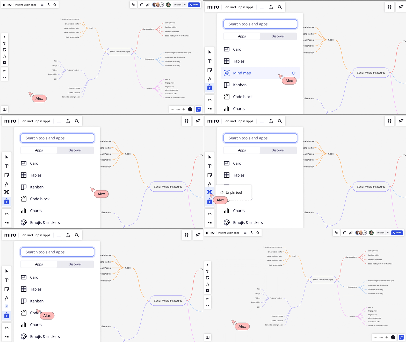
Pin and unpin apps and actions to customize your creation toolbar (left). Get into the zone by organizing your creation toolbar your way, emphasizing the apps and actions you need most, and reducing the clutter of everything else.

Refreshed main menu (hamburger) navigation ⚙️
We’ve simplified and grouped similar settings in one place to make it easier for you to find them. You’ll now find more options under Board (including Board history), Preferences, View, and Help.
Enhanced start view 🗺️
If the start view has not been set for a board, we’ll automatically adjust your view to fit all content so there’s always something to see.
We hope these Miro updates help you work more efficiently and creatively. As always, we welcome your feedback on these changes and any suggestions you may have for future improvements.


