Hello fellow Visual Miro board fanatics! 👋
I thought you might be interested in some mid-week inspiration for what’s possible inside of our favourite platform 😁.
I include a brief summary with some pics below, but if you’d like more details, or more imagery, head over to my case study on the step by step process.
Cudos to Amanda Fellov and Sid van Wijk from Miro for having the vision and motivation to get this project up and running. I couldn’t have asked for a more creatively satisfying project or better sparring partners. Mega thanks to you both ❤️
Project Objectives
- Create a 'digital twin' for Miro’s Executive Briefing Center team (based in Amsterdam) so that remote workshop participants would have an equally valuable and engaging experience
- Show that presentations don’t have to be linear by transforming the existing workshop materials into an immersive (and delightful!) journey
- Ability to reuse and customise the visual content, enabling flexibility for the future and alternative purposes
-
Should be easy and smooth to use, working with best practices to enable optimal platform performance
-
Quality and unique design that showcases something never seen before and demonstrates the full power of Miro
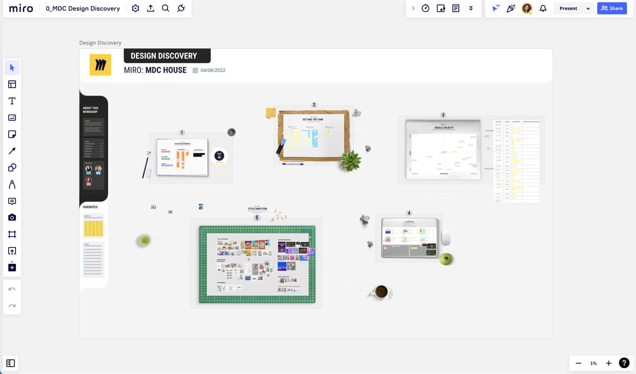
Design process (all team collaboration done inside Miro):
- Design Discovery: We start by delving into the business and end user requirements to fully understand and explore what we need to achieve.
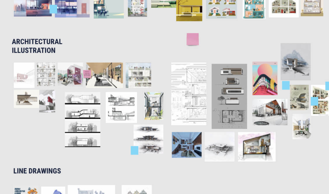
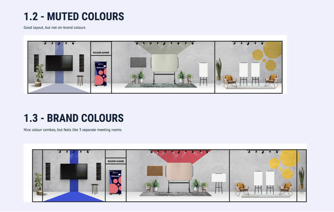
- Concepts: I tried out different layout options, content ideas, and styles to see what worked best for the project.
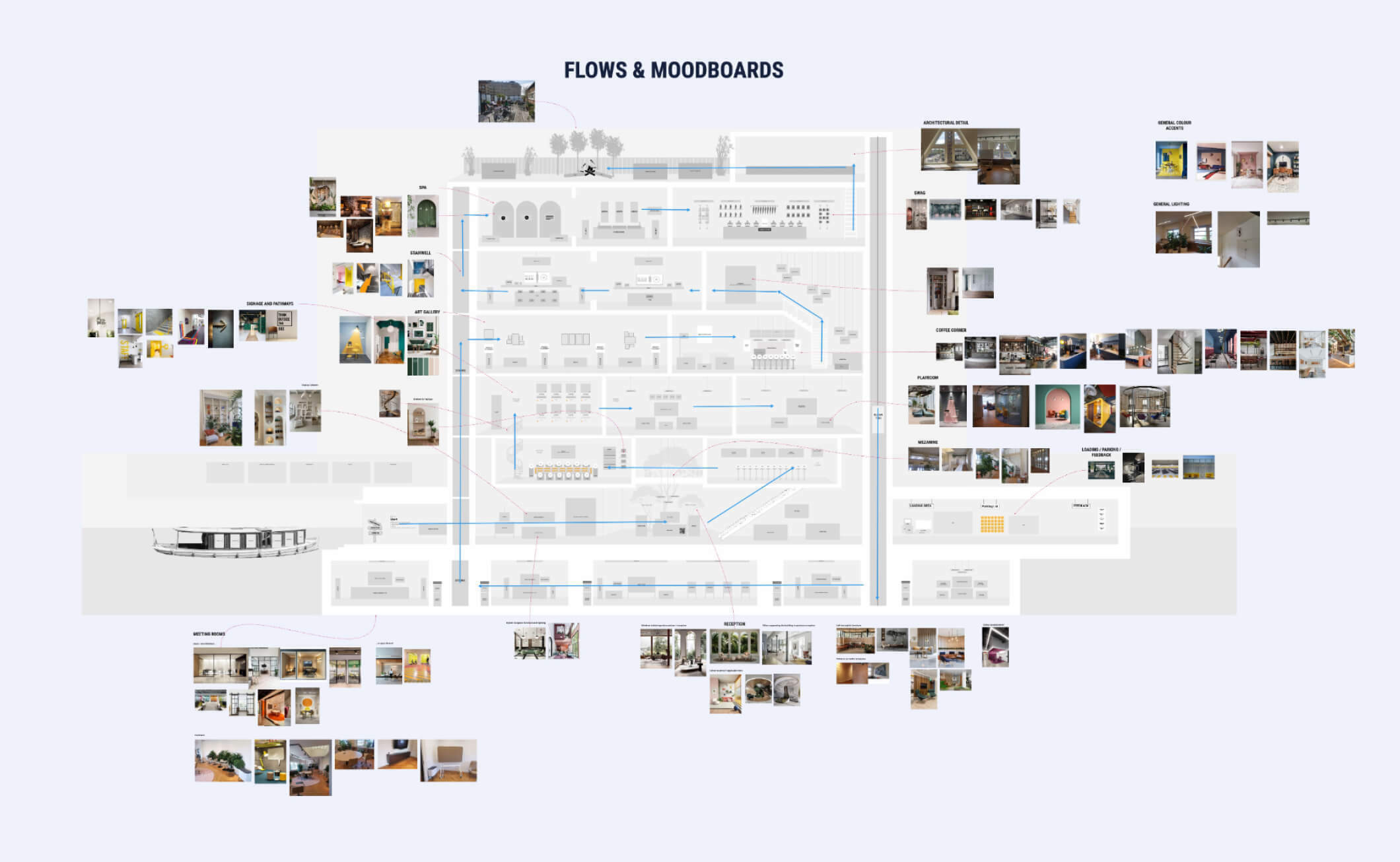
- Wireframes: I tested and validate various layouts and flows, making sure we were able to commit to the right format for our needs.
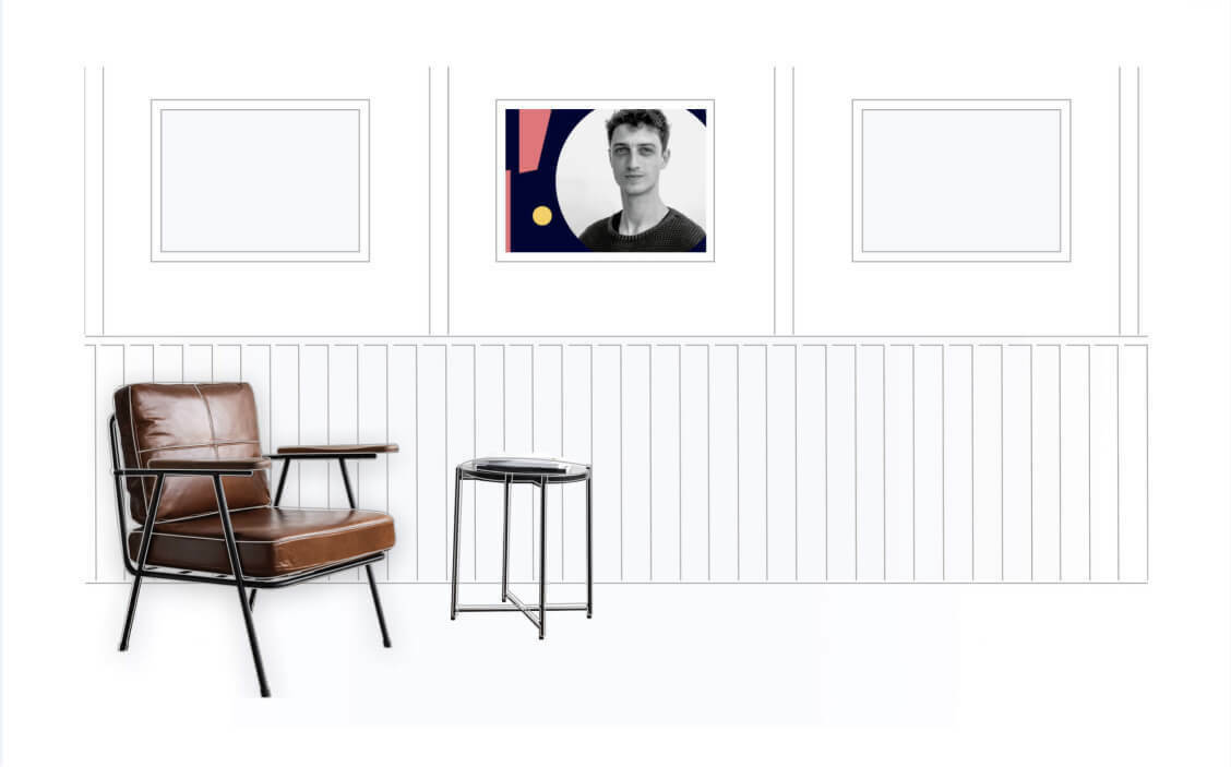
- Design: Once we had the wireframes and concepts approved, I combined them to create a cohesive and visually appealing design that brought everything together.
- Build: Executing the design with precision, whilst paying close attention to best practices to ensure a smooth and high-performance end result.
Final Result Highlights
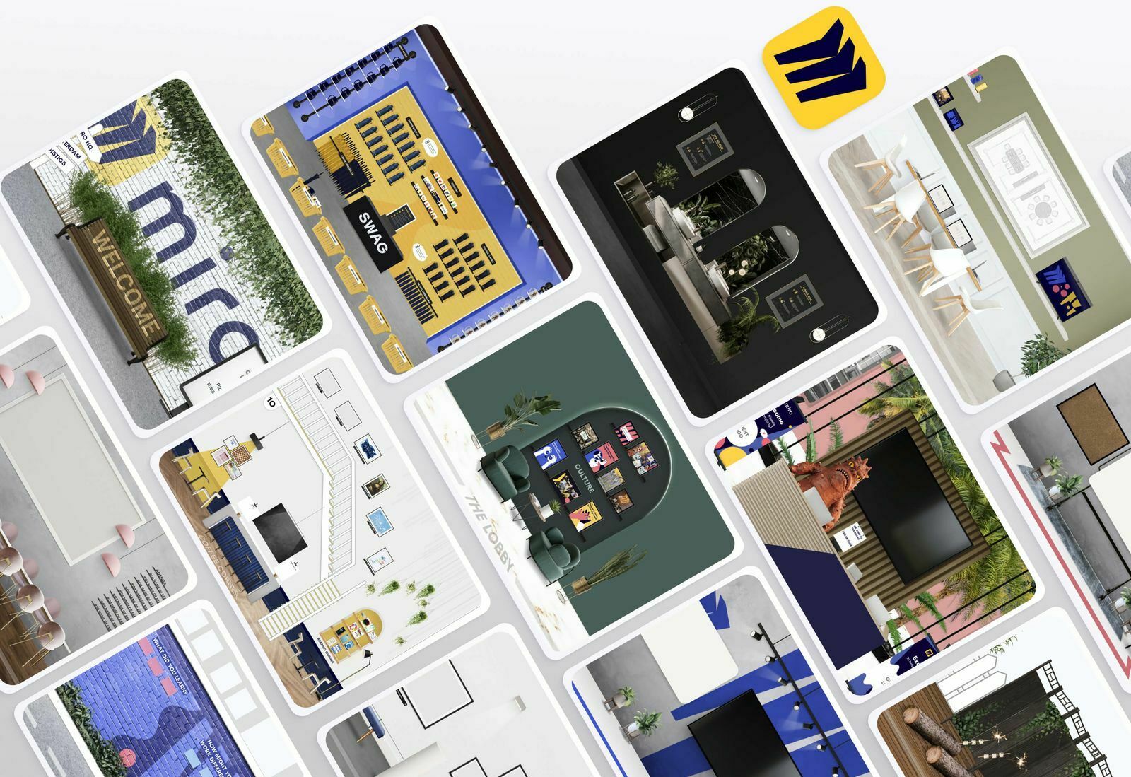
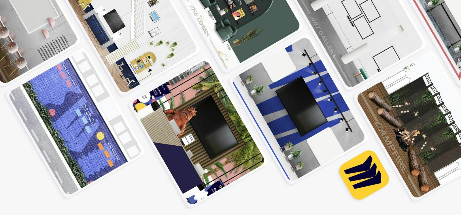
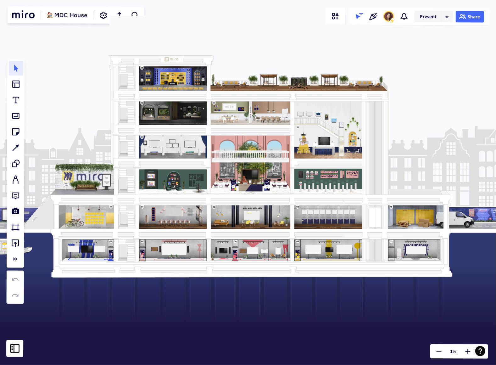
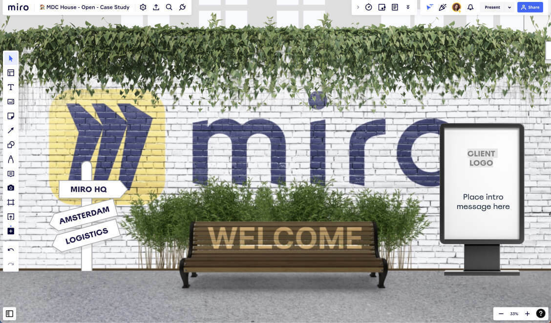
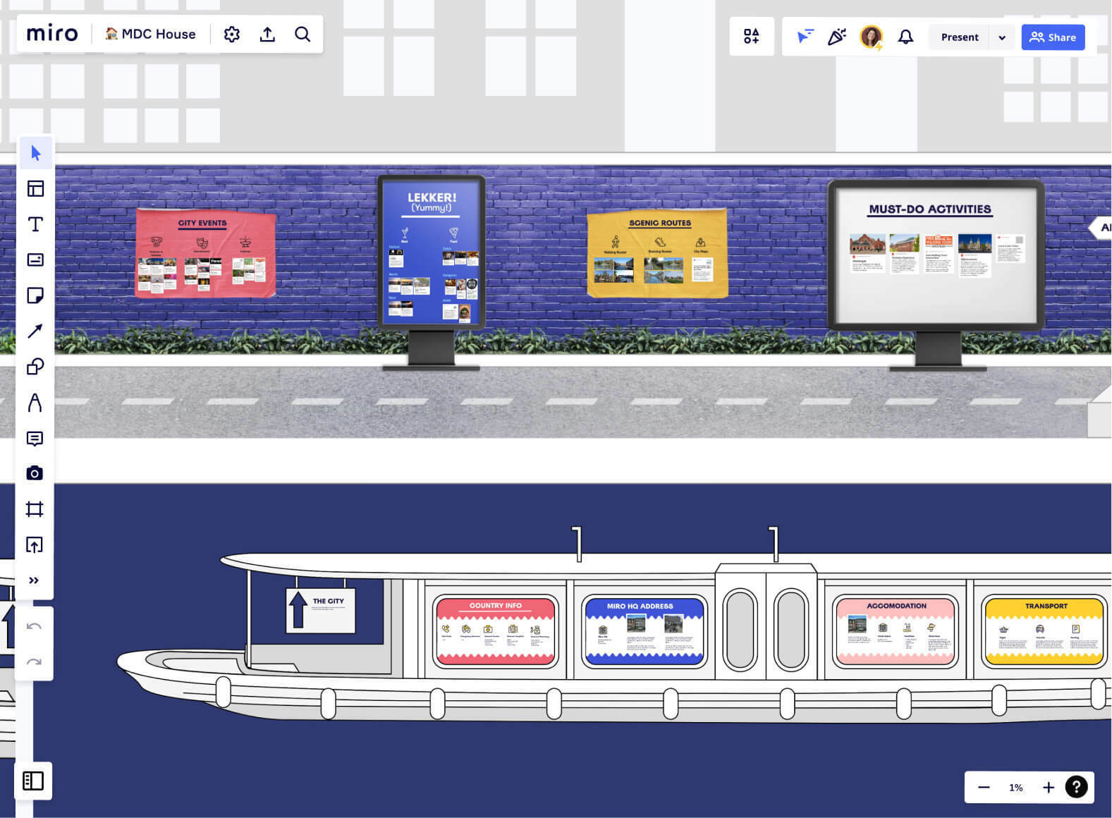
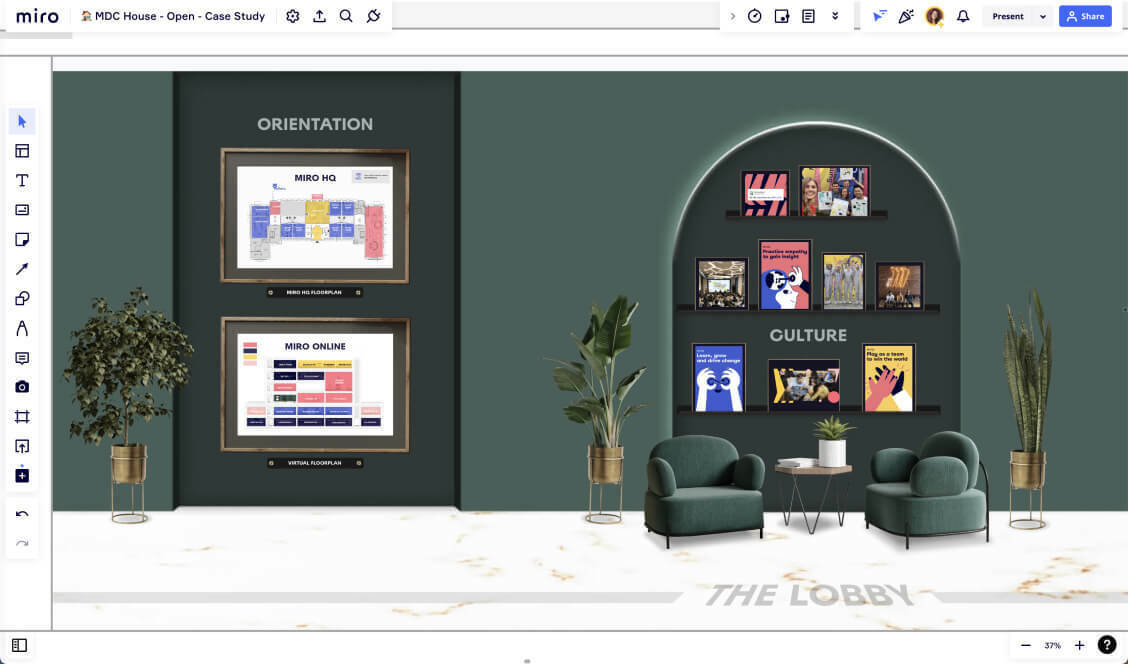
- A relatable yet immediately impressive virtual office
- Meeting rooms either hold or link to workshop content
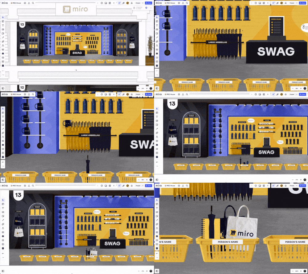
- A joyous swag store experience where you can put the items you want into your own basket
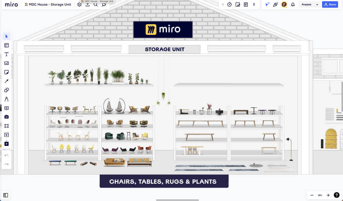
- A Storage Unit where we keep an organised catalogue of the moveable furniture
- Hide and reveal content depending on which stage of the workshop you are at
- The Miro team (board included) won the ABPM Momentum Award for their "impressive" briefing programme 🙌
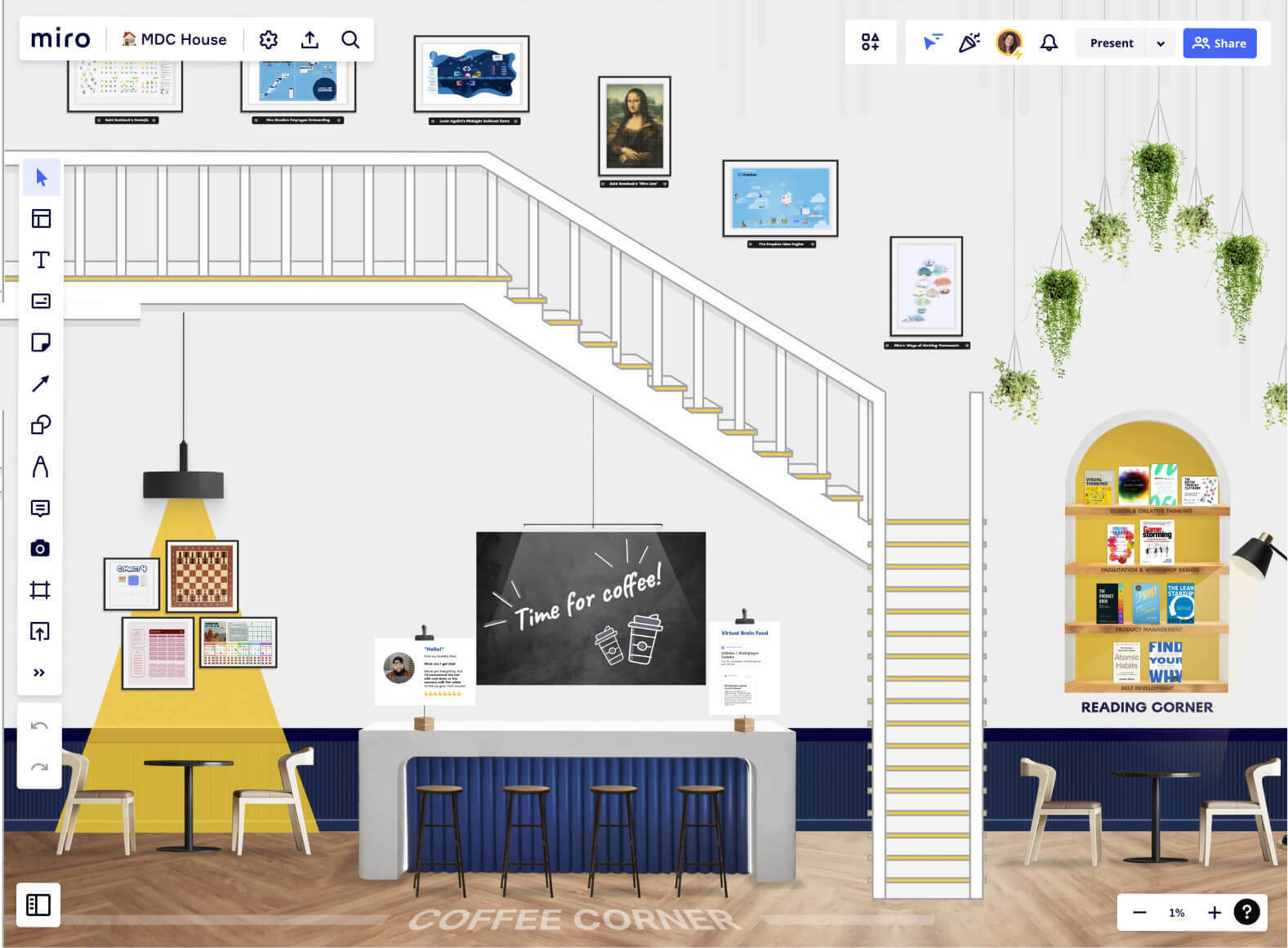
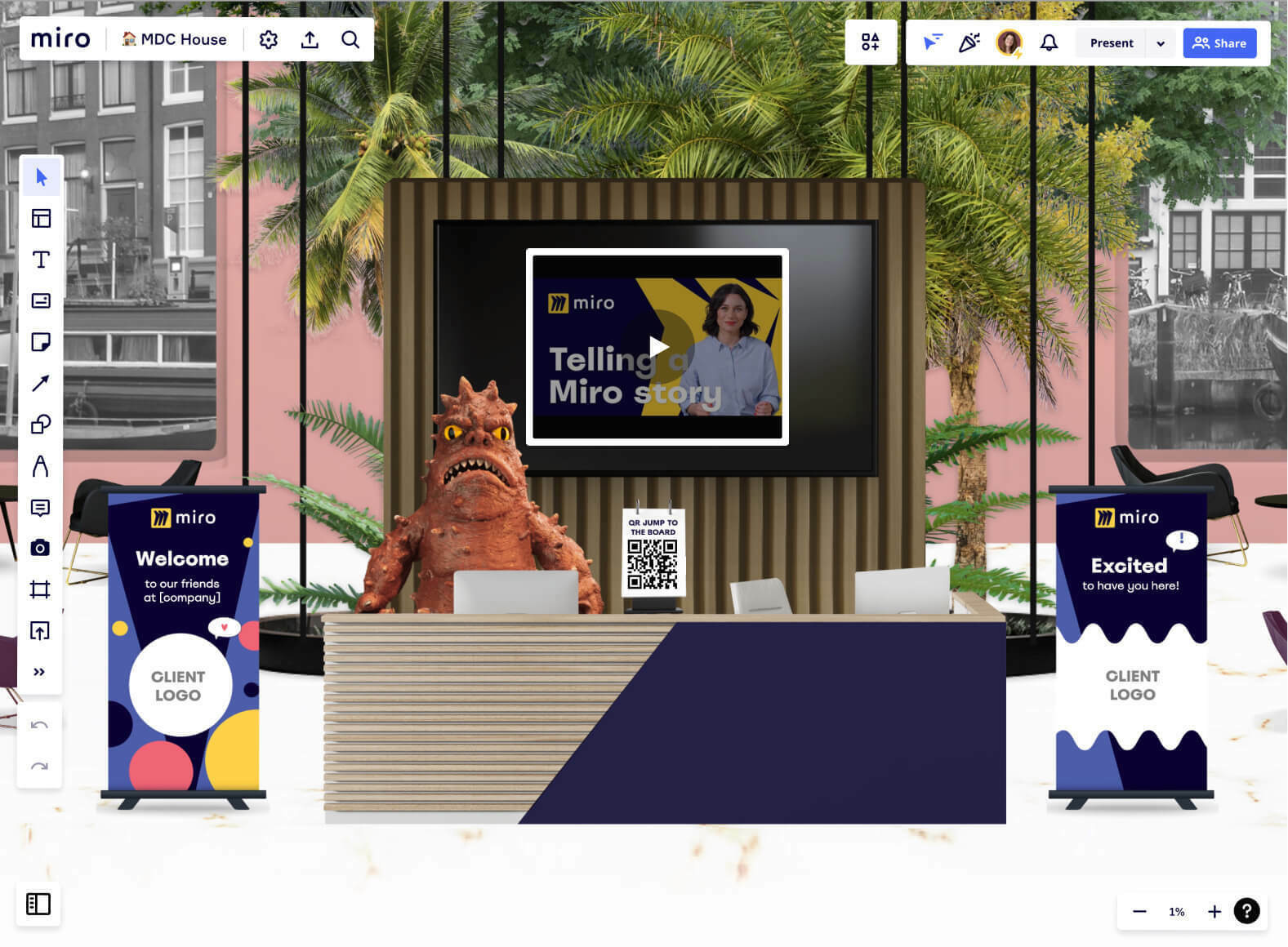
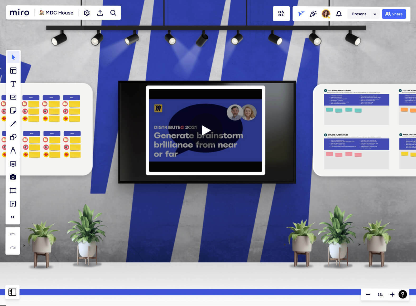
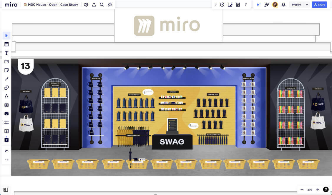
Alternative uses for ‘virtual offices' in Miro
- You could impress customers and prospects through tours and workshops in a purpose built environment
- Onboard your new joiners with a novel experience that reflects your company and values
- Host an awesome online event in a unique venue, using a different room per presentation/ activity
- Present your wealth of documentation in a memorable and structured layout
-
Provide a playful collaborative space where your employees can co-create, have fun, and make it their own
-
Build a unique company floormap to communicate teams, purposes and facilities
Want to design your own office?
Don’t second guess it. This is a lot of fun and truly valuable. In the words of Sidney van Wijk from Miro - they use the house “every day”.
Get in touch if you’d like to bring me in to build your own Miro board design, this is the kind of shizzle that makes my heart thump 💗💗💗
What else would you use a ‘virtual office’ for?
Let me know! And also, what would you add or change from what you’ve seen? I’m super keen to hear how I could improve upon future versions 👂🎶❤️
Thanks for reading folks. I really appreciate your time and attention, and I hope it was inspiring 🌟
------
Read the full case study
------
