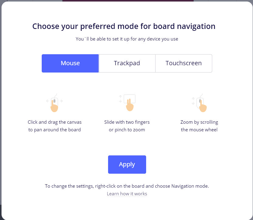
This icon needs to have more emphasis. Maybe something that lets a 1st time Miro user that they have choices.

I use a mouse but Miro always auto selects Touchscreen for me. I do not operate my laptop by touchscreen. Relying on a 1st time viewer to know what that icon is for is a leap of faith. Maybe this should pop up to give viewers the option.


