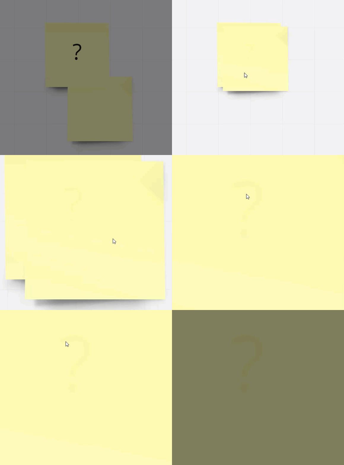
Does anyone find the UX of the Stickies snapping location annoying?

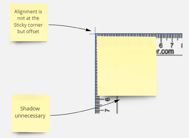
I prefer that they snap directly to the physical corner of the Sticky and not offset.

Also, the Sticky shadow does nothing for me… if this takes up Board Memory I prefer performance (speed of loading) than seeing this.
 

@Brandon Lee - I’m with you on the alignment of sticky notes. I think I noticed an ever greater change to this about five months ago:

https://community.miro.com/ask-the-community-45/anyone-else-noticing-some-sticky-notes-are-slanted-crooked-2790

I don’t mind the drop shadow so much, but I do with they were not translucent as this makes it more challenging when you want to use sticky notes to hide what’s under them (of course, the same thing happens with shapes):


Reply