
Hey there!
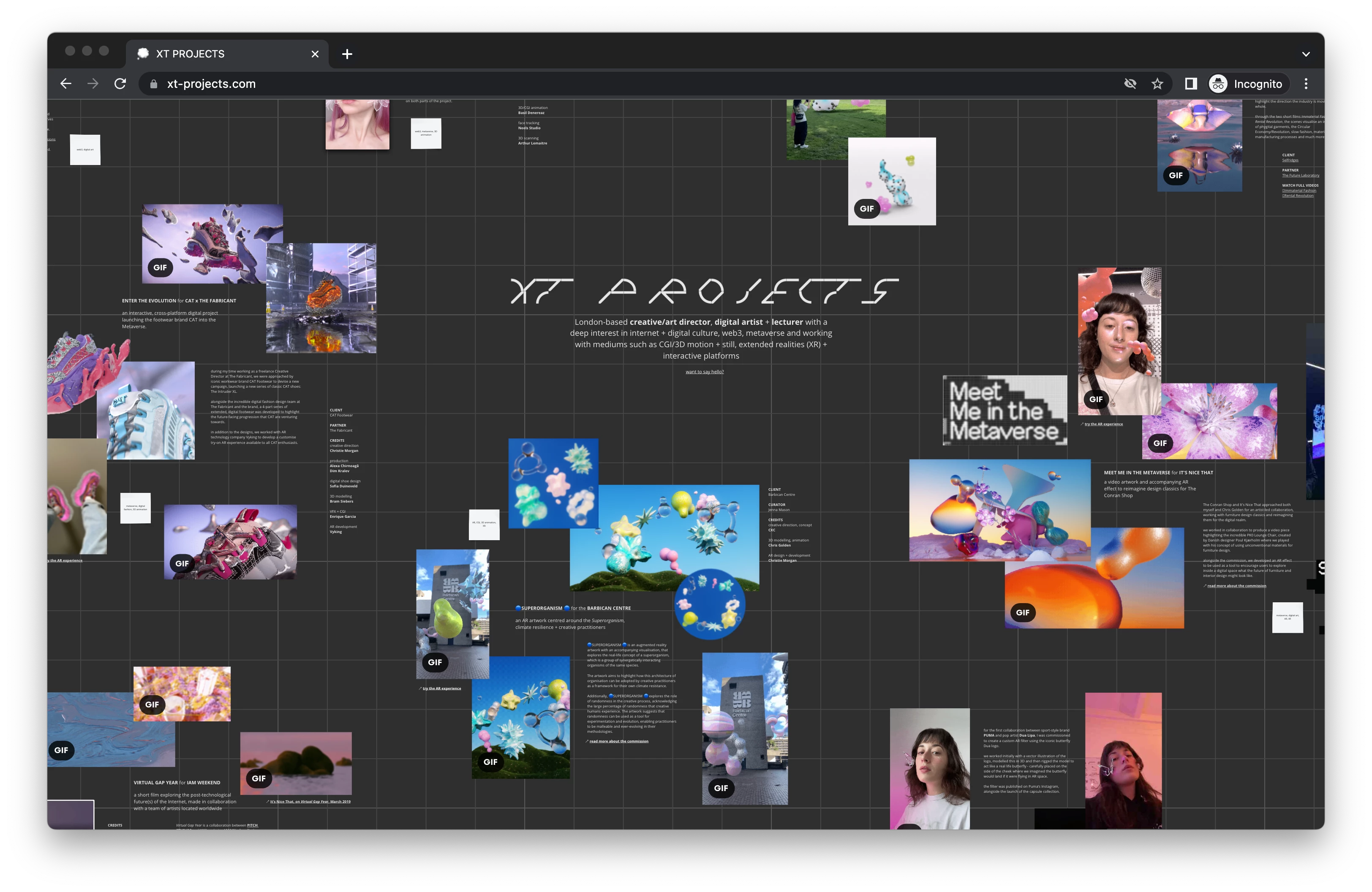
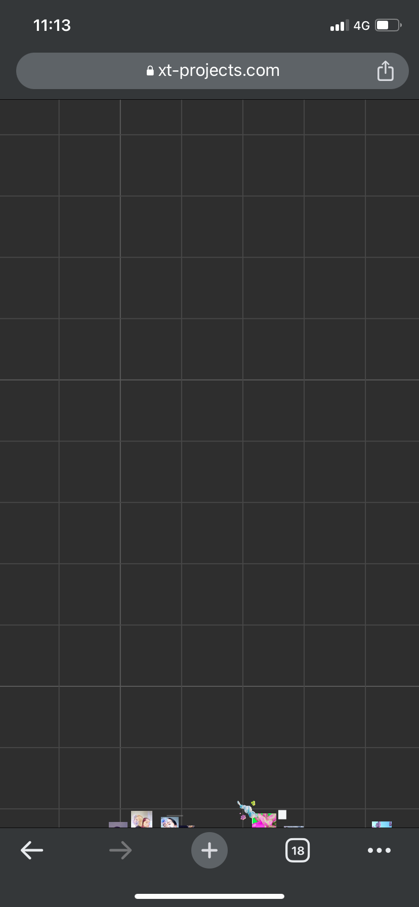
I’ve worked out a way to have my board / portfolio act as a website, where I have basically embedded the board with no UI fit the entire frame of my website (http://xt-projects.com) and it looks great!
However I’m having issues with the start view, mostly on mobile/tablet as it doesn’t seem to follow the same rules that it does on desktop. It starts in a completely different spot even though the iframe is responsive (I think?).
Attaching some screenshots below.
Desktop start view (looks almost perfect, although coordinates are still a bit off):
Mobile start view (no idea why it puts the view way up the above where all the content sits):
I also tried adding the moveToWidet parameter to my iframe but it didn’t really seem to work either as it was zoomed in and not in the right position on either desktop or mobile.
Would love some insight if anyone can help? Here’s what my current code looks like:
<iframe src="https://miro.com/app/live-embed/uXjVOkn1OQc=/?embedMode=view_only_without_ui&autoplay=true&moveToViewport=-1804,1139,11405,6517&embedId=880557525393&embedAutoplay=true" frameborder="0" style="overflow:hidden;overflow-x:hidden;overflow-y:hidden;height:100%;width:100%;position:absolute;top:0px;left:0px;right:0px;bottom:0px" height="100%" width="100%"></iframe>
I’m wondering is there a way to manually adjust the start view on mobile only and then have different coordinates for desktop?
Thank you!
Christie

