Is the distribute horizontally/vertically options mixed up?

  • 19 March 2022
  • 3 replies
  • 1000 views

Userlevel 7
Badge +7

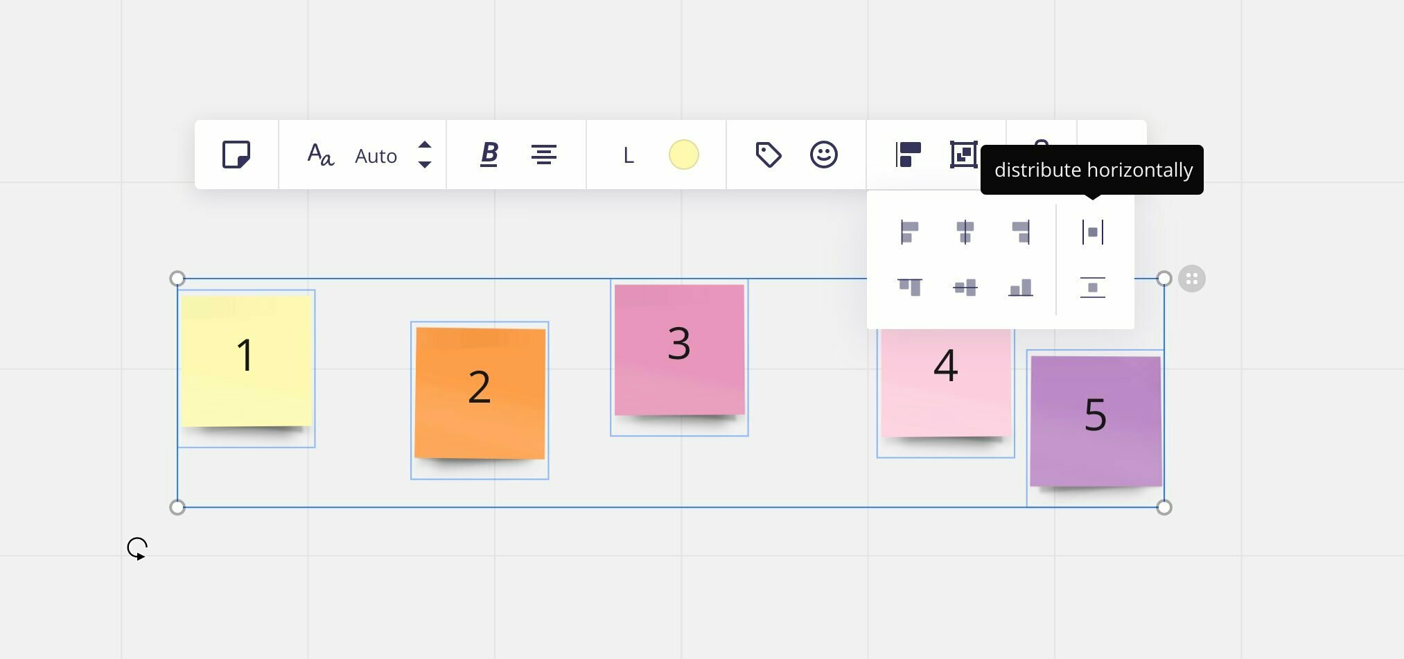
Is it just me, or does the distribute horizontally and distribute vertically option “icons” when selecting multiple objects look mixed up to you?

I’ve always had to think twice and wait for the tooltip to be really sure that I’m picking the right one.

To me, this indicates a vertical distribution:

| ■ |

… while this indicates a horizontal distribution: 

–––
 ■
–––

Because if we would follow through the visualization, the vertical distribution would look like this:

| ■ |
| ■ |
| ■ |

… and the horizontal distribution would look like this:

–––––––––
  ■   ■   ■ 
–––––––––

But in Miro, it’s the other way around. Am I looking at it the wrong way, somehow? :thinking:

What are your thoughts here?


3 replies

Userlevel 7
Badge +6

@Henrik Ståhl -

Agreed, they could make it clearer by just using a double arrow to show the orientation of the distribution.

Kiron

Userlevel 1

If instead you imagine the extended visualisation to look like this, focussing on the two guidelines, it might makes more sense:
- horizontal distribution between the two guidelines: | ■ ■ ■ |
- vertical distribution between the two guidelines:


The two icons’ alignment with the other horizontal and vertical alignment features should also give you a hint.
And if all that fails, the |■| looks a bit like an “H” which could serve as a mnemonic.

(and no, I am not the designer of this feature; in my role at Miro I support the designers processes, teams, and culture)

Userlevel 7
Badge +7

@Peter Boersma Thanks a lot, that definitely makes more sense! 🙌 Will probably take a while getting used to, but at least now I understand the thought-process behind it. 😊

Reply