Dear Miro Community,
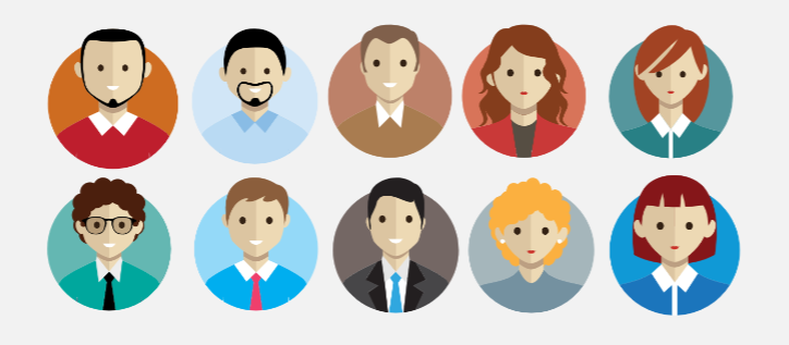
I use Miro for some time and truly enjoy it. Today was working on workflows and wanted to use certain type of icons to represent different groups of users. Imagine my surprise when I compared male and female icons (attached). First ones show smiling men, while second - dissatisfied women. I am not a person who fights for equality in every single aspect of life, but this simply looks weird ![]()
Do not need support, but I am curious of your thoughts. Also, if any miro graphic designer reads this - could we please add some happy female icons and / or at least a few more neutral male? ![]()
Best, Justyna


