We found there is some update from Miro yesterday that the comments boxes group with numbers when the page zoom out, image as below:-
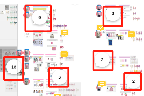
 

Please advise how we can remove this function as this is not user friendly and the colored comments boxes could only be shown after we zoom in every single area which is very hard to notice the colored comments box.

Thanks

@PressLink - There used to be an option to disable the new Comments 2.0 (which includes the grouping of comments), however, the new Comments appear to be full rolled out with no way to go back to the old comments.

I would suggest sharing any feedback both in this post, and through here (I would copy the link to your post, and share it in the feedback box, rather than typing out your feedback again, and so the product team can see your screenshots):


The grouped numbers hidden the color of the comments box which is not a useful function. And please advise what’s the meaning to group the message?  The content of the message is more important than how many comments boxes shown there.

Please kindly review again  and see how to fix it to be a more user-friendly function.

Similar Feedback also provided as per your indication.

Thanks!


Reply