Max Harperis the visual strategist at Refractive, a visual thinking tool consultancy that builds Miro apps and integrations full-time for Miro Marketplace and enterprise clients.
About Max’s Distributed ‘22 Session:
From data-syncing integrations to collaborative, creative, and analytical tools; come explore the vast potential of Miro apps with Refractive, a visual thinking tool consultancy that builds Miro apps and integrations full-time for Miro Marketplace and enterprise clients.(Session description will be edited t to reflect highlights post session)
Ask Max About...
Developing Miro apps with Refractive
How organizations are using Miro to change the world
Spending 1,000 days using Miro
His favorite Miro tips and tricks
Missed Max at Distributed ‘22? Watch his session recording here.
Make sure to check out more from Max and his work at Refractive here.
Question, comment, and like below
Page 1 / 1
We can’t wait to see what questions you have for Max! Ask your question below for a chance to win! We will be gifting 1 person who asks a question in this thread exclusive Miro swag from our Miro Swag Shop
Hi there Max!
I’m really fascinated by the potential of “visual thinking tools” and systems. As an architect, designer, researcher (and technologist now I guess), I work on a lot of cross-collaborative projects that require me to express, document, and process ideas to audiences that aren’t familiar with Miro. Do you have any tips or apps that are user friendly for different demographics?
Outside of design, toolsets and platforms vary so much for tax/finance, event planners, ML and Data scientists, maintenance/custodial workers, etc etc.
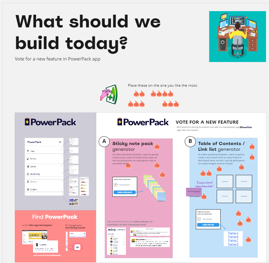
As food for thought: Here’s a snack bite from my session on Day 1 of Distributed.
And, in our Distributed session yesterday, the audience voted on a quick PowerPacktool to code during the session and add to the app immediately thereafter.
@Robert Johnson had a feature idea of 'Sticky Note Pack Generator' and
@Jonathan White was rooting for "Table of Contents / Link List Generator".
‘Table of Contents / Link List Generator’ won!
(Robert, we'll build and add the Sticky Pack generator soon also ).
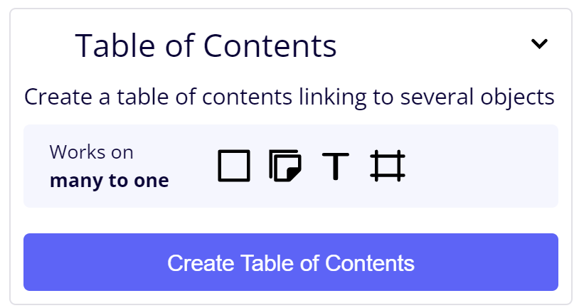
Here's a demo of Table of Contents / Link List generator working - its in the PowerPack app now:
@Max Harper - Hey, I’m fine with being second place as this ToC is still a huge time saver!
@Max Harper and @Robert Johnson these are both amazing options, but I am not sad I won honestly! This will save so much time and I cannot wait to try it out!!!
Hey my name is Jackie!
Hi Max! My question is coming from a place from someone who works in the production industry and constantly collaborating, building and sharing ideas with clients and other creatives. May you share any tips that would allow for a more easy and organized way of sharing batches of ideas in regards to rounds and versioning of the course of time throughout the duration of a project?
Hi @Max Harper would love some best practices on how to use the Color Palette and Gradient tools in your power pack! I was able to create palettes but has some trouble applying the colors :)
Also when is the Pro version of power pack going to be available? Sign me up!
@Jacklyn Reid This question is awesome, I’m going to take my best attempt at some answers, If I miss the mark, let me know and we can try another … version.
One thing I have come to recognize in “Project Boards” in Miro is the (western anyway) inclination to start at the top and work down and from left to right (in either order). Adding some structure to this inclination… I’ve come up with a few habits/patterns:
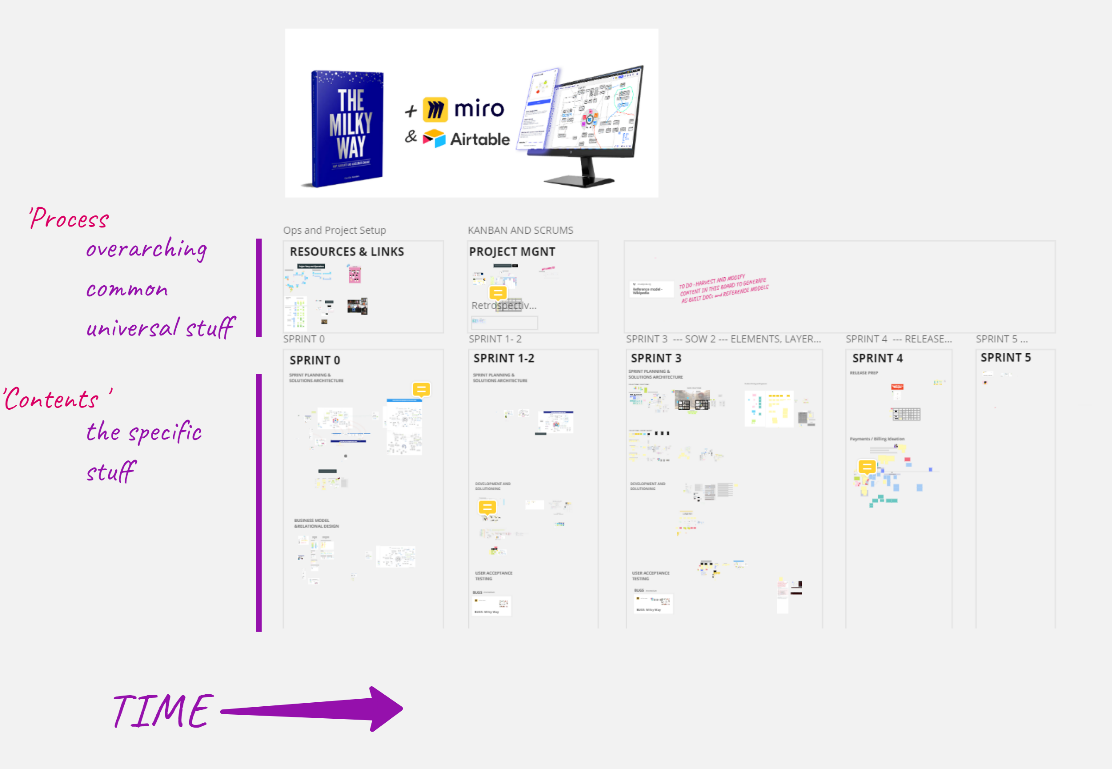
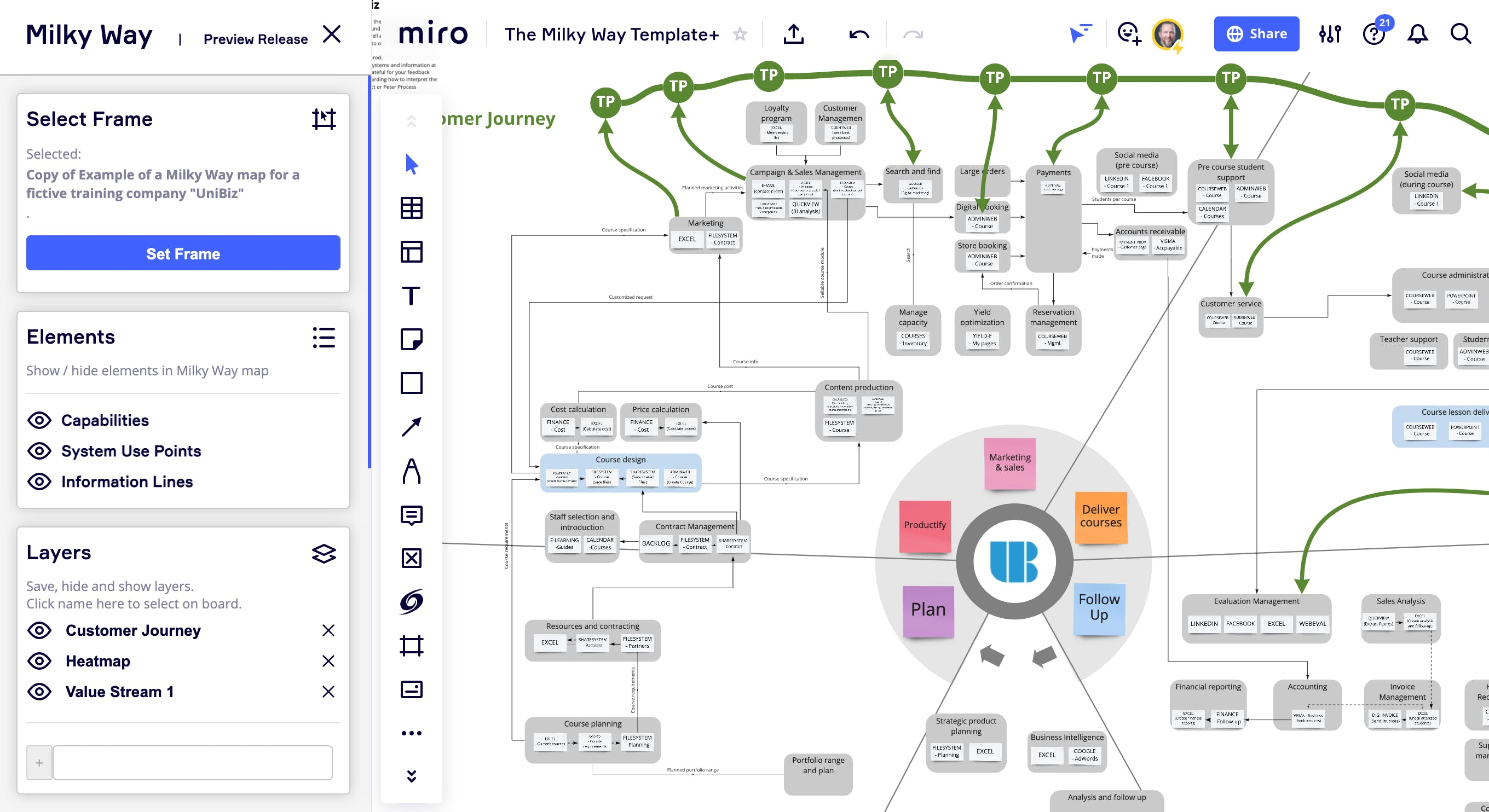
Here’s a board where we’re working with @Thomas Larsson at Milky Way of Milky Way International on a co-development of Miro App. The app helps connect org-design/operations maps to a data representation of these diagrams systems. The project has spanned nearly 2 years of dev and testing and iteration. I’ve annotated in purple/red.
One thing I’ve found useful in organizing and communicating ‘versions’ over the life span of a project is to organize as follows:
Overarching general information is at and across the top. Process, Team, Resources, Planning, etc.
The lower half is where content goes. We build in sprints, so each sprint becomes a column space of time / activity.
New sprints are concieved of in the white space to the right.
Past sprints are on the left most side of the section.
The current sprint has the Kanban board above it (also… we do kanban ‘backward’ so as to match the flow of time) “Back log is what I call Frontlog, and its ideas in front of us”.
New ideas are generated in the white space to the right and those that make it into the sprint enter the kanban…
When we finish a sprint - we move the kanban and the future ideas forward to then next open sprint column.
This leaves a good history of ideas and solutions that can be easily scanned as you move backward in time (from right to left)
The bottom portion also has process structure. You’ll see “Solution Architecture” and UAT(User acceptance testing) as two sub sections… this is where we design the app and where we test once its built… This keeps the theoretical and the real separated …
This is one of a number of things I might answer with… Curious what others think. :)
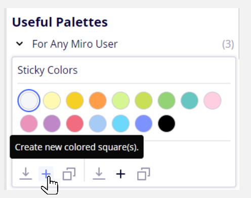
@Rachel Here’s a quick video I did for PowerPack > Colors > Palettes.
The button icons I know can be improved to better express what they do.
The usage section of the palettes is organized as:
left side is 3 options for the 1 color that is selected above in the palette.
create a new square with the color selected
fill the selected shape on the board with the color selected
duplicate the selected shape on the board and fill it with the color selected
right side is same 3 options but for all the colors in the palette.
create new squares with all the colors in the palette
fill the selected shapes on the board with all the colors in the palette
duplicate the selected shape on the board and create enough of them to fill with all the colors in the palette
We did add tooltips (in Colors, soon other tools too): Hover over buttons in palettes and there should be a tooltip. Please let me know if those tips can be improved.
Hope this helps. I would LOVE to see your palettes. Post back :)
Hi! Do you think miro is the answer that will finally get us over the bridge of working from home full time? Are offices necessary when we have Miro?
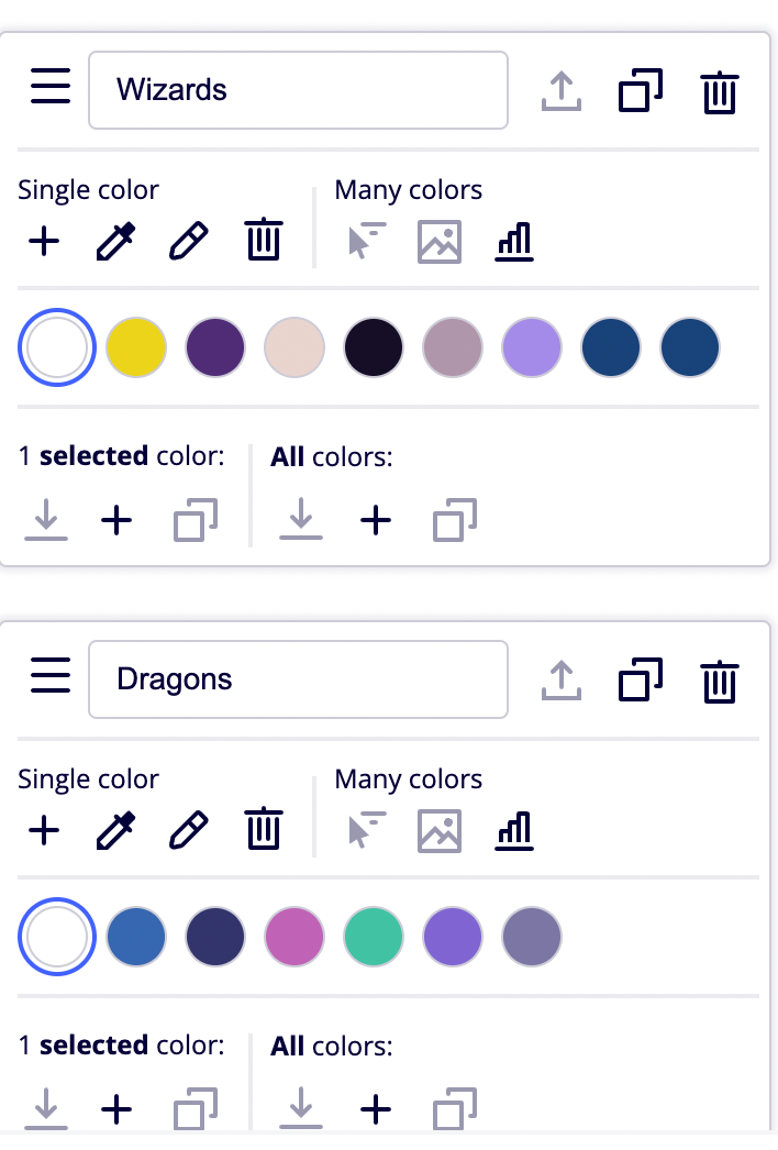
@Max Harper here are the color palettes I created for our Miro Distributed Session! One for Wizards and one for Dragons!
@Rachel love it!
@Joseph Z
I’d love to see more vacant office space turned into affordable housing.
I’d love to see “office culture” be far more intentionally designed than what we’ve done to date. Hybrid or otherwise, culture, mentorship, socializing, collaboration. It shouldn’t be an after thought or assumed to just happen simply because we occupy the same physical space.
I think the other Distributed speakers addressed this question more eloquently …
I think of Miro as “space” — as office space. As, dare I say, a metaverse, where millions meetup daily to do amazing things.
I dont think our human souls will ever be fully satisfied by cyber-only relationships. PDFs and e-books haven’t killed real books … and there’s very, literally tangible, reasons for that.
Hey Max!
I enjoyed all your team presentations!
It is not much of a question... as you had already replied to me on M139 - Creating Miro Apps & Integrations: Expanding Miro's Power awesome session.
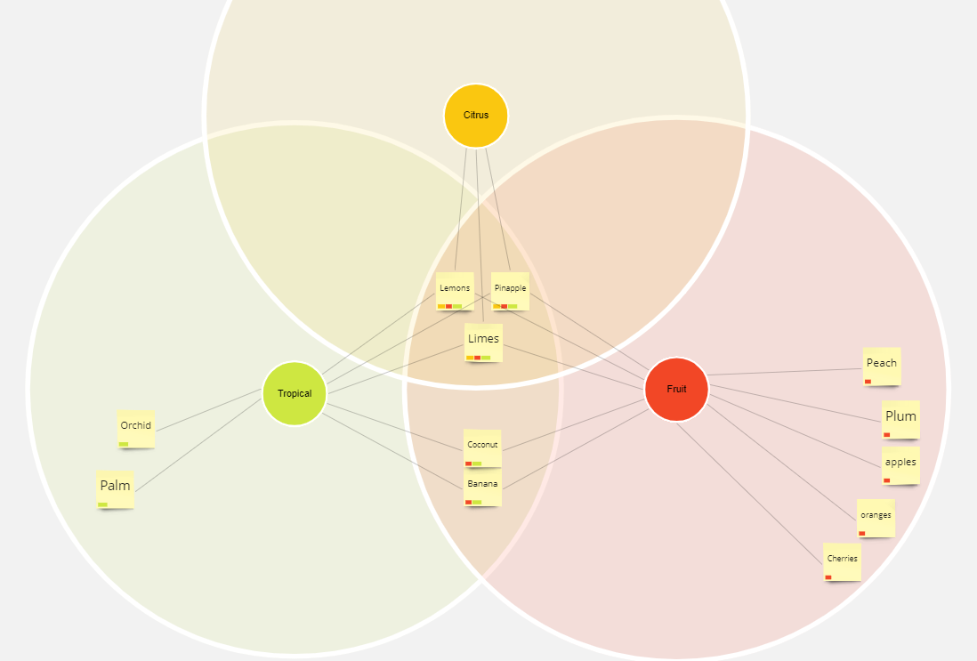
One of the things I would like you to consider is developing a boolean operators / Venn diagram viz analysis tool in your toolset.
I developed qualitative research and oriented researchers within grounded theory-based categorization/semantic building for about a decade, assisted by data analysis software, beyond the Miro context. I think "auto-tagging", and boolean (+ semantic, and proximity operator) tools could bring the whiteboarding experience to a new analytical level.
Powered by such "auto-magic", a variety of custom "emerging to meaning" applications could be tailored ad-hoc: mood analysis, attitude x behavior, etc.
I will connect with you on LinkedIn.
@marie beyssac Thank you for your comment and for sharing your imagination on thinking tools! Would love to learn more about all these visions.
How would you see a venn diagram tool working? Curious about the very specific use-case / workflow... Data → Diagram ? or Diagram → Data? Or bidirectional sync?
Clusterizer already kind of works as a quasi tagged item→venn-diagrammer…in a light-weight, imperfect sense. It helps to draw the circles in…
Cheers, Max
Hi there Max!
I’m really fascinated by the potential of “visual thinking tools” and systems. As an architect, designer, researcher (and technologist now I guess), I work on a lot of cross-collaborative projects that require me to express, document, and process ideas to audiences that aren’t familiar with Miro. Do you have any tips or apps that are user friendly for different demographics?
Outside of design, toolsets and platforms vary so much for tax/finance, event planners, ML and Data scientists, maintenance/custodial workers, etc etc.
@McNisky I realize I missed your question right at the top.. My apologies. And a great question at that!
My answer has ballooned into a long read.
I grew up in a small town in western Colorado with the blessing of a close group of friends: the sons and daughters of orchardists, ranchers, coal miners, counter-coulter hippies, Mexican immigrants, and a few ‘big-city’ intellectuals in remote exile. We had only one school and one sports team, all went to eachothers’ birthday parties. Dinner at each house might bring prayer to a god, or a quaker sharing moment, or hippie circle thanking mother nature. I’ve realized later in life how much it taught me to value code switching into nuanced vocabularies and the joy of creating connection across differing communities.
When I think of designing thinking tools, operational visuals, or visual presentation items for different demographics I study the audience: their culture, their mythology, their literal vocabulary and their visual vocabulary.
For those audiences that you mentioned a few initial thoughts.
Data scientists: Those posting on Medium have started to coalesce somewhat around this pastel-toned rounded corner visual style. This likely coinciding with a) a younger tech savvy and design savvy set gravitating to this technology, and b) the technology leaving the academic realm and being adopted in professional markets. Academia at its upper echelons … in my experience, struggle with visuals -- its rare to get past busy grad students publishing hurried visuals, or quick lesson plans, and get to full on re-thinking of visual systems. I share some thoughts on this below. Once visualization of technical concepts meet market pressures, they often get improved in the crucible of design feedback.
Old:
from the Minsky era
New:
Maintenance and Custodial: I’m increasingly seeing this world communicating in video ... from tool reviews, assembly and maintenance instructions, to other tactical tutorials and demonstrations. I think we’re seeing an improvement from the exploder diagram. More and more tools and instruction manuals are digital and inclusive of video. Old:
New:
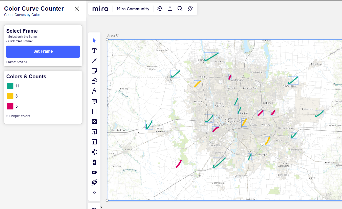
I recently had a rural electric coop ask for a simple Miro tool so that they could count pen marks of different colors: this apparently was helping them do issue management or some such… Was a surprising use of Miro for me… and it was awesome to be able to help. Its pretty rewarding to be in a position to be invited into the imagination space of so many different Miro users - so many clever ideas.
Miro is a pretty accessible tool for rudimentary geo-spatial and architectural communication. I could see a facilities manager a, say, a community college or some such, leaning on Miro to help communicate and manage ideas, plans and operations of that facility. I’m sure there’s a raft of ‘facility management software’ out there, just like there’s probably some, I’m guessing grotesque, electric utility operations suites selling people on dashboards and the like… I like how Miro kind of lets people invent new tools. Or get some things done that are costly elsewhere.
Visualization for different demographics:
Some considerations
1) Visual metaphor
Visual metaphor can be a good entry point for people. Grafting new concepts onto familiar concepts. Finding a genuine metaphor that has the right connotation for a given demo can go a long way in getting a visual design or interface to connect.
Metaphor can be a really precarious tool in visualization in my opinion. I warn visualizers to be mindful of its limits. I think we can all remember a time when we felt like a metaphor was getting ‘tortured’… where the conceptual or logical parallels ceased to be helpful. I find this happens plenty in visualization as well… e.g. “our organization is a seedling… and … we’re growing into a tree as we develop… and our fruits are our products… and -- what’s that you ask? what are our roots? What is rain? What is the soil fungi? What are birds…? “
I tend to reach for metaphor only as a starting point with an audience. A grounding backdrop against which or on top of which to map more abstract thinking. A metaphor can help us set up the dimensions of a visual: i.e. left = past, right = future, up = conceptual/spirit realm, down = physical reality.
2) Dare to Improve… Not Just Copy a Visual Vocabulary:
I like to ask:
“Are the experts in this domain the best visualizers of the domain?”
There’s cognitive inertia in mental models. When one generation is taught with one mental model or system of thinking tools, they will reach for the same tools to teach the next generation.
This inertia must be questioned - where lie the merits and what can be improved? I myself have failed to become a relative expert at something and turnaround and teach those coming into the domain behind me. Those who take on that challenge of not only recycling the content they were fed, but innovating on it… that is a remarkable purpose in life.
What’s pretty exciting to me is that while the ‘influencer culture’ affecting this next generation is and will undoubtedly have some odd or bad side effects, we might also be seeing a generation of people engaged in peer to peer education like few before it. Think of all the sharing on YouTube and TikTok…underneath all of that is a pressure to push educational content to the next level. There’s an economy there…
Here’s some spaces I’m tracking for the power of innovation in visualizations… visual thinking tools.
---
Visual Law
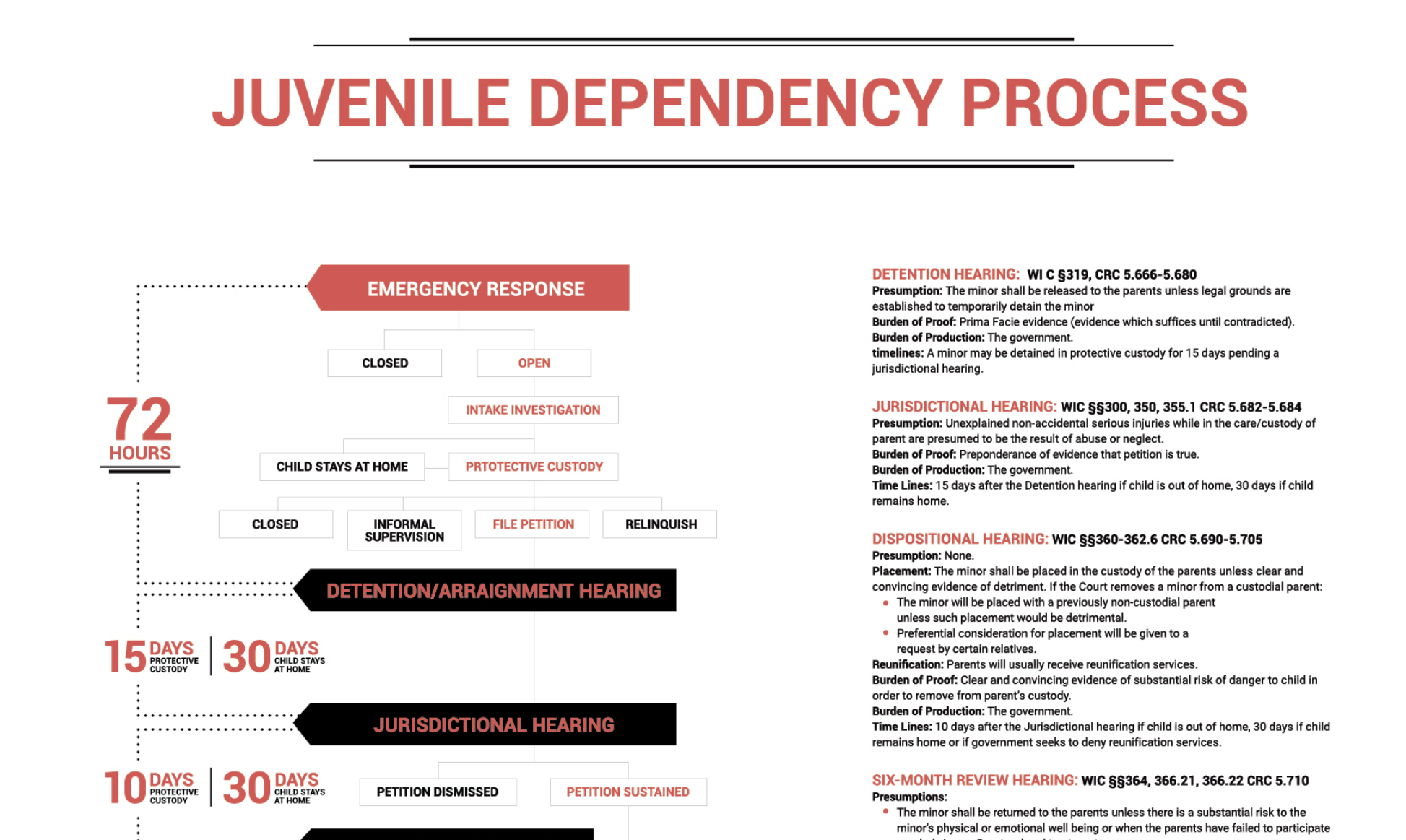
One area I’m keeping a keen eye on is Visual Law. It’s in in it’s infancy WRT design quality, but the goal of expanding the understanding of ‘law’ to audiences beyond ‘the lawyers’ has great importance for liberty and justice. I have firm belief visualization has a role to play: what do you think? Here’s a few leads in that direction:
I can imagine being a lawyer or social sector advocate working with a client or their family and being able to literally point to a place on the flow chart map below and talk about the pathways and being able to create far more shared understanding quickly than waving my hands in the air.
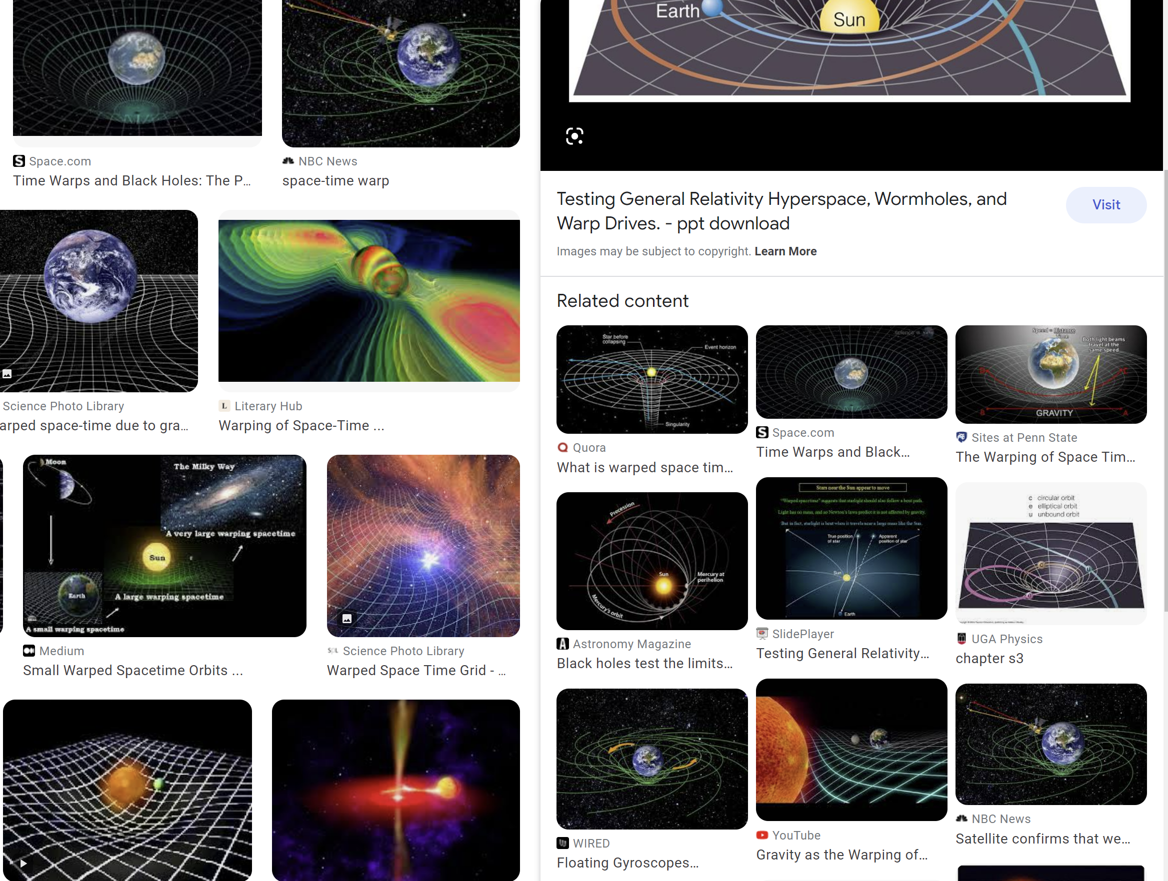
Science visualization: I’ve found some excellent people asking a similar question to above --
“Are top tier educators doing enough to make my knowledge more accessible ?” :
Here’s a better(?) way to visualized ‘curved’ spacetime.
Good: rough
Better: ...but, uses gravity to explain gravity (addressed in the next one)
Best (? for now?) :
Quantum Electro Dynamics
Every once in a while a Richard Feynman comes along and invents a new system of visualizing, one which can unlock millions of other minds and revolutionize an entire field of knowledge. Do you have a Feynman Diagram of your own?
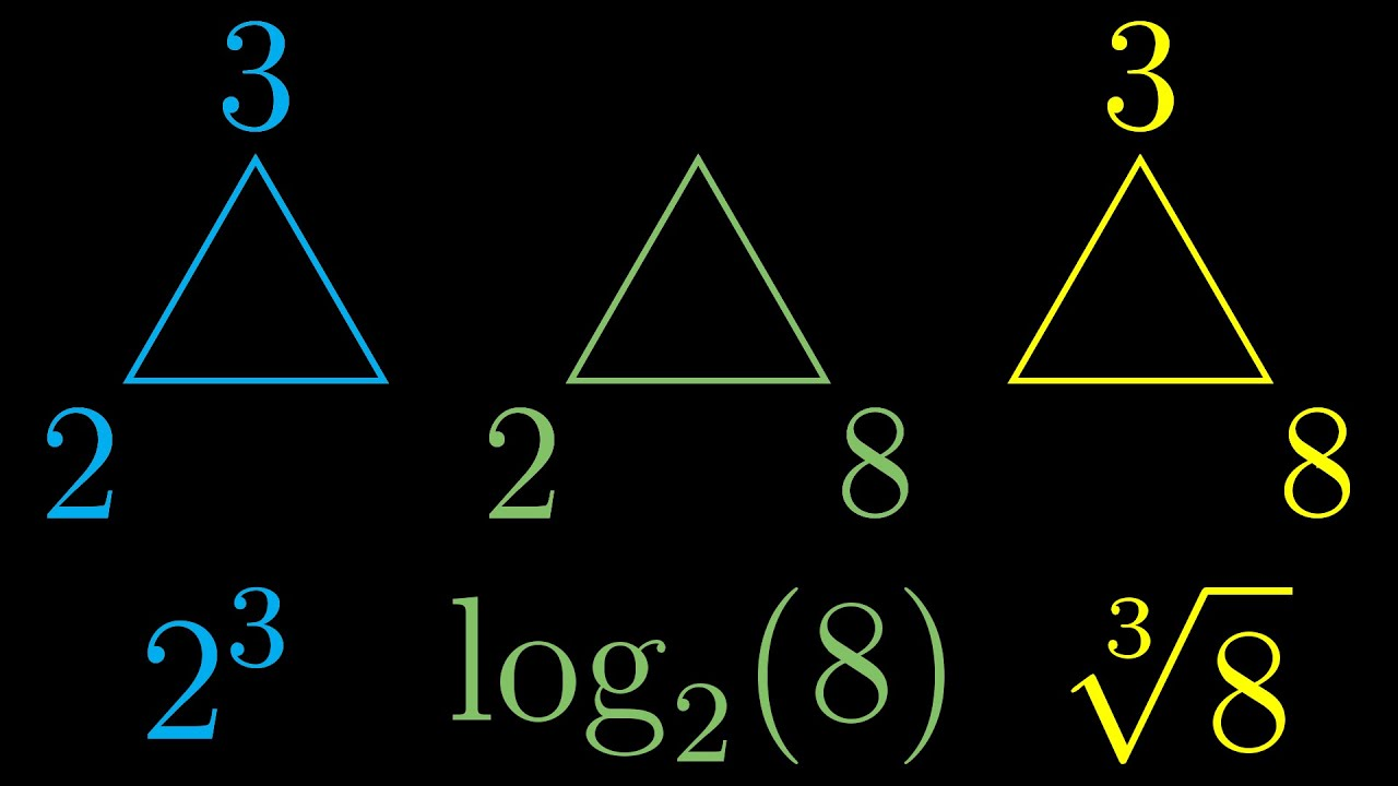
In math visualization, you’ll find some excellent people pushing the future possible of better educational visuals - I’m constantly eager for better notation or math representation, animation, interactivity, etc:
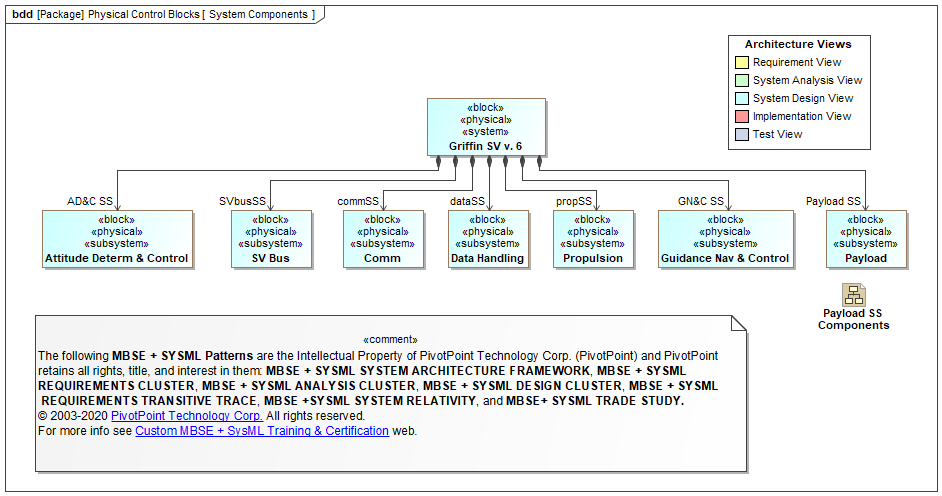
Enterprise Architecture or organizational design is a field that has looked like this for decades: Built by engineers for engineers.
Milky Way International is a set of leading EA practitioners and thought leaders we’ve taken on as partners- we met here on this forum. They are doing some great work with systems. We’re working with them because, among many brilliant parts of their methodology, they explicitly care about good visuals, ones that don’t repel executives’ and strategists’, one’s that are more attractive and inviting.
Don’t Dumb it Down
You don’t have to dumb it down to make it accessible. I think my main critique of some of what I’m seeing in the visual law resources I linked above is that some seem to be making visuals look light-hearted, wacky, casual or fun(?), as an attempt to make them more approachable. I personally don’t think this helps. I do think its important to make things clear, use simple terminology and not make visuals daunting. I’m not sure the font below is really helping… it just makes me feel talked down to… I am likely not the target here… but what do other’s think?
Simple Good Design Goes a Long Way:
Good UI and graphic design is built on centuries of art and science: color theory, psychology, neurobiology, perception science etc. Much of design science is highly audience-respective and culturally aware… good designers are taught many tools for eliciting the desired response from a target demographic. Good, clean, legible, simple language, in thoughtfully laid out visuals can speak to a wide audience. Big retail companies know how to do this. Look at Nike, Apple, and other global brands for good examples (of what to do, and probably case studies of it done wrong)…
Two great resources (in a sea of them...)
Powerpoints and Presentations: (because, even the most fervent Miro users still live in a ‘slide deck’ world):
Slide:ology by Nancy Duarte ( famous for the Al Gore Inconvenient Truth PPT ) rbook, course]
Information visualization:
Visualization Analysis & Design by Tamara Munzner hbook, vids]
If you made it this far… thank you for your endurance. :)
@Jacklyn Reid This question is awesome, I’m going to take my best attempt at some answers, If I miss the mark, let me know and we can try another … version.
One thing I have come to recognize in “Project Boards” in Miro is the (western anyway) inclination to start at the top and work down and from left to right (in either order). Adding some structure to this inclination… I’ve come up with a few habits/patterns:
Here’s a board where we’re working with @Thomas Larsson at Milky Way of Milky Way International on a co-development of Miro App. The app helps connect org-design/operations maps to a data representation of these diagrams systems. The project has spanned nearly 2 years of dev and testing and iteration. I’ve annotated in purple/red.
One thing I’ve found useful in organizing and communicating ‘versions’ over the life span of a project is to organize as follows:
Overarching general information is at and across the top. Process, Team, Resources, Planning, etc.
The lower half is where content goes. We build in sprints, so each sprint becomes a column space of time / activity.
New sprints are concieved of in the white space to the right.
Past sprints are on the left most side of the section.
The current sprint has the Kanban board above it (also… we do kanban ‘backward’ so as to match the flow of time) “Back log is what I call Frontlog, and its ideas in front of us”.
New ideas are generated in the white space to the right and those that make it into the sprint enter the kanban…
When we finish a sprint - we move the kanban and the future ideas forward to then next open sprint column.
This leaves a good history of ideas and solutions that can be easily scanned as you move backward in time (from right to left)
The bottom portion also has process structure. You’ll see “Solution Architecture” and UAT(User acceptance testing) as two sub sections… this is where we design the app and where we test once its built… This keeps the theoretical and the real separated …
This is one of a number of things I might answer with… Curious what others think. :)
Thanks @Max Harper for the mention. I can really appreciate this way of working because everything is on the same board for our planning. And it is something nice about that. No one can complain that they don´t have the information. 100% transparency.
@McNisky
"cross-collaborative projects that require me to express, document, and process ideas to audiences" I feel you. I have been there :-)
We are both an instructor for Enterprise Architects / Portfolio courses and practitioners.
We have tested many tools to make it work for a broader audience (see our courses) and concluded that you need two sides of the brain.
Visual side - where Miro is a good example. Data side - where Airtable is a good example.
From a course point of view, we were shifting from in-class-course to online in early 2020. We had two weeks. This was a good thing The user-friendly part of our chosen tools came down to why Miro and Airtable finally won.
When we present stuff, it is often PowerPoint. But the source is often from Miro or Airtable Interfaces.
If you want to explore more, see https://www.milkyway.international/milky-way-tool
Get back to us if we should meet.
@Max Harper , wow wow – appreciate the mountain of time and resources you’ve sent. I’m not able to get to all of it at the moment, but am very much looking forward to continue to digest and look over the coming week. Will get back to you soon – Thanks!
Thank you to those who participated in our Distributed ‘22 AMA! We have selected winners for this thread and will be contacting them via DM. Please continue to use this thread as a source of inspiration and to ask questions of our community experts! We’re so happy you’re here :)


 Missed Max at Distributed ‘22? Watch his session recording
 Make sure to check out more from Max and his work at Refractive

 ).
).


") The user-friendly part of our chosen tools came down to why Miro and Airtable finally won.
The user-friendly part of our chosen tools came down to why Miro and Airtable finally won.
