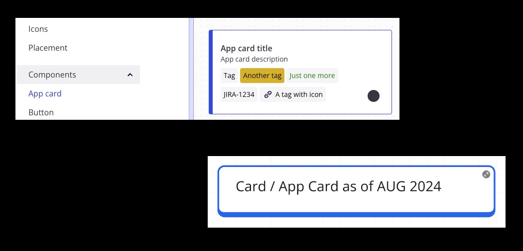
Mirotone.xyz has a AppCard component but it doesn’t match the design of an actual Card or App Card on a Miro board, here’s a comparison (Mirotone.xyz on the top and actual Card at the bottom):
We could sprinkle some CSS to mimic the look similar but I do hope the one on Mirotone can be updated to match instead, here’s some CSS I added in a quick attempt:
.app-card {
  border-radius: 8px;
  border-width: 2px 2px 6px;
  padding: var(--space-small) var(--space-medium);

  .tag {
    background-color: transparent;
    border: 1px var(--indigo100) solid;
  }
}