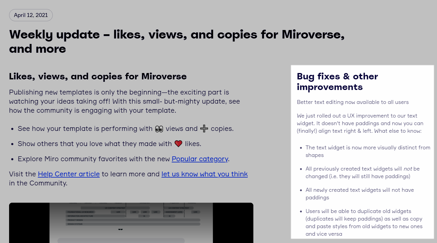
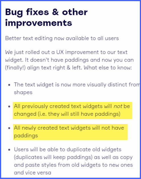
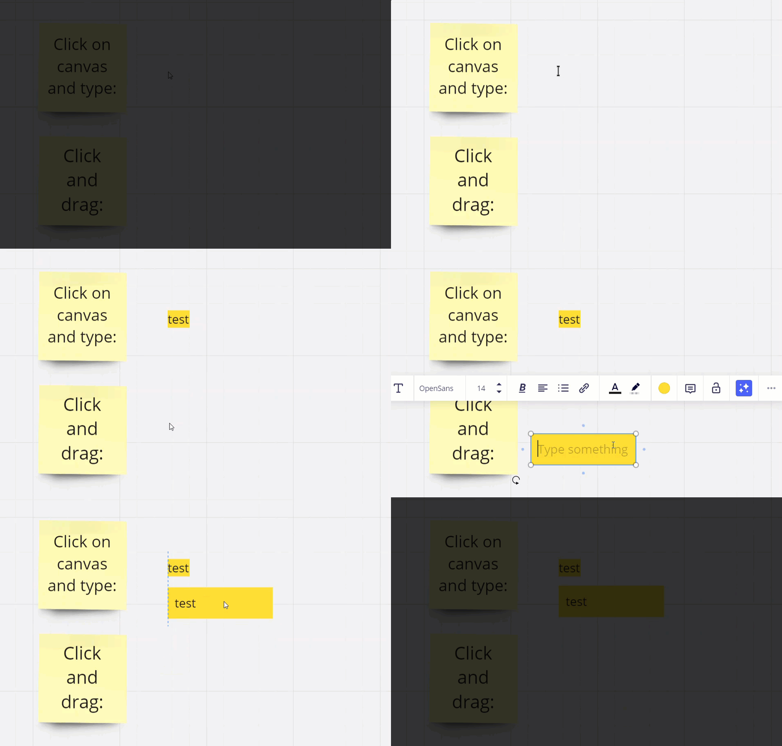
I am creating a large background that is locked. Students will work with sticky notes on top of the background materials. Since it is all locked, when learners click on it, intentionally or not, the bounding boxes / grey outlines, appear around every locked element. When these bounding boxes appear around text, usually the outline is right at the edge of the words, making it hard to read. Image 1is how it usually appears: I am referring to this as “tight” bounding box.
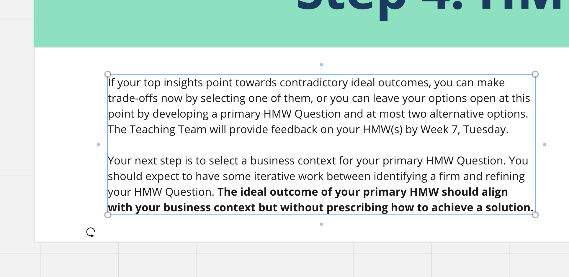
Then suddenly I noticed that some of my text boxes had a nice margin around the text. Like this:
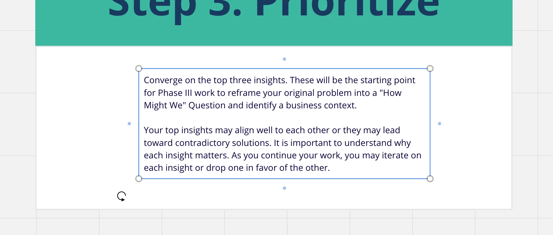
I am able to ‘copy style” for this text box and apply it (paste style) to another text box and get the same nice margins.
my question is:
How did these margins appear? I have no idea how I made this happen. I see no menu item that might have been responsible. Does anyone know???


