Hi guys,
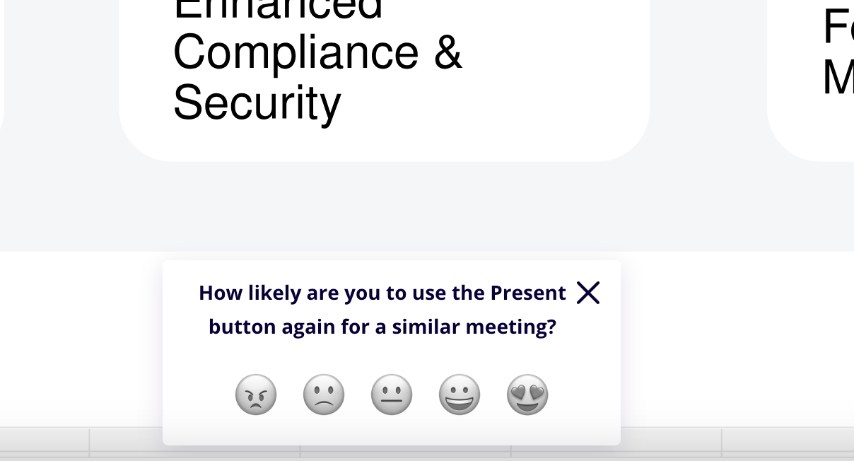
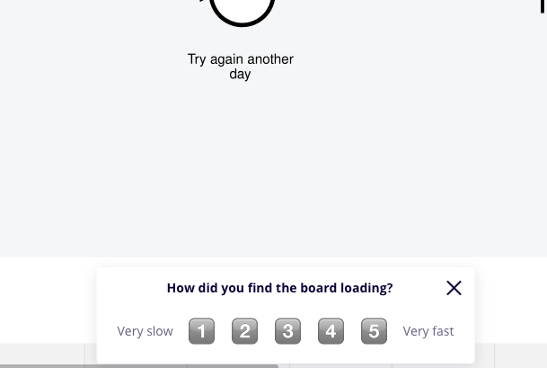
The feedback survey form pops on top of the controls, and hide buttons such as “Return to Scott” when presenting.
This is really confusing for users when I’m telling them to “Return to Scott” and a popup asking them about their experience is covering it.
Please can you either allow us to disable these popups on our accounts / presentations, or move it somewhere more sensible so it’s not interfering with the interface.


