Use Case:
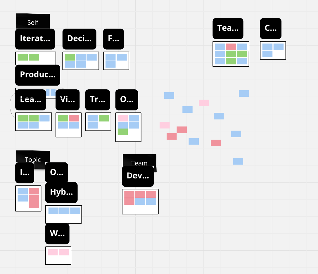
I cluster a group of stickies. Then I want to review the cluster categories that were made so I can organize them. This requires zooming out to move them around or see them as an overview.
Observed:
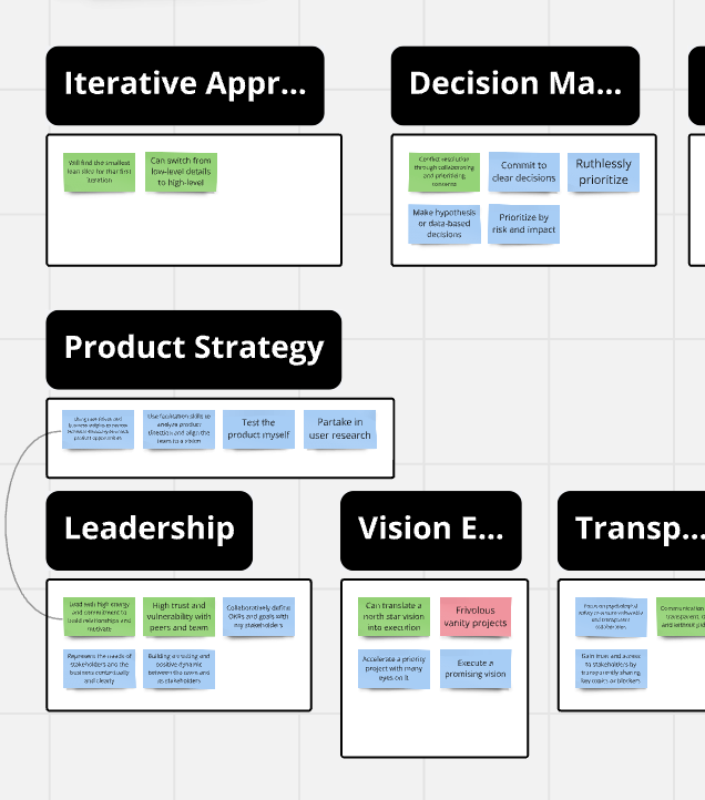
Currently the titles scale with the zoom level. This makes most of the titles easily cut off (see screenshots).
My current work around is to delete the cluster title and add a new title myself with a text box or stickie. Or, I just avoid using the cluster feature at all as it takes too much effort to clean up.
Want:
I’d like the cluster titles to stay static so that I can organize or view them while zoomed out.


