We use kanban block to track daily activity and add comments as actions on the cards.
Few days ago Miro started to group comments that are placed near with each other to the one big comment block. Clicking on this block shows the comments inside but changes the zoom on the board.
How to disable this grouping of comments on the Kanban board?
Page 1 / 1
@Stepan Kokhanovskiy - I was going to suggest that you disable the Comments 2.0 beta from your team as per the Comments help center article:
If you prefer to disable this beta feature, open a comment, click the three dots (...), and toggle off Comments 2.0.
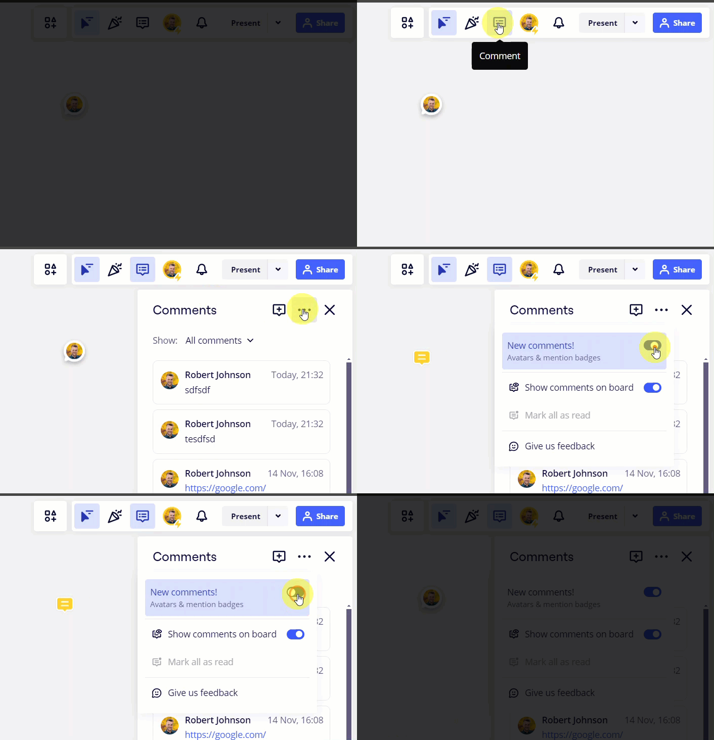
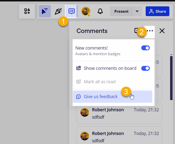
However, upon review in all of my accounts, it looks like the option has changed - maybe disabling this will (temporarily) solve your issue:
Since this change is messing with your workflow, I would suggest providing your feedback to the product team as follows:
Wow, this is the least obvious place to keep toggle for new features. I’ve scan all settings of board and my profile. Disabling of comments 2.0 feature also disables comments grouping.
Thanks for pointing.
Hi @Robert Johnson,
It looks like Miro has updated where you can no longer turn off Comments 2.0, so comments are being grouped when I don’t want them to. Is there a new way to toggle this off?
Hi @Robert Johnson,
It looks like Miro has updated where you can no longer turn off Comments 2.0, so comments are being grouped when I don’t want them to. Is there a new way to toggle this off?
@AdrianC - The disable/opt-out option has disappeared for me, too, and I no longer see any mentioned of “comments 2.0 beta” in the Comments help center article, so it looks like the feature is GA (general availability) now.
I would suggest sharing any feedback both in this post, and through here:
Unfortunate that there isn’t a current solution. But thank you for the quick response!