Hey everyone! 🙂

We’ve added some new tools to help you create presentations faster in Miro! Check them out

Frame management tools 

  • 🪄 In a single click, Magic Organize helps you rearrange the presentation order of your slides to reflect how they are placed on the board. (from top to bottom and left to right)

  • ☑️ Bulk select frames lets you select multiple frames simultaneously to delete, reorder, or hide them. 

  • 🙌 Drag to resize your frames to fit the content you want to present. 

  • 👩🎨 Choose any background color for your frames.  

  • 👀 List view is added to the presentation frame sidebar for those who want a good text overview of the presentation slides. 

Content editing tools 

  • ✂️ Crop images with different shapes to make them pop. 

  • 📏 Alignment guides will pop up while you crop images to keep them aligned with everything else on the board. 

Learn more in our Help Center, and we’d really love to hear your feedback below!👇

@Sophia Chia -

I love that the list view is back again as I really missed it with some of my larger boards!

Kiron


Glad to hear! @Kiron Bondale :D 

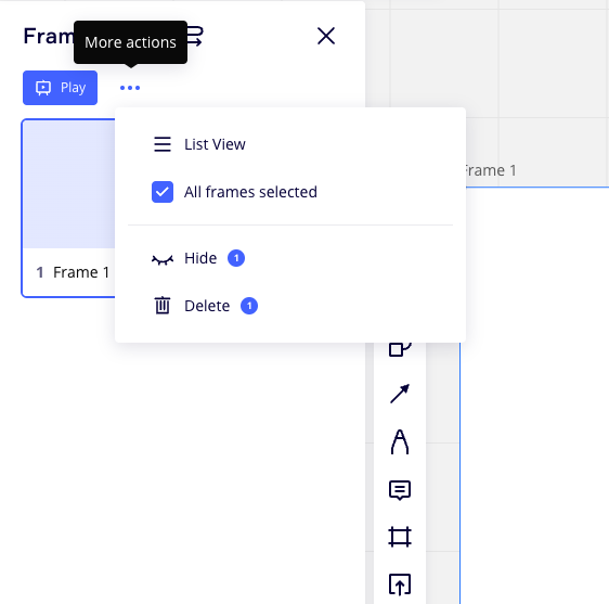
List view can be found behind the “More actions” dropdown in the frames sidebar! 


Re:

  • 🙌 Drag to resize your frames to fit the content you want to present. 

  • 👩🎨 Choose any background color for your frames.  

Are these really new? I have been using Miro nearly five years seem to recall always being to drag-to-resize and select a custom background colour.

@Kiron Bondale - Am I missing something?


@Robert Johnson -

Agreed - these two frame capabilities were already there AFAIK…

Kiron


You are right @Robert Johnson ! Those were released this year, but some users have been asking about them, so we decided to share about it again as a bundle feature set with the other new tools that help people create presentations. :) 


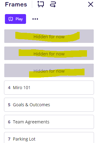
Did they change the way the frames are presented? I used to be able to see what the frame is named in the panel. Now if the frame is hidden, I can’t see which frame I am looking for. There is also no “eye” on the list or thumbnail view to hide or unhide.


Did they change the way the frames are presented? I used to be able to see what the frame is named in the panel. Now if the frame is hidden, I can’t see which frame I am looking for. There is also no “eye” on the list or thumbnail view to hide or unhide.


@Jim Sparks - Yikes!

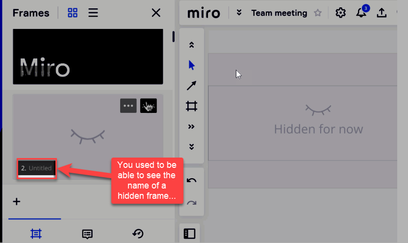
I can see where the intent may have been, “The board owner hid the frame for a reason, so let’s hide all information about it, even in the frames panel.”  However, now even the board owner cannot see the name. You used to be able to:


@Jim Sparks - I will open a Miro support ticket and confirm this new behaviour with them and let you know what they tell me!


@Robert Johnson Thank you!


@Jim Sparks - I received a response from the support team and unfortunately this new behaviour is by design:

In this case, the behavior that you're noticing where the name of the frame is hidden would indeed be the expected behavior. The assumption here is that the user who chose to hide the frame also wants to hide the title. It also is indeed a function of the redesign as you've mentioned here. 
 
The team really appreciates your feedback here and has let me know that they are going to consider this feedback for future iterations of the product. 

I suppose one option moving forward would be to create a Wish List post to request that the Frame name be visible to the board owner/co-owner.

You can post in the Wish List category by following the guidelines here: Wish List: Everything You Need to Know.

If you do create a Wish List Idea post, I would also recommend that you post a link to it back here, so that future readers of this post can quickly get to and vote for your Idea.


The assumption here is that the user who chose to hide the frame also wants to hide the title.

You could say that's a perfectly correct assumption, if we're talking about hiding it for other users. But why would you want to hide it from yourself? 🤔 I'm sort of thinking that this might be the result of a miscommunication within the product team and that it will probably be corrected soon, now that you've brought it to their attention.


@Henrik Ståhl - I agree. The more I look into the change of removing the frame title from the frames panel when it is hidden, the more broken/confusing I find the experience to be. For example:

  • When a Frame is hidden, you can still see the frame’s title on the board itself.
  • When I go into presenation mode, all frame names are hidden -- visible and hidden, so hiding it in the frames panel is not hiding it in all instances.
  • When I press Plan in Presentation mode, the frame titles are still hidden.
  • If I open the Frames panel and click on a visible frame, I navigate to it.
    • If I click on a hidden frame, I navigate to it AND it becomes visible -- I could see myself wanting to havigate to it and give some context before displaying it -- when using the left/right arrows in navigation mode, I can navigate to a hidden frame but then have to use the ellipsis menu on the frame to unhide it.

Obviously I am overthinking this. I get that Miro is anticipating the presenter is sharing their screen using a 3rd party app and not Miro’s screen sharing (which is now burried in the Video Chat feature?), in which case the user may open the Frames panel to move around and they may not want the participants to see the name of the frame. However, when using Miro’s screen share, and the presenter opens the frames panel, only they can see the frames panel. Oh well. I just have to get used to this 😁 


Reply