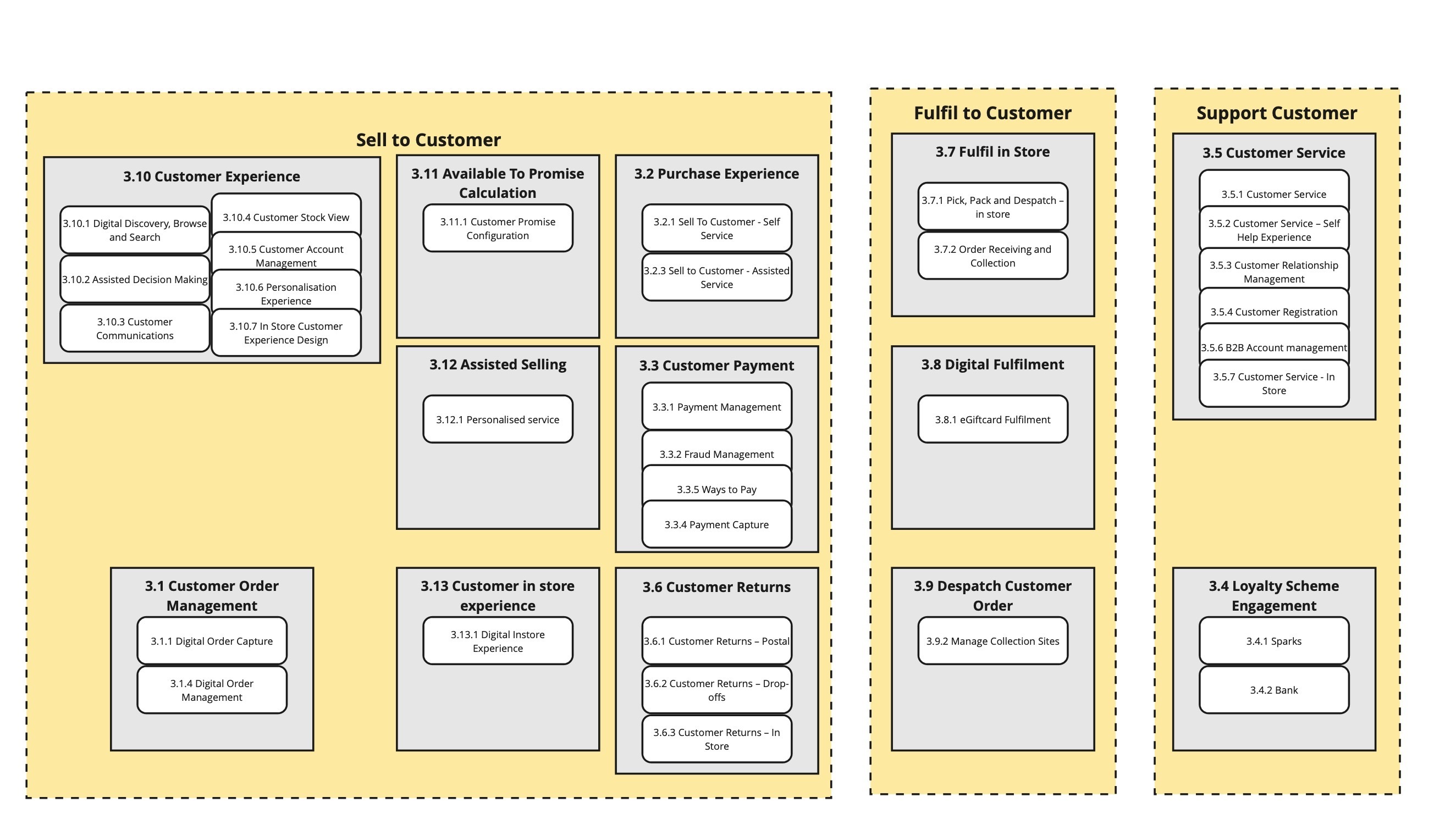
I have created a square shape with dotted lines around it and input text to the shape, not using the text tool. I have selected the text to the top of the box. As two of them are the same width the text is in the same position. I have increased the width of the box on the third shape and the text automatically moves down. How can i resize or switch off? Many thanks in advance
Can you paste a screenshot of that portion of your board so we can see exactly what you are encountering?
Kiron
Hi Kiron, Thank you for your reply. I am a newbe here. Firstly i cannot take a screen shot on my mac. it seams to prevent it in some way. I have exported it as a pdf using a frame
Thanks in advance
it doesn't look like the image i uploaded is showing? Now I don't know what to do. I have tried again and it is on the screen so i hope it works this time?
Thanks
The image came through cleanly so can you now explain using that example what you are/aren’t wanting to happen in it?
Kiron
Great thanks, You will see 3 yellow boxes, I have clicked into the shape to enter the text, Then aligned the text to the top. When i extended the width of the box ‘sell to customer’ out to the left to make a group, the text automatically repositioned itself lower in the box. Therefore when they are lined up the text in the 3 boxes are at a different level. I know i can place a text box in the shape and line them up but I think entering text in a shape is more efficient than additional shape. Maybe it is that when a shape is extended, the header and footer is extended.
hope that explains
many thanks in advance
Alan
The vertical positioning of text is a percentage basis so as the vertical size increases or decreases, the absolute location of the text will move down or up in relation to the changing overall height (e.g. 5% from the top or bottom depending on which vertical alignment option you picked). If I change the width of the shape, the vertical positioning won’t move.
However in your case, you have three separate rectangles with the same height and although the width of each is different, the vertical position of the title text should be consistent.
I tried to reproduce this and couldn’t (see below). As such, it might be a system configuration related issue for you so you might want to try using a different Miro access mode (e.g. different browser, desktop app instead of browser), and if it still happens consistently, open a MIro support request here: Submit a request – Miro Support & Help Center
Kiron
Thanks Kiron, I will try a different browser. Cheers
Hi Kiron, I have tried the same thing using Microsoft Edge and the same thing happens. I will submit a request.
Thanks
Alan
Actually, you did reproduce it, Kiron. See the slightly different vertical position in your 3rd example/test shape. Effect is more pronounced the slimmer the shape gets.
Reply
Enter your E-mail address. We'll send you an e-mail with instructions to reset your password.