Hello.
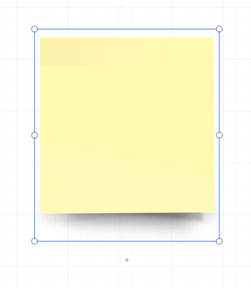
The first image is from the iPad app. There is only one dot at the bottom of a sticky note.
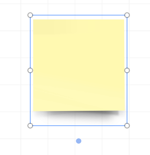
The second image is from the web app in Apple Safari on an iPad Pro. There is also one dot at the bottom of a sticky note.
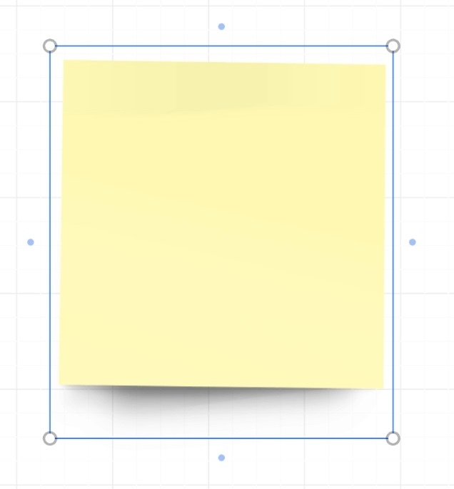
The third image is from the web app in Apple Safari on a MacBook Pro. There is a dot on each side of a sticky note.
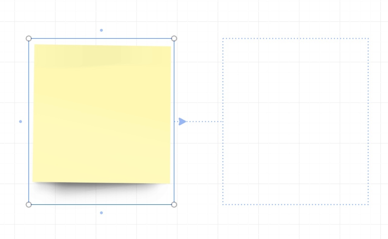
The fourth image is from the desktop app on a MacBook Pro. There is also a dot on each side of a sticky note.
The point is why does both versions of Miro on a MacBook Pro provide a blue dot on all four sides but both versions of Miro on an iPad Pro only has one? Will this be corrected so the iPad matches the Mac?
The fifth image is from the web app in Apple Safari on a MacBook Pro. There is an additional ability for the blue dots where we can hover the cursor of one of them and a dotted-line sticky note appears. Will this be coming to the iPad app as well?
We could mindmap or create diagrams so fast if these missing abilities came to the iPad.
Thank you for your time. Bye.
