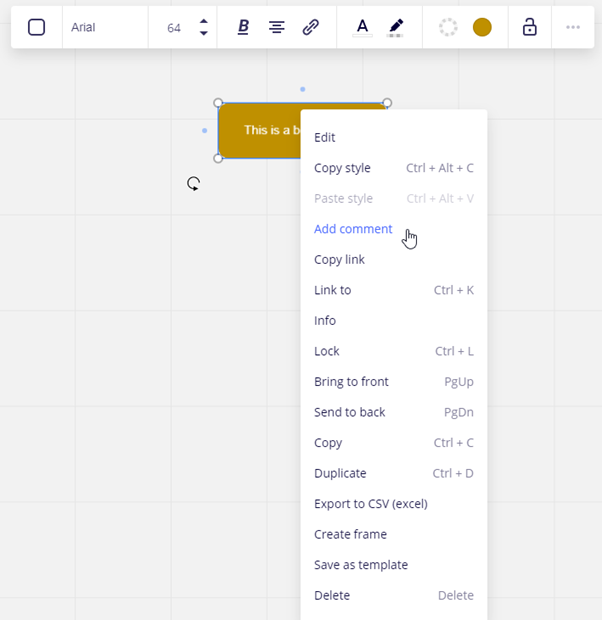
I have discovered that the Three-dot context menu and the mouse right-click context menu are almost, but not quite the same. This has been confusing for me and my participants. Can we make them aligned?
Specifically, you can add a comment to an item from a mouse right-click, but not from the three-dot menu. (Images below) Can we have these menus be the same?


