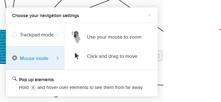
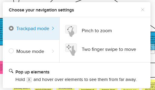
Is there any way at all to return to using the left mouse button to move around the screen (click and drag)? It seems going to the Navigation Settings only allows you to choose between using the mouse or trackpad, but no option is available for choosing which mouse buttons control movement. Not sure why Miro decided to make this sudden, unnecessary change! If it’s not broken, don’t fix it!


Now, I have to keep clicking “V” to pan with the left click which is very counterintuitive (the right click to pan keeps glitching for me and feels VERY awkward).


Obviously I don’t like this update, but it might help out to know that holding ‘space’ will have the same effect, however isn't a toggle. I find holding space to be easier than using ‘V’ and is what I’m using until Miro addresses this issue.


An other input regarding browsers with mouse gestures (Vivaldi, Opera, ...): This right click moving is broken. I is not smooth at all and it moves around only after releasing the button. Meanwhile often mouse gestures are triggered - like the one to close the tab!

It also seams that there is a middle click move behavior (same as with the right click): This is totally unusable on Linux/Unix as the middle click is for pasting the content of the clip board. So every time you move the board that way you create some thing on the board...


Hi all, first off – thanks for bearing with us and providing detailed descriptions of things that work and don’t work for you! The product team is currently consolidating all of the feedback to decide what the next steps can be. I will share an update with you here in the next few days once I know more. 

In the meantime I also encourage you to give this update some time. You may get used to it after a few days, and, if not, please, don’t hesitate to flag it here – I’ll make sure to surface all of the feedback the community members are providing to the product team working on these updates. 

Hi 

As a (very) frequent user of Miro I am so annoyed by this change it made me switch back to old and inferior solutions I long ago neglected like Google Slides. 

I am left-handed, so the old navigation with left button+zooming with scroll wheel was natural and easy. The new change makes me work slower, less efficient, breaks my line of thought and make the entire Miro experience bad!

I hope you realize what I am saying - this is not a matter of us user getting used to a new change in the UX - it is a crisis of broken experience that has impact over your most loyal users!

Hope this will come through without obvious reactions like “try to get used to it” - do we have any other choice???

Completely agree with this, I also use a left-handed mouse and it’s driving me completely crazy. It’s not good enough to say “get used to it”! I’ve also tried using the hot keys and now having to go back & try to remember what text I’ve unwittingly replaced with V and H……. 


Hi all, first off – thanks for bearing with us and providing detailed descriptions of things that work and don’t work for you! The product team is currently consolidating all of the feedback to decide what the next steps can be. I will share an update with you here in the next few days once I know more. 

In the meantime I also encourage you to give this update some time. You may get used to it after a few days, and, if not, please, don’t hesitate to flag it here – I’ll make sure to surface all of the feedback the community members are providing to the product team working on these updates. 


Hi Lena, I just want to add to the others here that I personally find this to be a very bad (and unneeded - why was this done?) change. Very counter-intuitive. We already struggle with onboarding and familiarizing people with the program, this is just another setback and discourages use.

Please at least put in the ability to give a user the option to switch back to the old way.


Just got back to using Miro this week after the xmas break and yep, add me to the list of unhappy campers.

A very unintuitive approach to navigating around a board. Would much prefer to have this as a preference that can be set.


I can’t seem to find navigation options on my boards to be able to edit anything.  Thank you for this thread though, I have now discovered that I can right click to move around the board.

Everything was working fine last year and then, sometime in December I think, the arrow button on the board stopped toggling on-off to give me a hand for navigation.  Instead it has defaulted to navigation instructions for a touch-screen that I am not using day-to-day (I plug a laptop with a touch screen in to a large desktop screen and use a mouse for day-to-day work).


Anyway, I’m OK with left clicking for selecting, and right-clicking for moving.  Just needed to be provided with instructions at the same time as the change being implemented.  :smirk:


Is there any way at all to return to using the left mouse button to move around the screen (click and drag)? It seems going to the Navigation Settings only allows you to choose between using the mouse or trackpad, but no option is available for choosing which mouse buttons control movement. Not sure why Miro decided to make this sudden, unnecessary change! If it’s not broken, don’t fix it!

So true - the old left button interface was so intutive, really annoying to have to change habits now. Totally unnecassary. Please introduce an option to configure buttons ourselves.


I can see from software that keeps track of how long I use programs for on my computer that I’ve now put 70 hours into Miro since the update, and I’m really sorry it inform that it does not get better!

While i’m now 100% used to the new controls, I’ve found that I am now slower at building boards, I miss-click more and I make unintentional changes more.

I could explain the specifics however in the interest in keeping this thread not too long, I won’t go into them.

Miro have generally been good at listening to the community and so I am sure this will be rectified soon. I think in order to prevent this from happening again, Miro should most likely look into how they test new updates. They have stated that this update was thoroughly tested however every Miro user I know does not like the new update, it is quite clear that the update made the platform worse and not better. While this has frustrated a lot of us, as I mentioned previously Miro will act soon, I’m sure due to the amount of people who don’t like the update.


Consider the cognitive impact to people choosing your software in year 3 of the pandemic … most working remotely.

You just elected to move the steering wheel to the back seat of the car.

Your rationale is completely lost on me.

This is behaviour I expect from Atlassian not Miro.


I have not been able to adapt to this new way of moving around the board, it has affected my productivity. Hopefully if there is the option to reverse it it has been somewhat frustrating. It is the first time that I have not liked a change in Miro 😅


I don’t particularly like using right click to move around since I associate a right click with an “alternative” to doing something normal (like navigating). Changing basic navigation has messed up a lot of people on my team. 

I would love to just switch the left and right click - left click to navigate, right click to select multiple objects. 


@Lena Shenkarenko Have you heard anything from the product team about this?


Has anyone found this feature to be more intuitive yet now that it has been roughly a month?


Let me add to the chorus of groans in this thread which I found by Googling “why is left clicking on Miro boards not working”. Because honestly it really is driving me round the bend. For me, it’s a double whammy of right click being a toggle and this playing havoc with browser gestures as other people have mentioned.

I’m beginning to get more into the habit of using my scroll wheel (which doesn’t toggle and is only active when pressed) but clicking left is still my default.

As suggested by others, this is crying out to be a preference that can be set...


The right mouse button navigation is horrible. Can you please reverse?  I was able to start a training and after few hours I got so frustrated that I had to take MURAL as backup to avoid the headache of this feature.


I don’t like new right mouse button to pan. Return the original controls. 


Meanwhile I stop recommending your product to friends. You had 3 months to get this control back and you didn’t. Bye!


This is a very irritating change that has cause me more the passing frustration. Most whiteboarding or drawing applications i have use (including Mural) the left mouse button - my guess is to mimic the pointing with the index finger. I find the change to the right mouse button very awkward and it definitely has reduce my productivity in this tool that I have been for using over a year now. I have been using it daily for few weeks now and i really dislike it. I strongly suggest updating Miro to allow this to be configurable (left or right mouse key, with or without modifiers like Alt, Ctrl). Whiteboarding tools are already tough enough to use by the novice in workshops this change just complicates matters for the worse and has users fighting with the tool instead of just getting work done. It has definitely added more friction and frustration to my use of this tool. 


14 gazillion apps in the world, both on desktop and web, across multiple operating systems, use left mouse button click and drag to move things.

And then there’s Miro

You fail UX design 101

At the very least you could give us the option to reconfigure the mouse bindings

You totally fail UX design 101


Really don’t like the right click feature - i am also thinking about going over to Mural as a result. It is SO counter intuitive and awkward. I cannot afford to be messing aroudn in collaborative workshops!


What a shame.


I’m also now using Mural - they have it so easy !


Any update on reverting back to the old way of navigation with left mouse button. It is frustrating. I am using Mural as a back up now as it is killing the productivity, increasing the stress.  Looks like some dumb decision by the Miro product team


Worst UX/UI idea ever !
When clients start to be confused with this (they are not tech experts), it starting to become a problem.

Don’t want to leave MIRO yet but please fix this, just give us the option !


@Dudley Newmark @Adrian Turner @FergusMc – thanks all :raised_hands:  Like I said above, I’m making sure to re-surface your feedback to the product team, and will follow up with everyone in this thread early next week. 

@Jacob Hernandez I’m very sorry to hear you have the impression I’m trying to dismiss your feedback. I’m actually aggregating everything the community members are sharing with us to ensure the product team has the holistic view of how our users are interacting with the update. 

Below is an example of positive feedback for your reference from a community member. That being said I fully understand that other users have different experience with this update, that is why we’re currently working on consolidating all of the data points to decide what the next steps for us can be. 


@Lena Shenkarenko ok, what did you decide? Because in the whole thread, over 8 months now, Kyle is the only one who’s happy with the right click.


Agree !
This is getting ridiculous.
Miro si supposed to help productivity, not slowing it down 😂


Come on guys, start 2023 with some good news and go back to how it used to be and work.


Reply