

THE ABSTRACT:
Where connecting lines and arrows have been used to join stickies and shapes, it would be awesome to be able to hover over a particular object with the cursor and be able to see which other objects are directly connected to it, cutting out unnecessary noise.
THE PROBLEM:
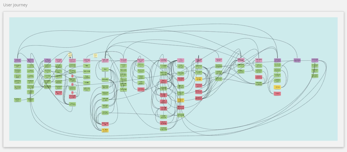
We’ve created a really complex user journey out of stickies with connecting arrows to show all of the ways the different stages can connect, depinding on the actions a user takes. There are TONS of connecting arrows and it’s making it really hard to see what’s what.
The flow through the journey and the different paths you can take is a key part of the story we need to tell on this project What we ideally need is a way to click on an individual sticky and have just the connecting lines that relate to it stand out so they’re more visible within the mess. We’d like to use this for a stakeholder playback session but it’s too hard to navigate at the moment.
In terms of this particular project this is actually a critical feature for us as we’re either going to have to re-think how we play this back or spend time replicating our work in another programme to get the clarity we need for our playback.
THE POTENTIAL SOLUTION:
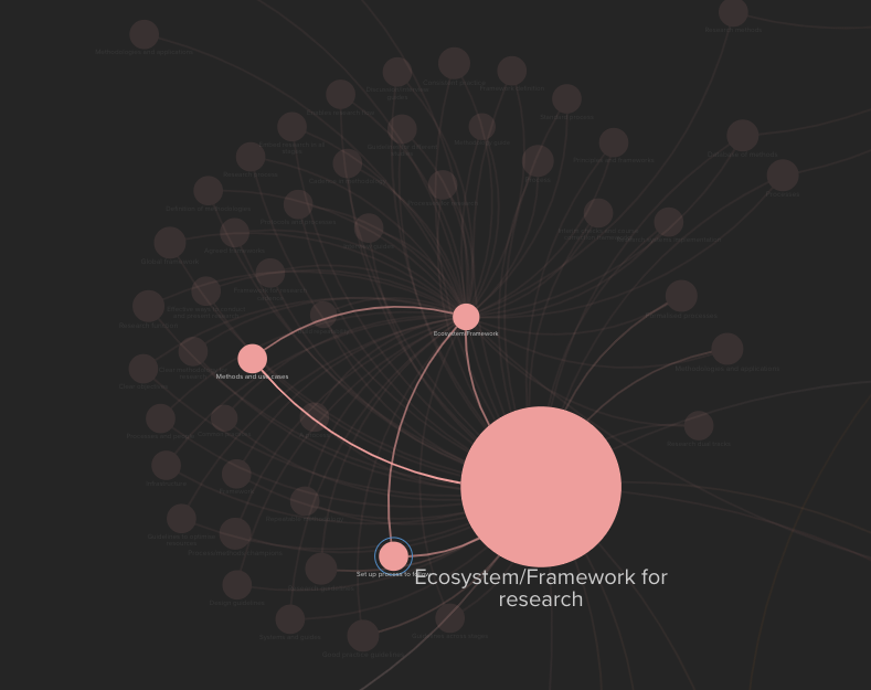
Clarity could be achieved either through highlighting the connections between selected objects or by making unrelated ubject fade into the background. I’m thinking of something similar to the way that Kumu helps you highlight individual connections in complex maps


This is exactly what we need for our mind map. I think it is critical in navigating quickly and efficiently when using this product. Considerable time can be wasted and mistakes made without it. Have any other products similar to Miro this capability?
even just directly related nodes to a selected node, rather than an ecosystem would be hugely beneficial
Would LOVE this. Was thinking I might have to build it but if someone else does, or has, that would be GREAT.
Seconding Matt, Oisin and Nick- I would LOVE this feature. My mindmaps suffer from ‘everything-connects-to-everything’ overload and a function similar to the way Excel reveals connections between fields in its formula-driven links would be ideal- that is, let us see things in layers
I second this (or 26th). It would be a HUGE thing in the analysis toolbox.
What’s Kumu by the way? I’ll check that out.
This is exactly the biggest missing thing we have experienced. We have a very similar diagram to above mapping out our software systems and this would help us reveal the connections. I might add it would be very nice to be able to have a setting to go n layers deep. Say I pick 2 and it would highlight everything 2 layers deep. Everything that is connected to the highlighted connection and everything connected to those connections.
yes +1 for this!
Yes please, this would be revolutionary, in addition to seeing linked pathways from point A to B. My maps also use different line colours/ weights to denote different types of connections, so it would be great if lines by type could also be highlighted. Cheers.
+1 we would definitely need and love this!!!
This would be a fantastic feature! +1
Oh YES, please! If there is any way to make this happen, no matter how layered this will greatly enhance the use of some Miro boards that we spent months to create. +1
+1
It’s hard to tell what is connected, if there is too many connections to an object. Need this for our mind maps. Or click object to view connected items (in our case a list of items connected would work as well, which you could then click to navigate)
Absolutely needed!
This came up in conversation today for work we are undertaking and I can see this becoming a blocker necessitating a look at alternative tooling.
Please please add this feature, it is flowchart 101!!
Made an account just to +1 this.
This would be a massive improvement for our use cases too! The lack of this feature actually prevents us from using Miro in a more scaled environment.
Please implement this yesterday!
Totally second this!
Missing this feature :(
I agree; I am desperately searching the internet for something providing this functionality, not finding anything quite right, and I would love to use Miro for this!
This would be a really nice feature indeed!
+1 I believe this would be helpful for our “big planning” event every 10 weeks where we create a program board across all of our team to help visualize several objects (target delivery, dependency and milestones).
This Feature would especially help better visualize the connected/related dependencies across teams as the board begins to get “noisy”, similar to OPs image, with more objects being added (lines begin to look like spaghetti )
)
All,
I mainly use this Miro for dependency management which is complex. Its quite dissapointing that Miro is lacking this basic feature for years. Without this its as good as useless for anyone managing dependencies. Please do implement this ASAP, otherwise we have to dump your licenses and invest in other product which is worthy.
Really like the miro tool, this is the biggest flaw/gap I can see. We really need this for our planning (dependencies and other connections), otherwise the board is an unreadable mess. We are just trying to figure how and if this is in any way possible in miro..
Any alternative suggestions are welcome